The network for creativity
Join 1.25M professional creatives like you
Connect with clients, get discovered, and run your business 100% commission-free
Creatives on Contra have earned over $150M and we are just getting started
Back to feedPost
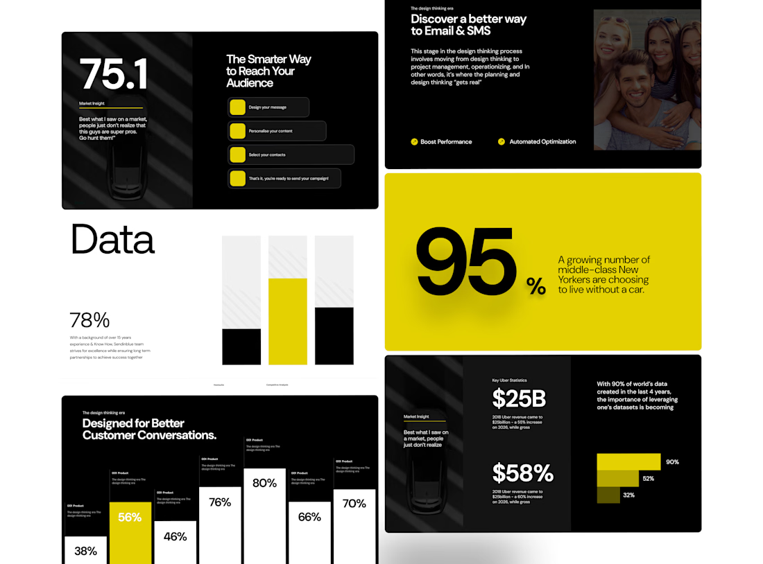
Designed around the idea that data doesn't have to feel dry.
I wanted this presentation to feel more like an editorial publication than a conventional business deck.
Large statistics create the impact.
Typography creates the rhythm.
Data visualizations create the structure.
And the yellow accent gives the system its energy. One of my favourite parts of the presentation design is finding the balance between information and emotion.
This project gave me room to experiment with oversized numbers, structured data, and a restrained colour system.
Nothing unnecessary.
Just enough visual language to guide the story.



Love the editorial feel here. Oversized typography and restrained yellow palette give the data real punch without adding clutter. Great balance of clarity and energy!


Thanks for the feedback brother!

The oversized type and restrained yellow accent create a strong visual hierarchy—especially effective for making dense data feel approachable.
The network for creativity
Join 1.25M professional creatives like you
Connect with clients, get discovered, and run your business 100% commission-free
Creatives on Contra have earned over $150M and we are just getting started











Related posts


✈️ What if booking a flight was actually fun?
I wanted to make the whole experience feel less like filling out a form and more like playing with an interface.
Turn your sound ON and give it a watch 🎧🔊.

THIS IS GREAT


Hourfield is a 16-second 16:9 launch film for products that organise people's time: calendars, schedulers, booking and reservation apps, planners. Retype a few short lines, drop in your logo and rename the calendar's days and tiles (meetings, table bookings, classes, shifts): the week re-plans itself on screen and the film lands on your logo lockup. Our second version, Maréva, a fictional table-booking app, turns the working week into an evening of reservations on the same animation and timing.
Built end-to-end through the SVGator MCP server. The calendar that re-plans its own week, the orbit that swirls into a single dot and the lines centred by their real letter shapes (fonts measured, not eyeballed) were computed in Python and written straight into a live SVGator project as 780 editable keyframes; I directed every note and finished it in the canvas. Maréva was made the same way, on the same timeline. Everything stays a real layer: 50 live text layers, named elements (headline, logo, product-name, tagline) and one logo image animated in two moments.
Yes, there is a lot to edit: every line of the story, a whole week of calendar tiles, a palette in nine roles. A full rebrand takes longer than five minutes, and that is the honest trade: it shows how much a single SVGator file can carry, and how MCP makes a detailed, story-driven film practical to re-make, not just to watch.
Links:
▶ Template (SVGator)
▶ Demo video, A → B


Love the smooth flow and the text animation! Good luck!

Traditional corporate training often feels disconnected from everyday work. Skillio helps bridge that gap with personalized five-minute sessions, job-specific AI simulations, and instant feedback.
The mobile experience supports role-based learning across professions, with interactive chat and voice exercises that recreate realistic workplace situations. A lime-green, lavender, and deep-green palette, bold typography, and a flower-shaped performance chart make progress easy to understand and engaging to explore.
Explore the project on Dribbble:
https://dribbble.com/shots/27808131-Mobile-App-Powered-Employee-Training

Sweeet