The network for creativity
Join 1.25M professional creatives like you
Connect with clients, get discovered, and run your business 100% commission-free
Creatives on Contra have earned over $150M and we are just getting started
Back to feedPost
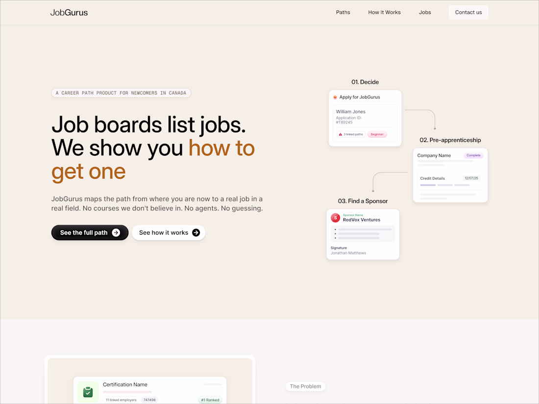
One thing I’ve noticed while designing websites for AI agencies is that many of them confuse visual complexity with technical credibility.
More gradients.
More effects.
More motion.
More interface layers.
But after a certain point, the interface becomes harder to process, and trust starts to decrease instead of increase.
So while refining Zevia, I started reducing rather than adding.
Lower contrast in certain surfaces.
More stable spacing rhythm.
Less motion competing with content.
More focus on typography and structural pacing.
Most of the work recently has been invisible adjustments, but those changes affect how long someone can comfortably stay on a page.
Still refining the system before launch, and would genuinely value critiques from other designers/developers here.
Especially around balance, pacing, and areas that still feel unresolved.
The network for creativity
Join 1.25M professional creatives like you
Connect with clients, get discovered, and run your business 100% commission-free
Creatives on Contra have earned over $150M and we are just getting started
Related posts
I had the pleasure to collaborate with one of my favorite agencies to date, Smith&Diction 🔥
I came in to lead the development of the entire site for Cowboy Space, a company that building a power grid in space to harness solar energy to power AI. Pretty crazy stuff!!
check out the site below 👇
Awesome work, Adriano!
Dropping a new @Framer component.
A a fully customisable, animated audio visualizer.
From classic VU-meter aesthetics to live microphone-reactive visuals, and much more this single component adapts to any brand, layout, or mood.
This is good
wait this is clean, how long did this take you
Trending
Claude
Claude has entered the design space. How are you using Claude Design?
Contra University
Learn from expert creatives how to earn more using next-gen AI tools.
creativeaiflow
Creative AI workflows are evolving. What tools do you use, and what are their strengths and weaknesses?
portfolioreview
The best portfolios tell a story, not just show a grid. Share yours for feedback.
freelancerlife
Freelancer life is wins, pivots, and everything in between. What’s yours right now?