The network for creativity
Join 1.25M professional creatives like you
Connect with clients, get discovered, and run your business 100% commission-free
Creatives on Contra have earned over $150M and we are just getting started
Back to feedPost
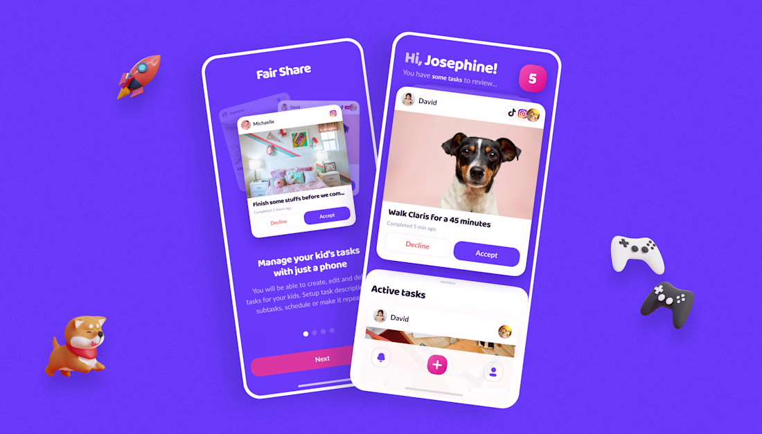
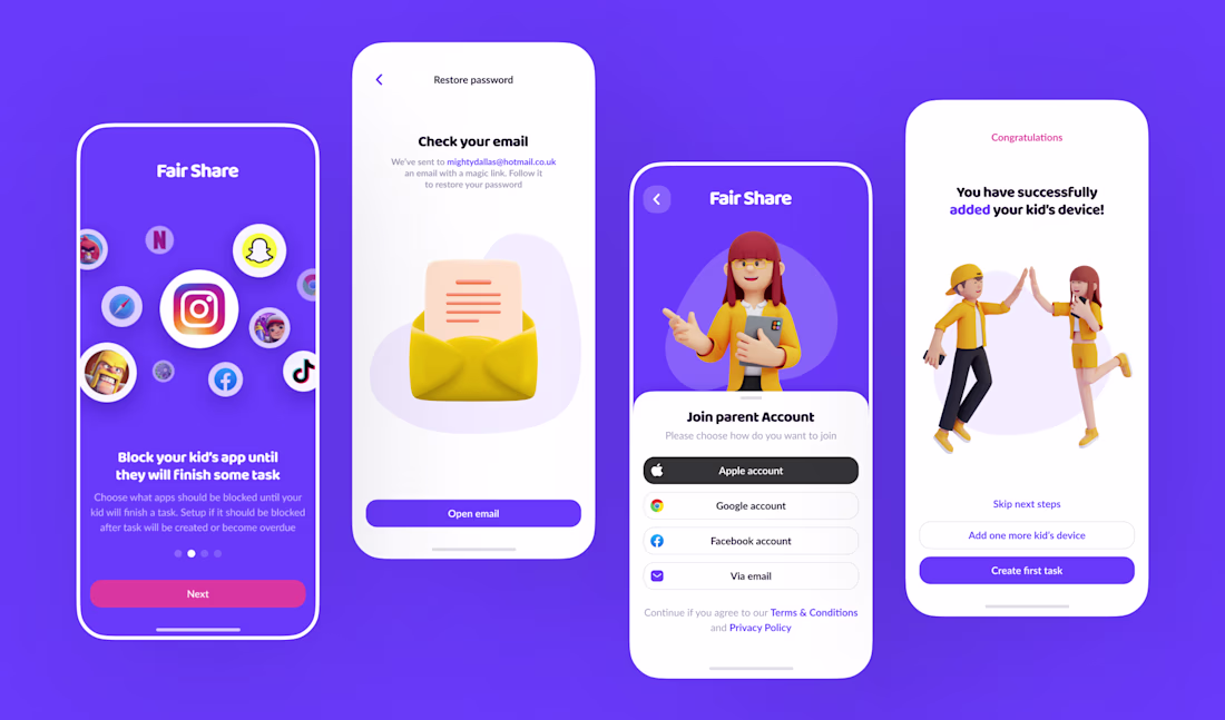
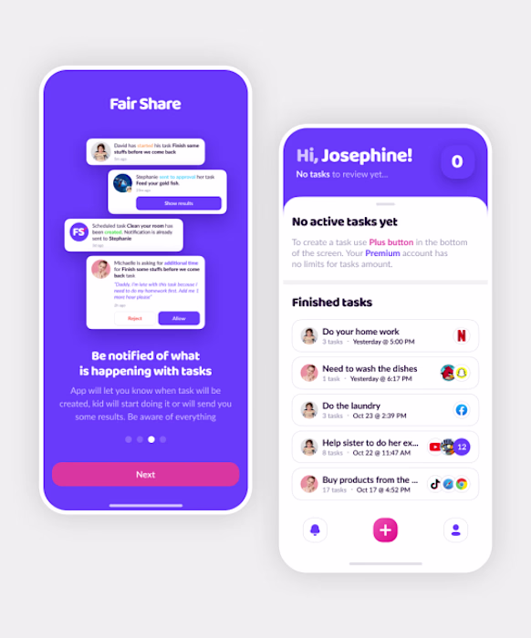
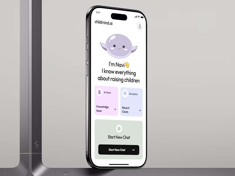
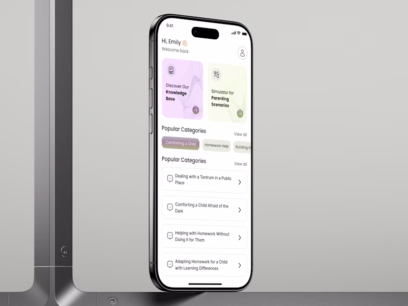
FairShare is one of those projects that looks straightforward until you actually start unpacking it. You’ve got parents on one side, kids on the other, and somehow the app has to work for both without feeling like two separate products glued together.
What I liked here is that the experience doesn’t try to force one messy interface on everyone. The parent side is clearly about control, structure, and keeping track of chores and screen time, while the child side stays super simple and focused. That separation makes a lot of sense to me — I’ve seen apps try to cram everything into one flow, and it usually just ends up confusing everybody.
The onboarding is probably one of the trickiest parts, because linking a parent and child device is exactly the kind of step where people get stuck and bail. Breaking that into smaller steps feels like the right move. For this type of product, setup can’t feel fragile.
I also think the color choice does a lot of quiet work here. It sits in a nice middle place — friendly enough for kids, but still calm and serious enough for parents. It’s the kind of thing you don’t always notice right away, but it changes the whole tone of the app.
Overall, this feels like the kind of case where UX choices really shape the product, not just the UI on top of it. The structure, the flow, and the tone all have to hold together, and that’s what makes it interesting.
When a product has to work for two groups with different needs, where do you usually draw the line between what stays shared and what gets fully split?
#UI #UX #UXDesign #UserExperience #ProductDesign #InterfaceDesign#UserResearch #DesignSystems #Wireframing #Prototyping #Onboarding #TwoSidedUX #ParentingApp #KidsUX #ScreenTime
Really enjoyed this breakdown. The point about separating the parent and child experiences while keeping the product cohesive is especially insightful😍
Impressive work. Your process is just as interesting as the outcome.
Like colours and style 🔥 nice work🔥
Great case study — I especially liked your point about creating distinct experiences for parents and kids while keeping the product feeling cohesive.
Impressive work!
це дивовижно 🔥
Love the visuals, one of the best have seen so far today....... Keep up the great work
😍😍😍😍😍😍
Wow! So stylish and emotional 🤗
Interesting concept and brilliant execution
Looks Good
The network for creativity
Join 1.25M professional creatives like you
Connect with clients, get discovered, and run your business 100% commission-free
Creatives on Contra have earned over $150M and we are just getting started
Related posts
KindScore - Kids Mobile App Design
This deserves more than just a like
AI PARENTING MOBILE APP: MASCOT OR NO MASCOT? 👀
Same app. 2 UX directions.
A - 🧸
B - 🤖
This is not about which screen is cuter.
For a parenting app, UX works when the user is tired, stressed, or guilty
So the real question is:
Which UX would a parent open again tomorrow?
Navi is not just a cute character.
It can become a retention mechanic.
Not through badges, points, or FAKE gamification.
But through emotional memory.
A parent may forget features.
But they remember how the product made them feel in a hard moment.
2nd optionis cleaner, faster, and more direct.
Strong for utility.
But easier to become another generic AI app.
UX impact:
+43% potential daily retention 📈
+27% user engagement ⚡️
up to 40% faster discovery 🔍
VOTE BELOW: WHICH UX HAS A STRONGER REASON TO RETURN? 👇
53 votes
Ends in 17h
Clean AI Layout
Hey Contra community! 👋
I’m Anna, a UX/UI Designer specializing in digital products and E-commerce. My focus is on transforming complex business requirements into seamless, responsive experiences that drive growth, using advanced tools and AI to enhance precision and efficiency.
How I can help your business thrive:
🚀 Web & Mobile Product Design — Crafting intuitive, high-fidelity responsive interfaces, optimized for seamless cross-device browsing.
📈 Scalable Design Systems — Building and maintaining comprehensive design systems from scratch using Figma variables, components, and auto-layout to ensure product consistency and fast MVP implementation.
🎨 UX Optimization & Visual Storytelling — Streamlining checkout journeys, improving information architecture, and setting clear CTAs to build user trust and boost conversions.
Ласкаво просимо на Contra 😍
Trending
Claude
Claude has entered the design space. How are you using Claude Design?
Contra University
Learn from expert creatives how to earn more using next-gen AI tools.
MagicPath
The canvas is infinite, and exploration is becoming the workflow. How are you using MagicPath?
creativeaiflow
Creative AI workflows are evolving. What tools do you use, and what are their strengths and weaknesses?
freelancerlife
Freelancer life is wins, pivots, and everything in between. What’s yours right now?