The network for creativity
Join 1.25M professional creatives like you
Connect with clients, get discovered, and run your business 100% commission-free
Creatives on Contra have earned over $150M and we are just getting started
Back to feedPost
Taste Test

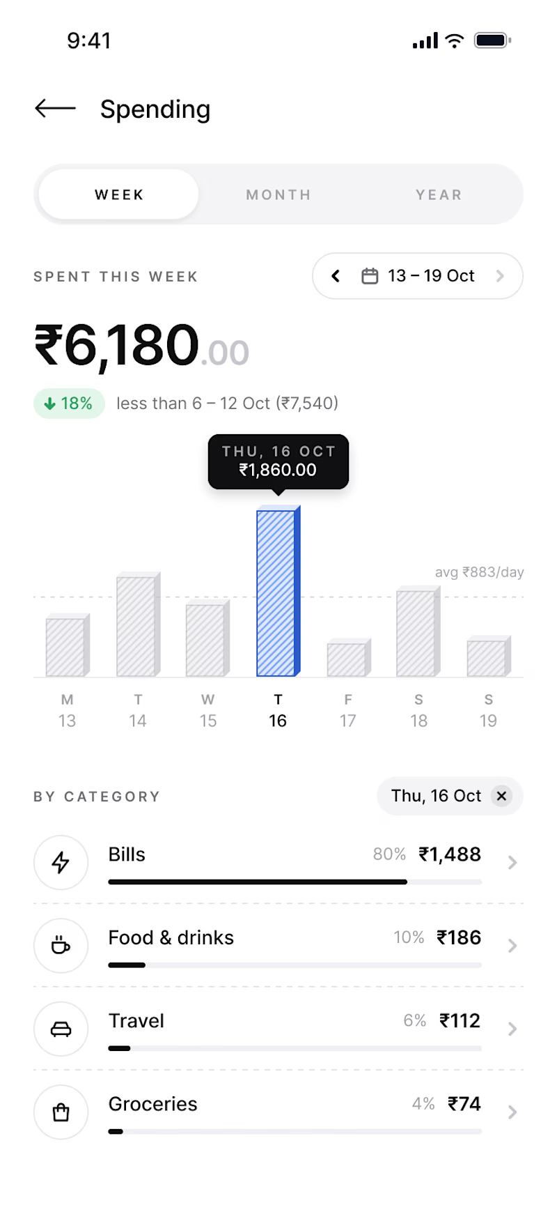
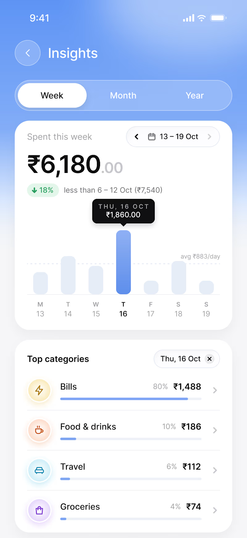

Great comparison! 👏 Variant A feels more focused and premium for a finance app — the minimal white background with clear hierarchy makes the ₹6,180 and categories stand out. Variant B is more vibrant with the blue gradient but slightly distracting for spending data. For trust &...

Thanks! This was mainly a visual exploration of the same Spending experience, testing a clean, focused direction against a more expressive fintech style while keeping the UX consistent.

My vote is B. The blue gradient gives the screen a personality that A's minimalism doesn't quite reach, and the Insights header feels fresh. A is cleaner, but B is the one I would actually remember.
Yeah, I can see that. B definitely has a bit more personality.

A. The white background lets the spending chart breathe, B's gradient pulls the eye away.
Yeah, that makes sense. A definitely keeps the spending data more focused.
The network for creativity
Join 1.25M professional creatives like you
Connect with clients, get discovered, and run your business 100% commission-free
Creatives on Contra have earned over $150M and we are just getting started











Related posts

A clean and modern food delivery app concept designed with a focus on simple navigation, clear layouts, and a smooth user experience.
Designed in Figma.
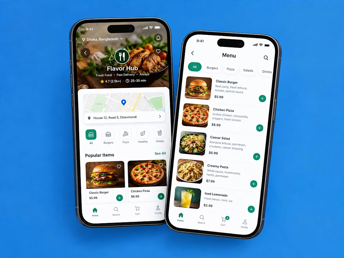

Love how clean and intuitive this feels, the navigation looks super smooth and the layout is really well balanced

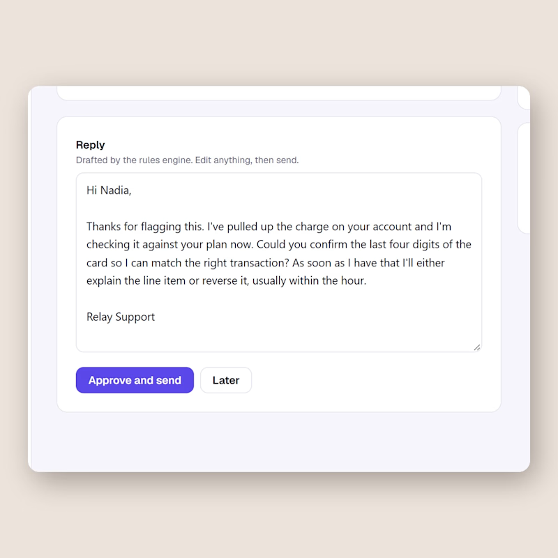
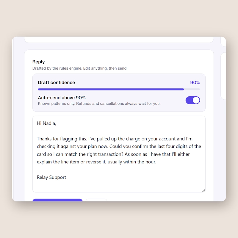
Same support inbox, one difference. Left keeps a human on every send. Right lets the AI send on its own once the draft confidence passes 90, refunds and cancellations excluded.
I built both in Relay this week and I still cannot decide.
Would you flip that switch for your own customers, and at what number?
0 voted
0%
2 voted
100%
2 votes
Closed

I'd flip it per topic, not per score. A 90 on a question the AI has answered hundreds of times is safe. A 90 on a question it has never seen is still a guess. Can Relay set a different threshold per topic?




Clean and confident work! The green gradient with the mark feels very modern for fintech - trustworthy but not boring. The app screens look really polished. Curious how you landed on this mark, does it represent growth / movement?