The network for creativity
Join 1.25M professional creatives like you
Connect with clients, get discovered, and run your business 100% commission-free
Creatives on Contra have earned over $150M and we are just getting started
Back to feedPost
Managing high-yield liquidity pools and executing crypto buys shouldn't feel like navigating a chaotic enterprise terminal. We designed Zyntra to bring institutional trading data into a crisp, light-mode Web3 workspace! 💎⚡
Slide through the 4 frames to inspect the UI up close:
🎛️ Add Liquidity Control Modal
💸 Transparent Buy Gateway
📊 Pro Order Book Engine
📈 Live Portfolio Performance
Which layout component catches your eye first; the interactive liquidity range slider or the transparent buy fee breakdown? Swipe across and drop your feedback below! 👇💬

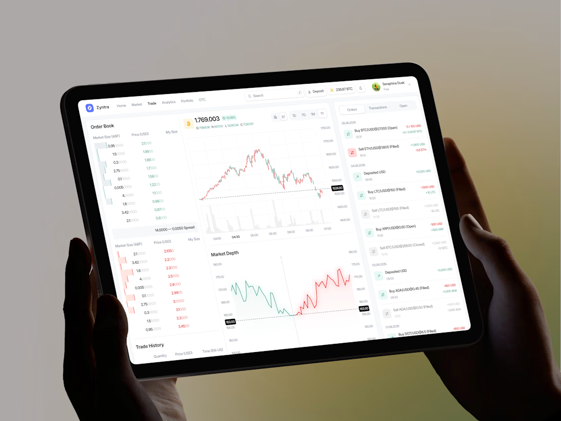
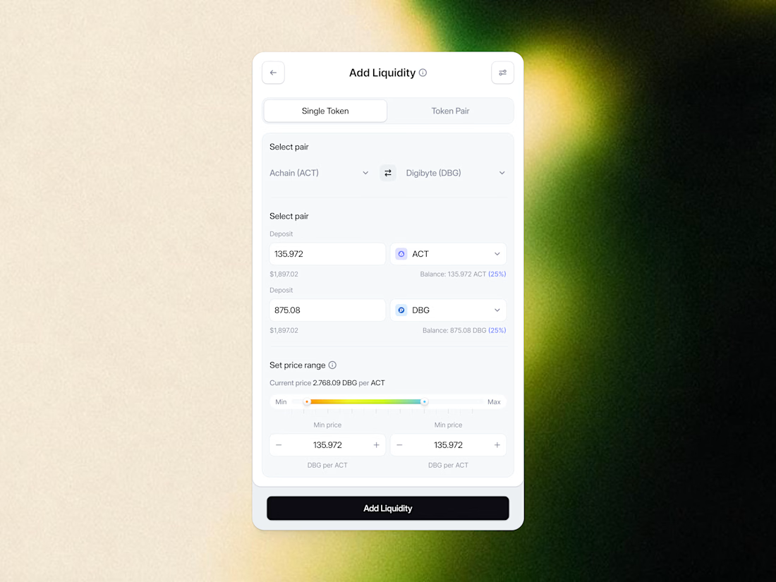
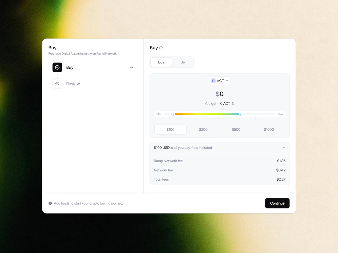
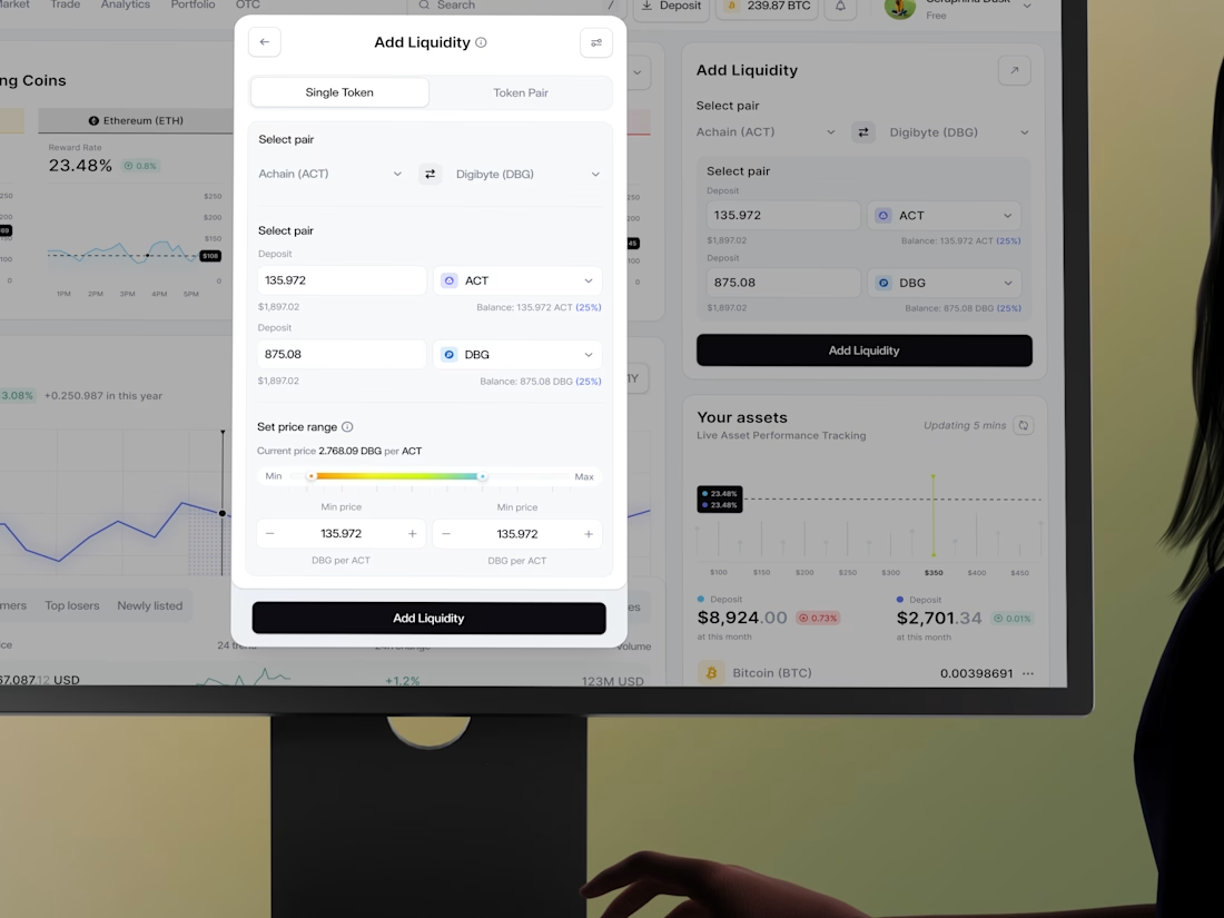

The Add Liquidity Control Modal and the Transparent Buy Gateway get separate named surfaces instead of one combined trade panel - each mirrors a distinct DeFi action with its own risk profile.

Exactly! Separating those two into their own modal makes the whole UX feel way cleaner without mixing up risk profiles. Glad you noticed that detail! 🙌
The network for creativity
Join 1.25M professional creatives like you
Connect with clients, get discovered, and run your business 100% commission-free
Creatives on Contra have earned over $150M and we are just getting started

Challenges
View all


Related posts

Finally dropping this case study.
✦ Really enjoyed shaping this experience.🚀


awesome😍


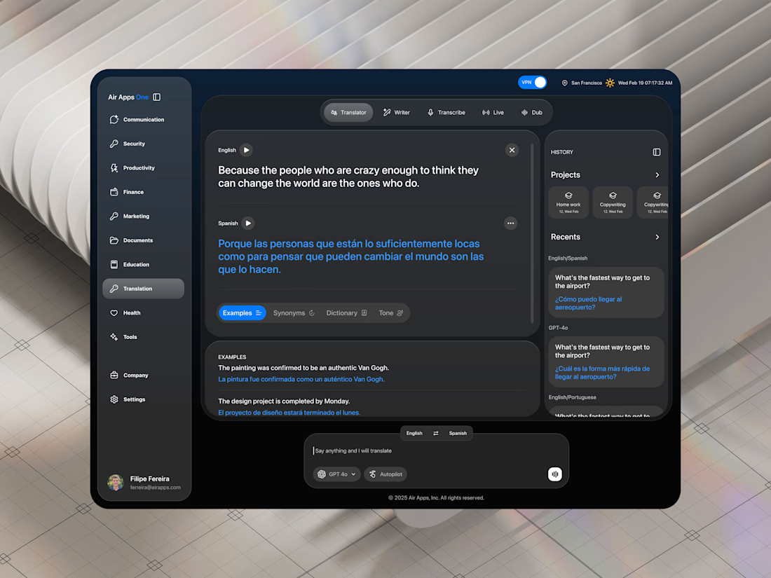

Adorable design! Fresh and vibrant!

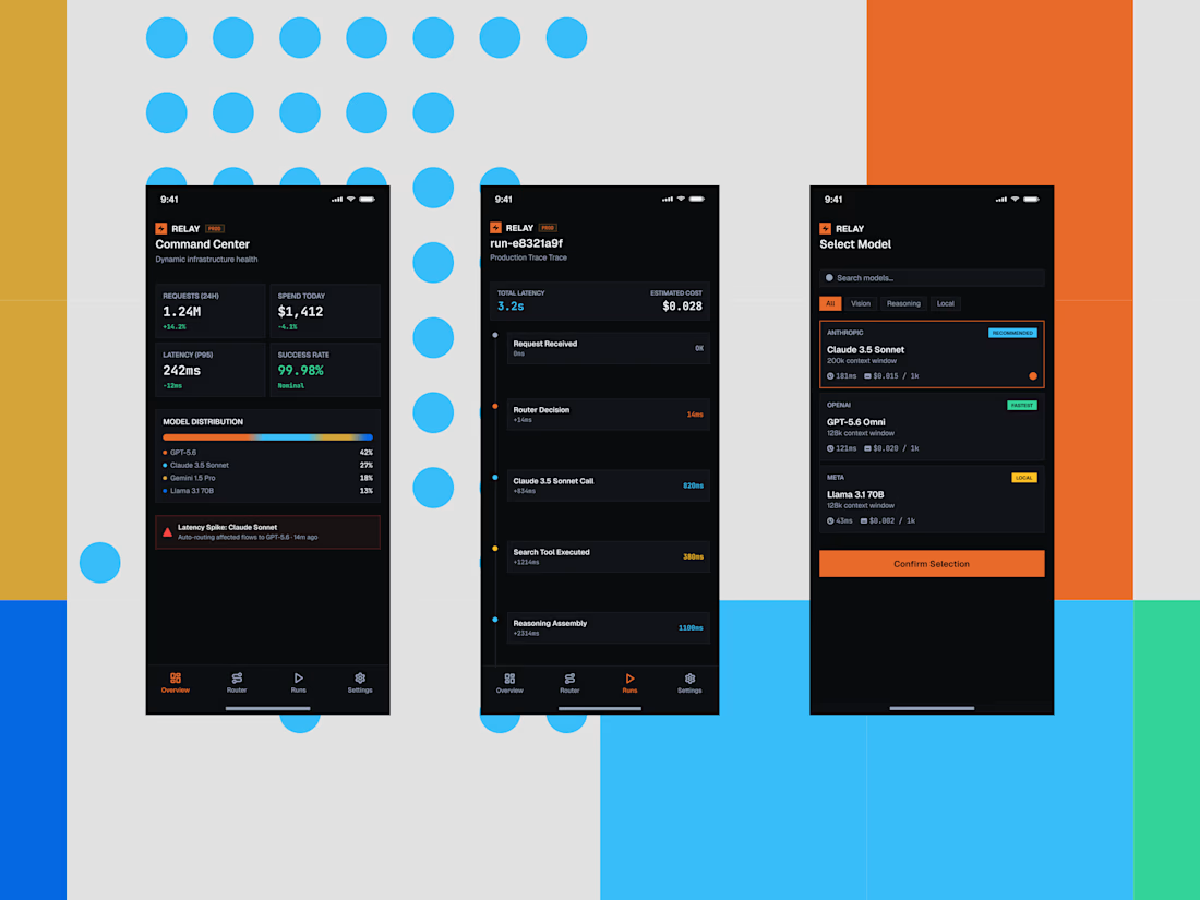
Some quick mockups for Relay, an AI infrastructure platform concept built around model routing, observability, and performance.
Exploring what a mobile command center could look like for teams managing multiple AI models, with a focus on clear data, fast decisions, and a developer-first UX.
Product design, mobile UI, AI tools, and a little systems thinking all in one.



the blue dots and orange blocks pop. did you build this in Framer?


