The network for creativity
Join 1.25M professional creatives like you
Connect with clients, get discovered, and run your business 100% commission-free
Creatives on Contra have earned over $150M and we are just getting started
Back to feedPost

I just released a free Framer template, Take One, a portfolio for videographers and directors of photography! 🎬
Six films sit on a wheel, and each clip is framed like a camera monitor. I wanted it to feel like you're on set.
Features:
• Film wheel you step through by scroll, arrow keys or touch swipe
• Camera-monitor overlay: REC light, timecode, Lisbon clock, frame lines and camera chips
• Accent colour per film, and the outgoing title turns into an outline ghost
• Reticle cursor that opens into a Play button, with a full-screen player
• Grid view: 4 columns on desktop, 3 on tablet and 1 on phone, with clips that play on hover
• Ruler playlist with fill bars and Auto Advance
• Drag the timecode to scrub through a film
• Smooth scroll and a fade between pages
• Films are edited in one list on the wheel component
• Desktop, tablet and phone layouts, SEO score of 100 🎥
https://www.framer.com/marketplace/templates/take-one-videography/


Thank you, Shruti!
The network for creativity
Join 1.25M professional creatives like you
Connect with clients, get discovered, and run your business 100% commission-free
Creatives on Contra have earned over $150M and we are just getting started
Related posts

The contact page is usually the last page anyone designs.
We made it one of the best
Recent client work: a contact section UI design for a company with offices across cities. Globe in the back, every location up front, and small interactions that make the whole web design feel alive.

Impressive work

🚀 The Keel website is now live!
I designed Keel as a fintech website concept focused on presenting financial products through a clean layout, clear messaging, and a simple user experience.
I’ve also built the website in Framer. Check it out below!
🎨 Built with Framer: https://thekeel.site/
Always happy to hear your feedback!

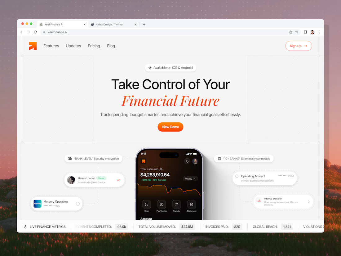

Congrats on the launch Nilkanth! Keel looks super clean — love how you kept the fintech messaging simple and focused. The "Take Control of Your Financial Future" hero with the app preview balances trust and clarity perfectly. Great job building it in Framer too!

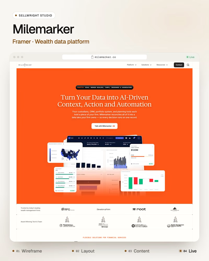
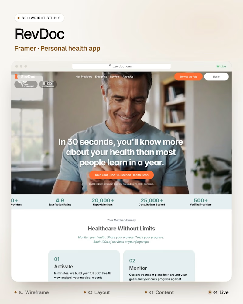
Bold or calm: which Framer homepage would you remember?
Milemarker (Framer), a platform that connects every system a wealth management firm runs, in bold orange.
RevDoc (Framer), a personal health app, calm and photo-led.
Both are built in Framer, and both have to explain a complex product in one line.
Which one sticks with you after you close the tab?
Live: milemarker.co · revdoc.com
More builds: instagram.com/sellwrightstudio · youtube.com/@sellwrightstudio
0 voted
0%
3 voted
100%
3 votes
Closed
Both directions work so well for their industries! The bold orange for Milemarker makes sense for a wealth management system connector - it needs to feel energetic and confident. But this calm, photo-led approach for RevDoc is brilliant for healthcare - instantly builds trust...