The network for creativity
Join 1.25M professional creatives like you
Connect with clients, get discovered, and run your business 100% commission-free
Creatives on Contra have earned over $150M and we are just getting started
Back to feedPost
Taste Test

Bold or calm: which Framer homepage would you remember?
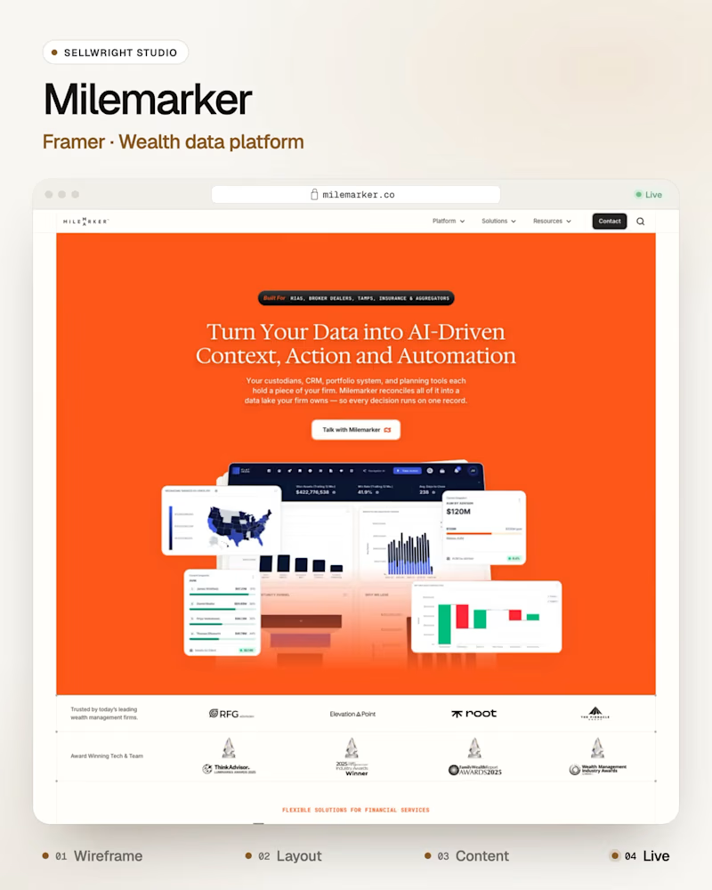
Milemarker (Framer), a platform that connects every system a wealth management firm runs, in bold orange.
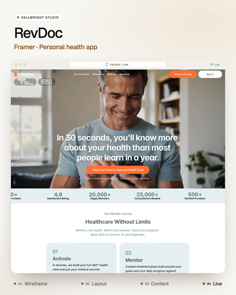
RevDoc (Framer), a personal health app, calm and photo-led.
Both are built in Framer, and both have to explain a complex product in one line.
Which one sticks with you after you close the tab?
Live: milemarker.co · revdoc.com
More builds: instagram.com/sellwrightstudio · youtube.com/@sellwrightstudio

0 votes
Ends in 1d

Both directions work so well for their industries! The bold orange for Milemarker makes sense for a wealth management system connector - it needs to feel energetic and confident. But this calm, photo-led approach for RevDoc is brilliant for healthcare - instantly builds trust...
Thanks, Sagar! That RevDoc line does a lot of the work: it makes a promise you can test in 30 seconds, so the calm design never has to shout. If you had to vote, which one would you pick for your own portfolio?
Exactly! That promise you can test is what makes it stand out - builds trust instantly. Really smart copywriting there. Excited to see what's next for RevDoc! 🔥♥️ Raja bhai
The network for creativity
Join 1.25M professional creatives like you
Connect with clients, get discovered, and run your business 100% commission-free
Creatives on Contra have earned over $150M and we are just getting started





Related posts


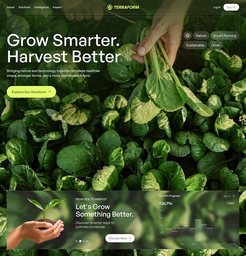
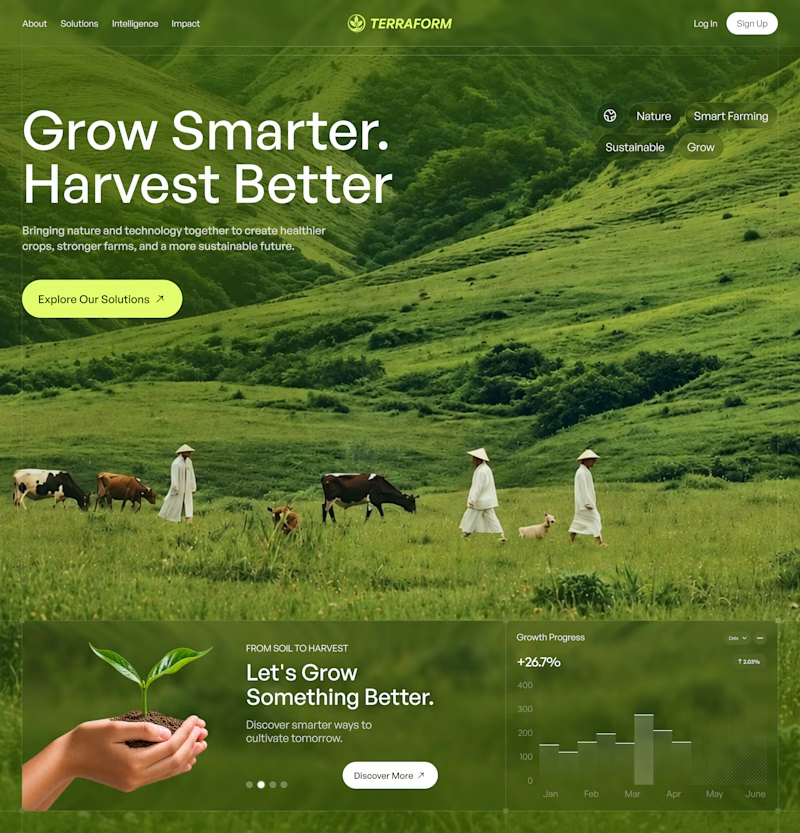

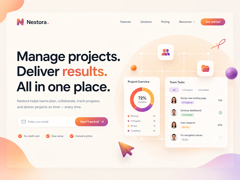
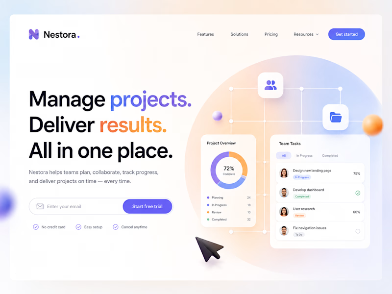
Both look great, but A feels more memorable at first glance.

Same layout, same message....but the color shift changes how the product feels.
One says get things moving, the other says stay in control.
Designed in Figma, built in Webflow.
Which one would you ship? 👇

2 voted
20%
8 voted
80%
10 votes
Closed

Great job

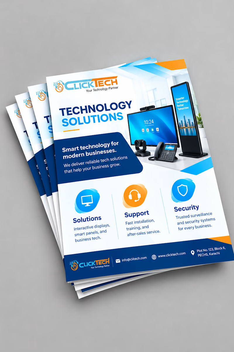
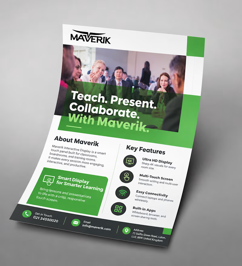
Same goal, different approach: a light, icon-based flyer vs a bold, photo-driven one.
Which would make you stop and read? Vote and tell me why!

2 voted
50%
2 voted
50%
4 votes
Closed
Malaika both are good but the first one (Maverik) would make me stop! Photo-driven creates instant trust and human connection, especially for education tech. Icon-based is cleaner but photo wins for engagement. Great work!