The network for creativity
Join 1.25M professional creatives like you
Connect with clients, get discovered, and run your business 100% commission-free
Creatives on Contra have earned over $150M and we are just getting started
Back to feedPost
The Analytics page in motion.
Focuses on exploring the data side of the product. Cards at the top summarizing earnings, spending, savings and investments.
Users can compare earnings and spending across yearly, quarterly, or monthly views, making it easier to understand financial patterns over time. The Spend Breakdown is visualized with a pie chart, giving a quick snapshot of where money is going.
The latest transactions are put in a table below.
Hover states, popups, modals, all included, with functionality as well.
Tell me what you think.
The network for creativity
Join 1.25M professional creatives like you
Connect with clients, get discovered, and run your business 100% commission-free
Creatives on Contra have earned over $150M and we are just getting started
Related posts
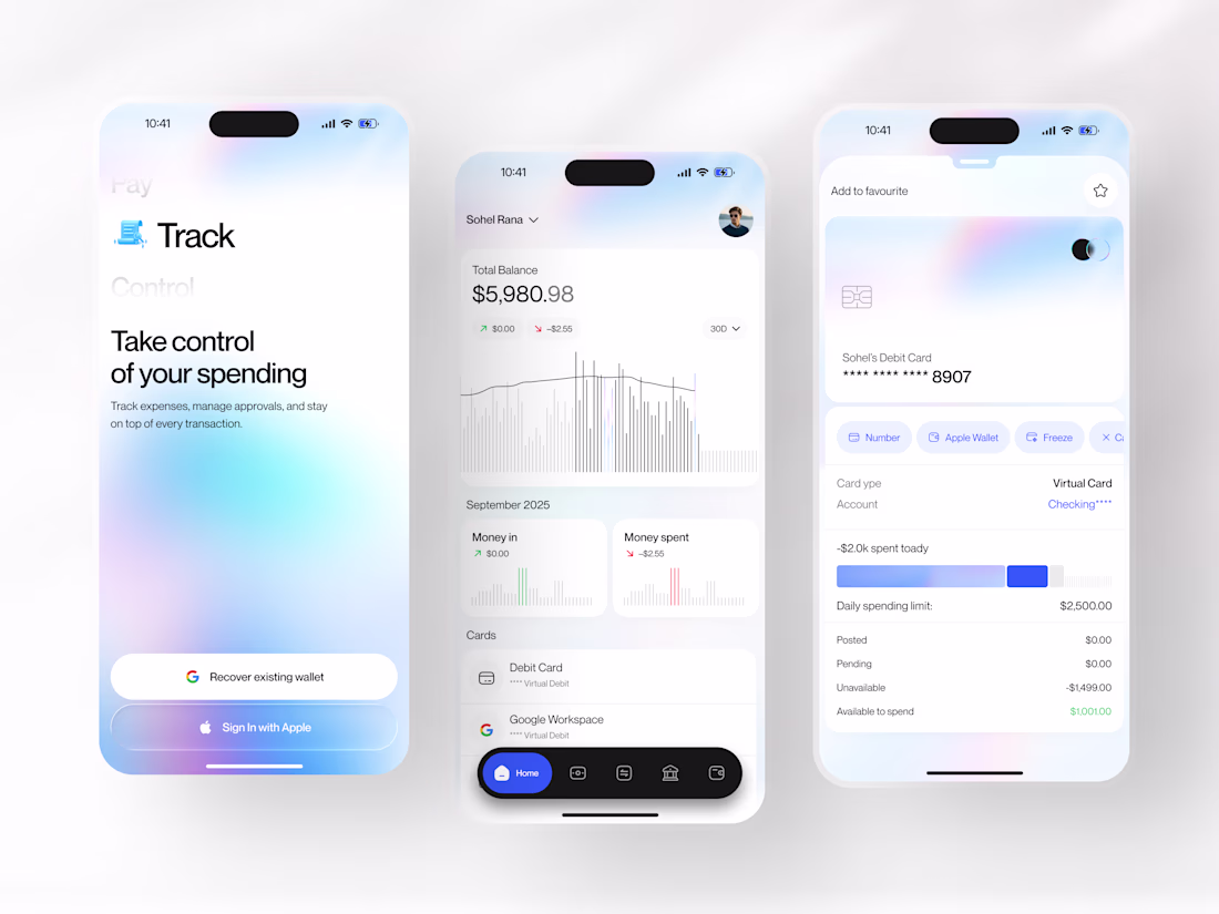
Track wasn't designed to add another finance app to your phone. It was designed to replace the clutter.
Managing spending, virtual cards, balances, and transactions shouldn't feel like jumping between multiple screens. This fintech mobile app brings everything into one clean experience where every interaction feels simple, fast, and intentional.
From onboarding to expense tracking, balance insights, and card controls, every screen is crafted to reduce friction while making financial management feel effortless.
A minimal interface, thoughtful data visualization, and intuitive card management built for people who want clarity instead of complexity.
Would you trust a banking app that feels this clean? 👇
Tools: Figma, Jitter
#Fintech #MobileAppDesign #UIUX #FintechUI #AppDesign #ProductDesign #FinanceApp #ContraFreelance #UIDesign #MobileUI
This is next level.
For this challenge, I'm excited to share this first glimpse at an AAC (Augmentative and Alternative Communication) app, named after my own non-speaking son whose name just happens to have the letters "aac" in his name! You'll meet him in the first half of the video.
The idea for a new AAC app that used animated characters to speak the words came to me during my first few weeks of learning Rive, and I'm so happy that this challenge has pushed me to make a considerable amount of progress and be able to show some of the features that set it apart, besides the fun interactive characters.
The ability to quickly add and remove words, quick phrases, easy to read icons, and intuitive categories, are all part of the app experience, and the characters (starting with just a couple ready-made characters, but eventually a custom avatar builder) bring an element of fun to the otherwise purely functional world of AAC.
When it's ready, I hope this app makes it easier and more fun for families, caregivers, and language-delayed people everywhere to communicate with each other.
Thank you for watching this video!
characterchallengeproductdesignmadewithriveIllustrationProduct DesignClaudeElevenLabsRiveRive Animation
You won already.
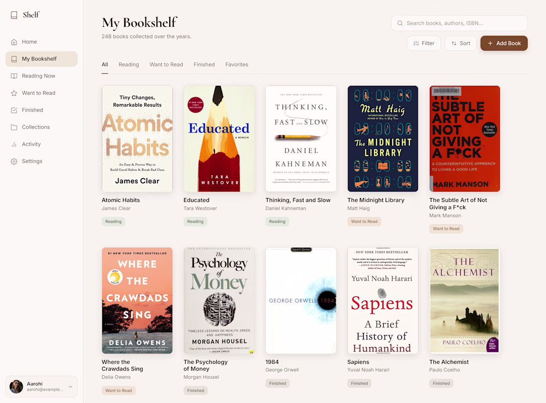
One thing I've wanted for years is a personal bookshelf app that makes it easy to digitize my physical book collection.
For the Contra × Wonder Challenge, I finally decided to design it.
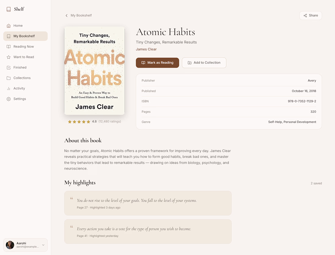
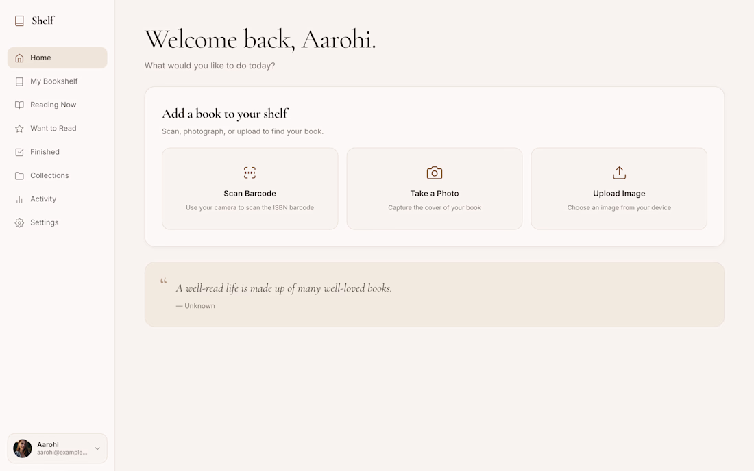
The idea is simple. Add books by scanning the barcode, taking a photo of the cover, or entering the ISBN manually. Once added, every book lives in a clean digital library where I can organize what I'm reading, what I've finished, and what I want to read next.
What surprised me most was Wonder itself. I expected it to speed up the process, but I didn't expect it to understand the direction I had in mind so accurately. It helped me iterate much faster while still giving me the precision to shape the experience the way I wanted.
This challenge gave me the perfect excuse to finally design a product that's been sitting in my head for a long time. Hopefully, it's also the first step toward turning it into a real app.
Public link: https://app.wonder.so/rudy-p-agnel/files/019f2f48-08b9-7ce4-b9d8-b01e1629a62d
This is a great design, I also need this app. Very beautiful.
Trending
Claude
Claude has entered the design space. How are you using Claude Design?
Contra University
Learn from expert creatives how to earn more using next-gen AI tools.
fifaworldcup2026
The World Cup is here and the whole world's watching. How are you designing for the world stage?
creativeaiflow
Creative AI workflows are evolving. What tools do you use, and what are their strengths and weaknesses?
freelancerlife
Freelancer life is wins, pivots, and everything in between. What’s yours right now?