The network for creativity
Join 1.25M professional creatives like you
Connect with clients, get discovered, and run your business 100% commission-free
Creatives on Contra have earned over $150M and we are just getting started
Back to feedPost
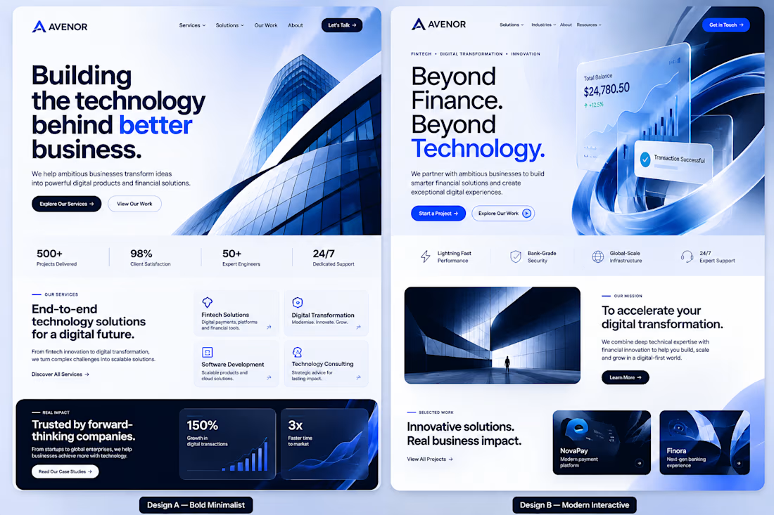
Two designs. One brand. Two completely different approaches
I've been exploring two visual directions for a digital agency and fintech technology company called AVENOR.
Design A — Bold MinimalistClean corporate aesthetics, strong typography, architectural visuals, and a structured layout focused on clarity and credibility.
Design B — Modern InteractiveA more immersive visual experience, dynamic fintech-inspired elements, striking blue gradients, and a stronger emphasis on innovation.Both have their strengths, but I'm curious about your perspective.
Which direction would you choose if you were building a technology brand today?
A or B?I'd love to hear not just your choice, but why you prefer it.
Let's settle this in the comments.



B for me, fintech lives on trust but those blue gradients make it feel alive instead of like a bank

Thank you... B definitely commands more trust than A
The network for creativity
Join 1.25M professional creatives like you
Connect with clients, get discovered, and run your business 100% commission-free
Creatives on Contra have earned over $150M and we are just getting started



Related posts

A beautiful Shopify store is great. But does it make people want to shop?
Take a look at my latest e-commerce design project for Amora Renae, a luxury hair extension brand.
I wanted the experience to feel as premium as the products themselves.
From the bold pink hero section and elegant product collections to the detailed product pages and responsive layouts, every design decision was made to bring the brand's identity to life while keeping the shopping journey intuitive.
But here's where I need your honest opinion:
If you were the customer visiting this store for the first time, what would catch your attention first?
The homepage and overall visual identity 🎨
The product presentation and collections 🛍️
The product page experience
The mobile shopping experience 📱
And for the designers here, what would you improve?
I genuinely want to hear different perspectives. Let's talk design, user experience, and what makes an online store memorable.
#Shopify #EcommerceDesign #WebDesign #UIDesign #UXDesign


Love the creativity behind this. The visual identity feels consistent and well thought out.

One skincare brand. Two different hero experiences.
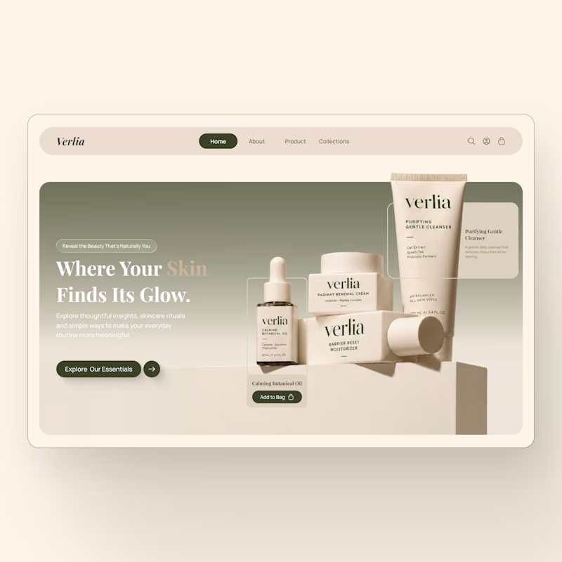
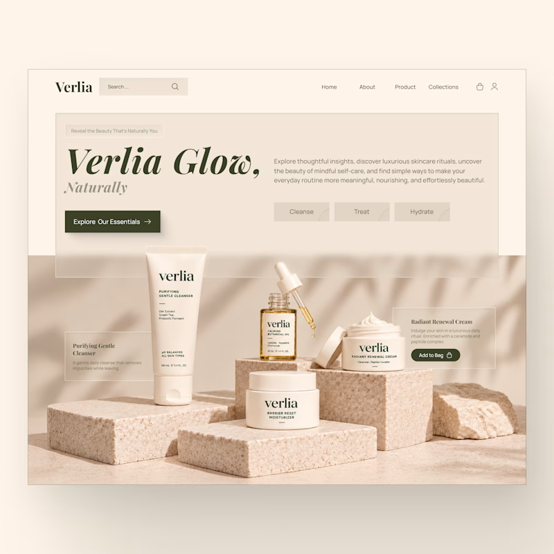
I designed two homepage hero concepts for **Verlia**, a premium skincare brand, exploring how visual storytelling can shape a brand's first impression.
Both concepts use a warm, neutral palette and minimal luxury aesthetic, but each has its own personality.
Option 1 — Minimal & Product-Focused. A clean, framed layout that puts the products and shopping experience in the spotlight.
Option 2 — Editorial & Immersive. A bold brand introduction paired with rich product photography and a more expressive visual composition.
Which hero design would you choose for a luxury skincare website?
Vote for Opt. 1 or Opt. 2, and share what made you choose it in the comments.


3 voted
43%
4 voted
57%
7 votes
Closed


Generative AI Development in Australia
Generative AI is changing how businesses create content, build products and solve problems, and our Generative AI Development in Australia service helps you put it to work the right way.
We build custom generative tools for content creation, product design, data synthesis and more, all tailored to your industry and your goals.
No generic plug ins, just AI built to fit how your business actually operates.
Ready to see what generative AI could unlock for you?
Learn more at: https://aiventechnologies.com/generative-ai-development-in-perth-australia/