The network for creativity
Join 1.25M professional creatives like you
Connect with clients, get discovered, and run your business 100% commission-free
Creatives on Contra have earned over $150M and we are just getting started
Back to feedPost
🚀 New Packaging Design Project
Grilled Chicken Breast – BBQ Flavor
Bold typography. Premium dark theme. Strong shelf impact.
This project was focused on creating a retail-ready packaging system that immediately grabs attention while clearly communicating product quality and flavor.
From concept development to realistic mockups — designed to sell.
Available for packaging projects.


Thank you Cito
The network for creativity
Join 1.25M professional creatives like you
Connect with clients, get discovered, and run your business 100% commission-free
Creatives on Contra have earned over $150M and we are just getting started






Related posts

I have a weird habit. Whenever I travel, I spend HOURS in pharmacies and supermarkets 🥫🧴
But I’m not shopping, I’m studying. Typography, paper finish, how much white space the brand dares to leave, how the label wraps around the bottles.
The best packaging lessons I’ve had weren’t from courses but from picking things up and turning them around in my hands.
What was the last product you bought only because of how it looked?
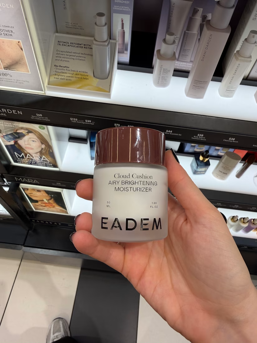
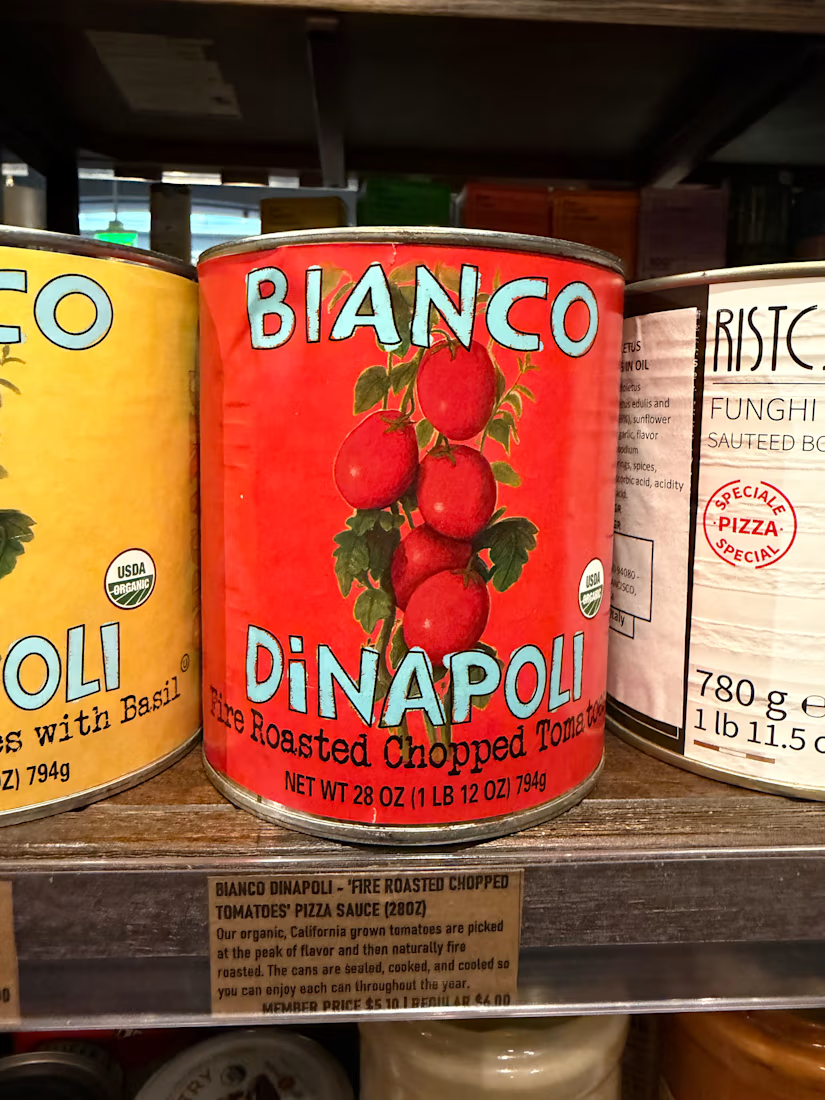
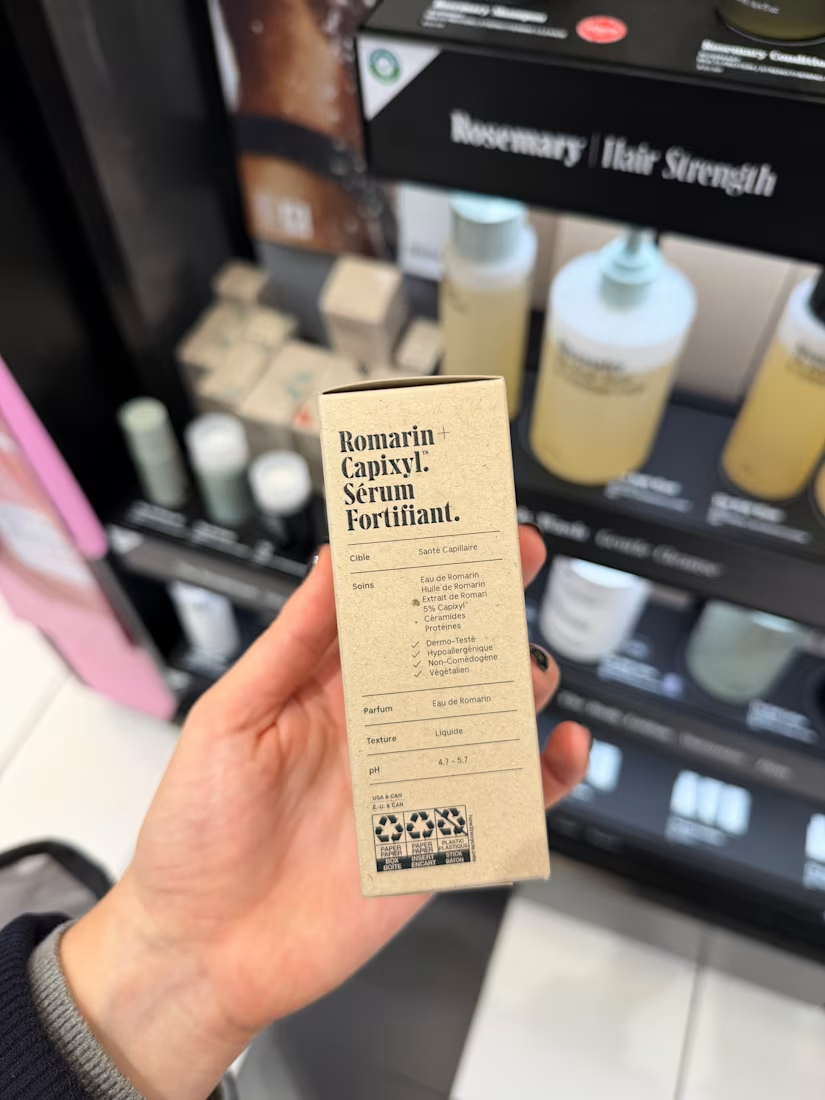
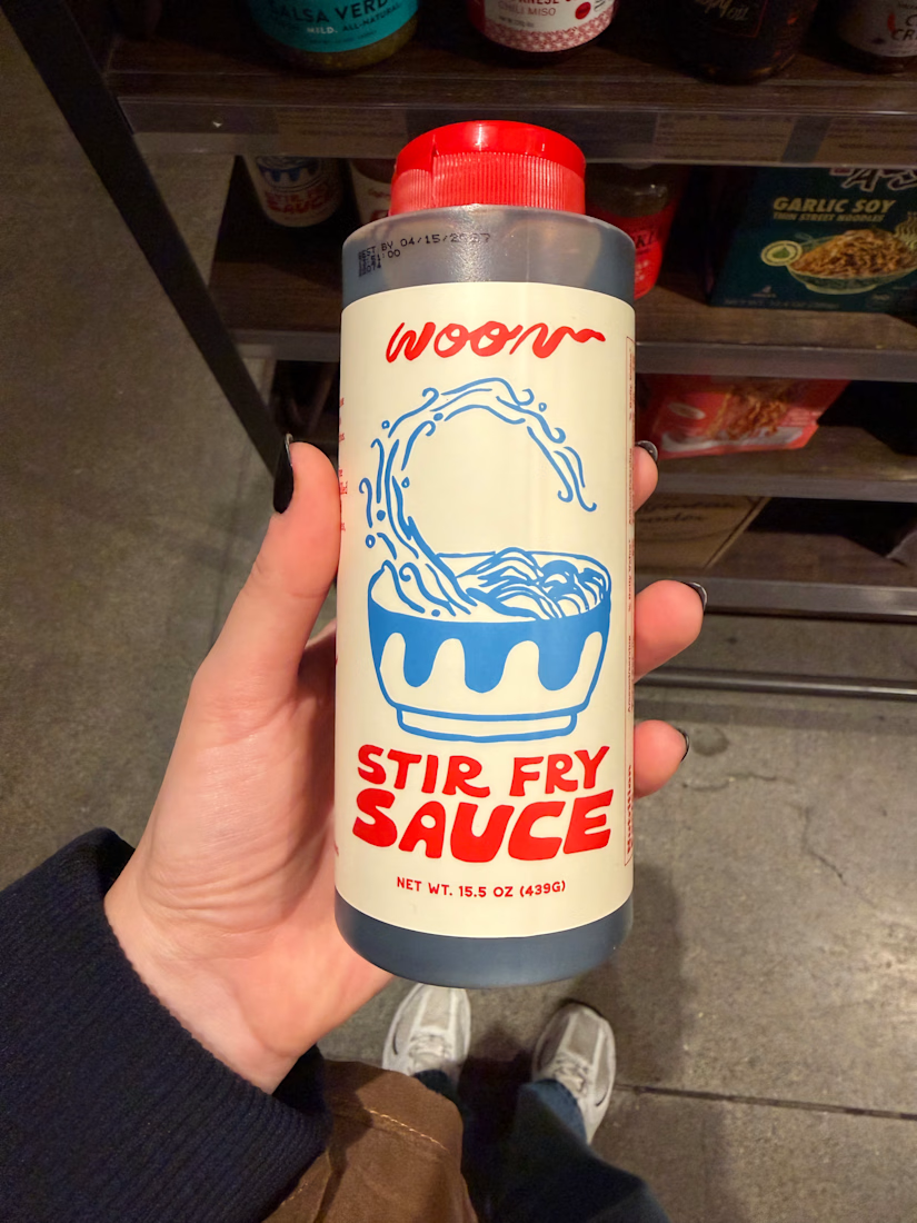

According to many creatives this is the best form of inspiration, I haven't really paid it the attention it needs or maybe not haha you tell me Anita how has this habit formed you taste?


Creating 2 concepts for a project, this is the first one.
I’m really enjoying the process!
Right now, we’re defining the strategy and visual direction, which will later serve as the foundation for developing the final brand identity.

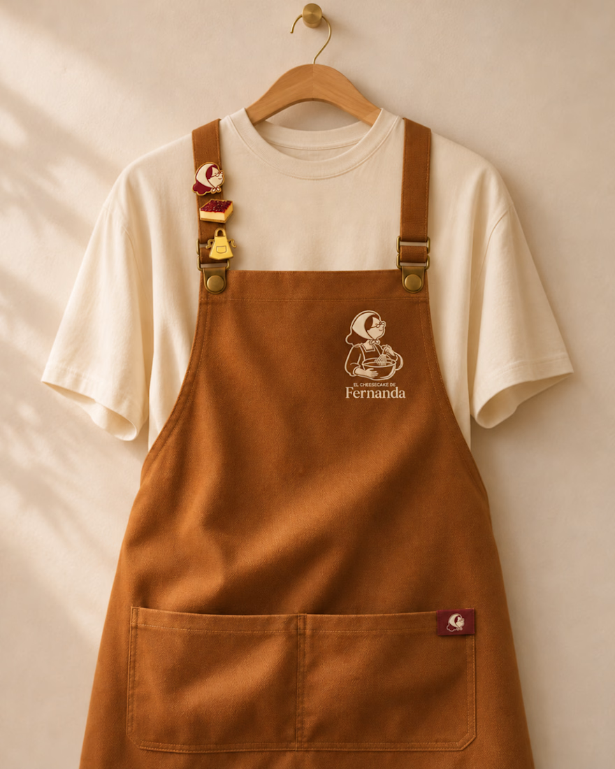
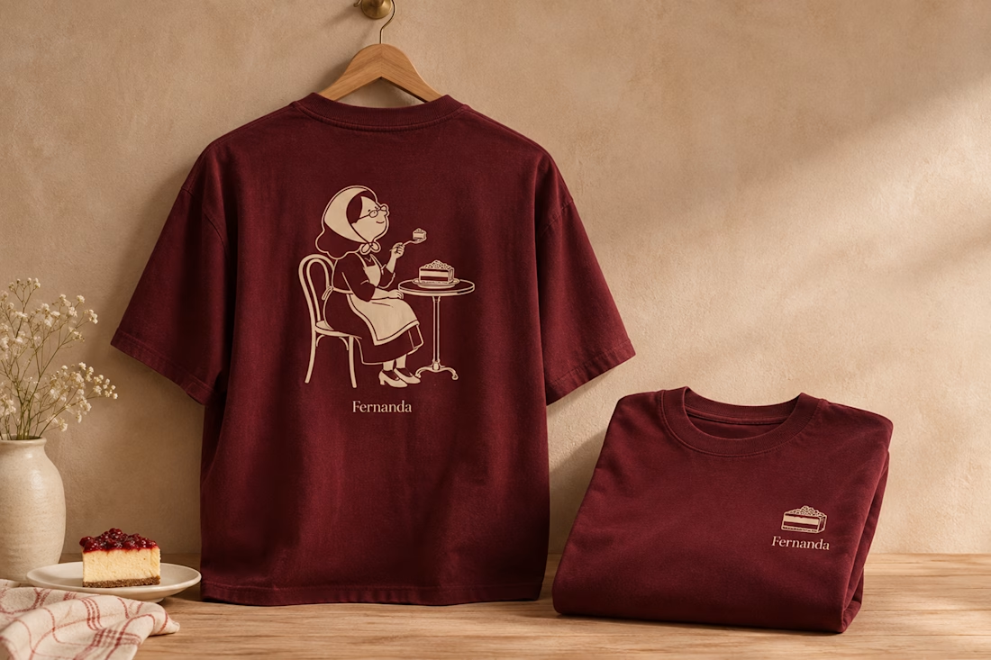

Nice logo design I like how logo is placed in clothes


The sharp V pops against that vivid gradient.