The network for creativity
Join 1.25M professional creatives like you
Connect with clients, get discovered, and run your business 100% commission-free
Creatives on Contra have earned over $150M and we are just getting started
Back to feedPost

A yacht is not a big car.
Anyone who’s owned one knows the feeling of watching someone walk aboard with a standard kit, a standard routine and a standard price.
The wrong compound on a gelcoat. The wrong product on teak that took decades to look this good. The wrong pressure on a surface nobody warned them about.
Some mistakes wash off. Others stay on a vessel for years, quietly lowering what it looks like and what it’s worth.
That’s the real fear for an owner or a captain. Not that the work won’t get done, but that it will be done by someone who doesn’t understand the material in front of them.
Azure Marine Atelier works the other way. Four specialised disciplines, each led by what the surface actually needs: hull polishing and restoration, teak care, interior detailing, and preventive maintenance.
“Not a package. A considered response to the vessel.”
So the website had to show that kind of knowledge, not just claim it.
We opened on the vessel at rest, with one line: “Preserving the Extraordinary.” We gave each discipline its own space and its own close-up, so you can see the work rather than read about it. We built “The Azure Standard” around a simple idea: surfaces cared for before they decline. And we kept the tone calm and precise, the way a good craftsperson speaks.
The payoff is a visitor who stops wondering whether these people know what they’re doing.
They see it in the details: the gloved hands, the grain of the teak, the depth in the hull. They arrive at the first conversation already trusting the answer.
That’s what a premium service site should do. It should make expertise visible before the first call.
If your clients are afraid of someone getting it wrong, show them you know exactly how to get it right.
#BuildingInPublic #WebDesign #UXDesign #CreativeDirection #BrandDesign


The network for creativity
Join 1.25M professional creatives like you
Connect with clients, get discovered, and run your business 100% commission-free
Creatives on Contra have earned over $150M and we are just getting started





Related posts


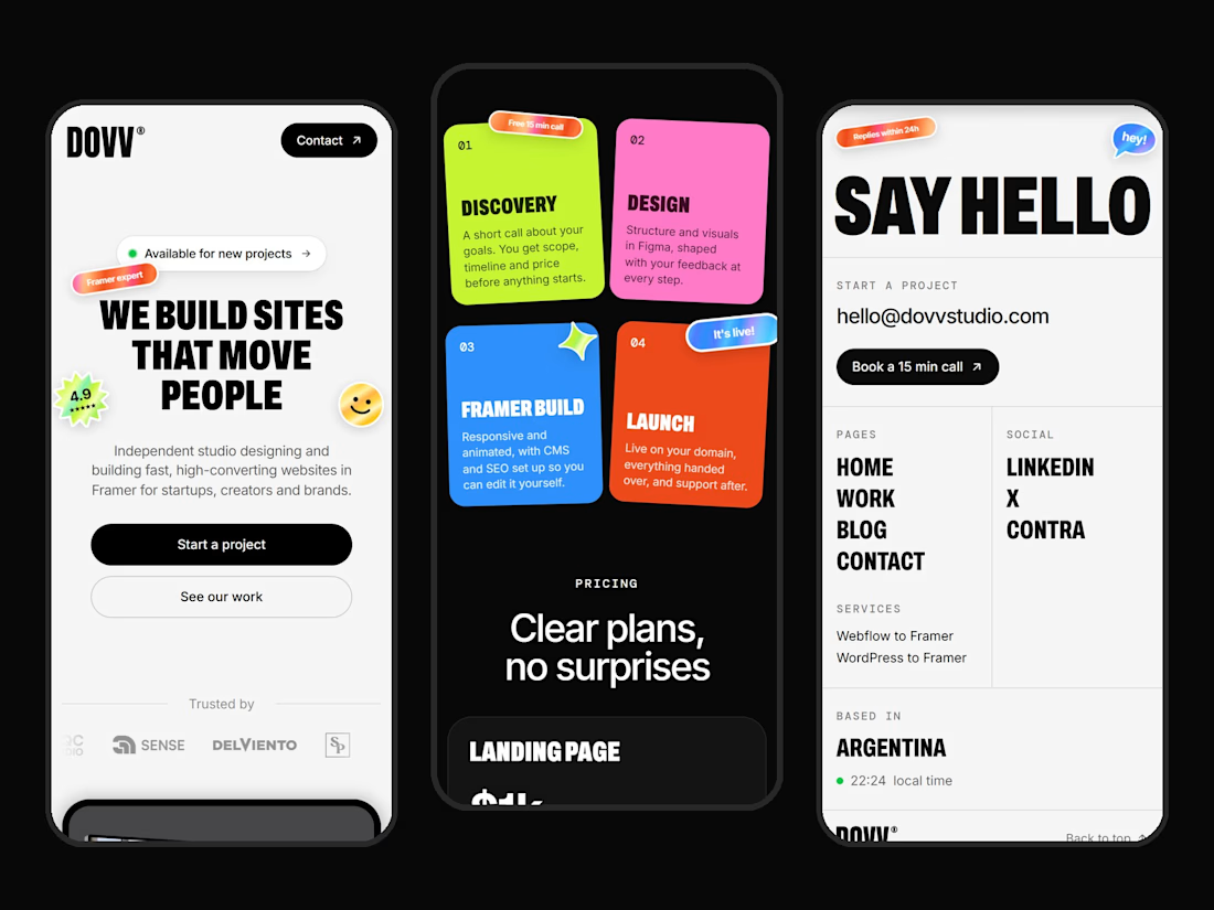

Clean mobile execution Dario! 📱 Love how bold DOVV's identity stays even on small screens. "WE BUILD SITES THAT MOVE PEOPLE" hits hard, and those sticky note cards in the middle for Discovery / Design / Framer Build / Launch are such a fun, scannable touch. That SAY HELLO page is super minimal and direct. Great Framer build!

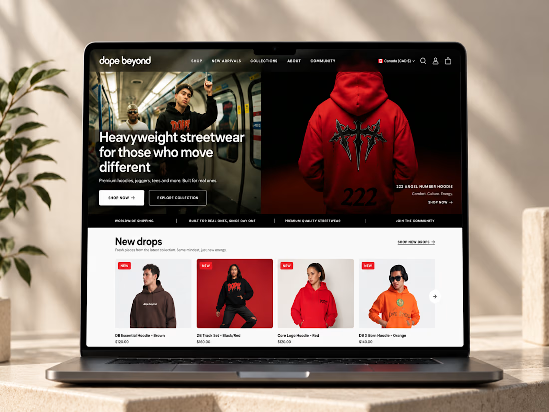
🔥 From streetwear to a standout Shopify experience.
I recently worked on DOPE BEYOND, building a bold e-commerce store for a streetwear brand using Shopify and the Palo Alto theme.
From mega menu navigation to size charts and color swatches, every detail was designed to make shopping easier while keeping the brand’s identity strong.
What do you think matters most in a fashion e-commerce store: design, user experience, or functionality? 👇

Ye le Jani Solomon wali post ke liye copy-ready:
Fire work Solomon! 🔥 DOPE BEYOND looks like a perfect fit for a bold streetwear brand — love how you took Shopify + Palo Alto theme and pushed it beyond the template with mega menu, size charts and color swatches. Those small UX...


Badge Placement: Consistency or Visual Balance?
Even a small indicator can change how the entire interface feels
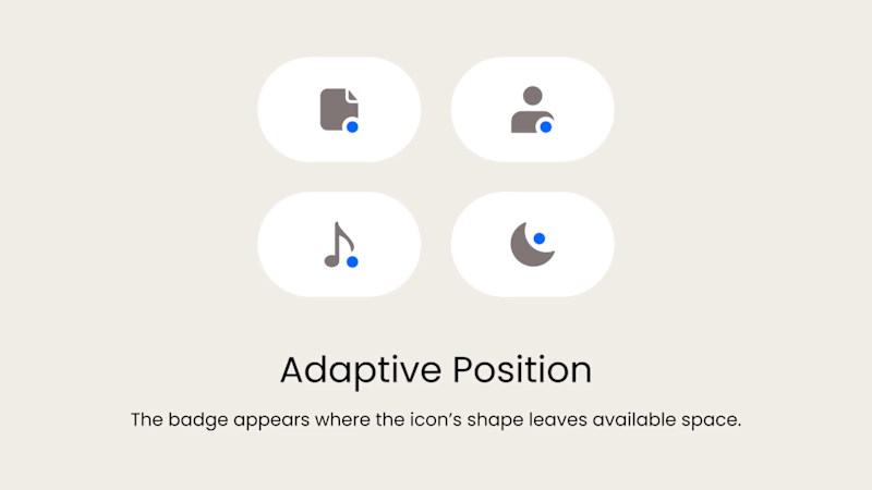
Adaptive Position
The badge placement changes depending on the icon’s shape and available space. The result feels more visually balanced but requires individual adjustments.
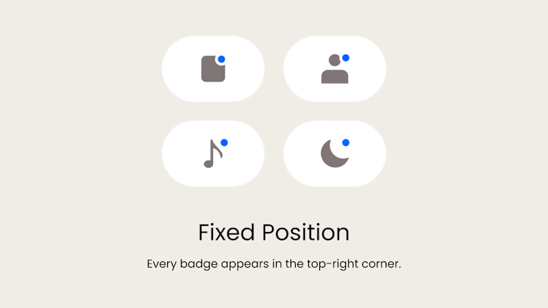
Fixed Position
The badge always appears in the top-right corner. This creates a consistent and predictable system, but on some icons it may feel disconnected or awkwardly placed.
What matters more in a design system: consistency or optical balance?
17 voted
43%
23 voted
57%
40 votes
Closed

Fixed for me. In a system, people learn where to look. I'd tweak the odd icons before breaking the rule.