The network for creativity
Join 1.25M professional creatives like you
Connect with clients, get discovered, and run your business 100% commission-free
Creatives on Contra have earned over $150M and we are just getting started
Back to feedPost

Absolut × Jolin Tsai — 3D Visuals for an Advertising Campaign
Se3d Studio created two distinct visual worlds for Absolut’s campaign featuring Jolin Tsai, combining 3D environments, lighting, and liquid effects to frame the artist and products.
For Absolut Vodka, neon blues, purples, and mirrored disco balls set a playful nightlife scene. For Absolut Extrakt, electric green lighting and sculptural liquid forms create a bold, immersive product world.


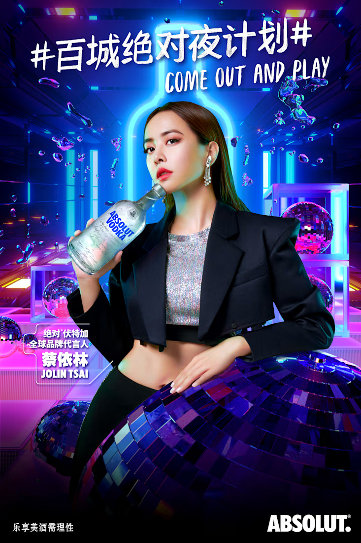
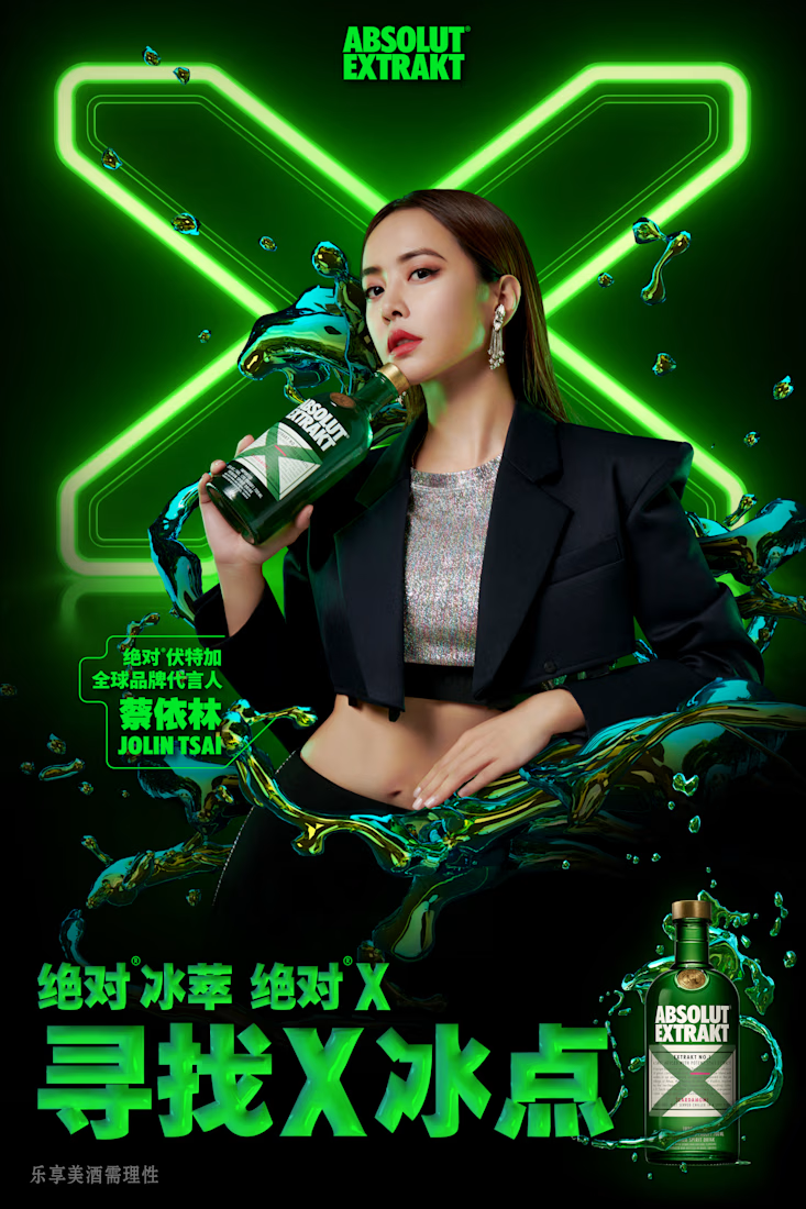

With Vodka and Extrakt each getting their own world, what did you hold constant between the two so they still read as one campaign? The pose and framing look shared, so I wonder if that was the anchor or if it was the lighting.
The network for creativity
Join 1.25M professional creatives like you
Connect with clients, get discovered, and run your business 100% commission-free
Creatives on Contra have earned over $150M and we are just getting started











Related posts

When Typography Breaks the Rules. 🖤
Bold 3D lettering, dramatic shadows, and twisted perspectives turn typography into an experience you can’t ignore.
Would you call this art or an obsession?
3dtypographymotiondesignexperimentaldesignGraphic DesignMotion DesignTypographyAdobe After EffectsAdobe IllustratorCinema 4D


That's really great Saleha it's unique I like it ❤️❤️❤️

Public animation for Binance.
What do you think guys?


Stunning work! Love both the design and the way you presented it. ❤️✨


Can't believe this brand is 3years now.
Check out the full project here: https://behance.net/gallery/182972929/SAGAH-Branding-project

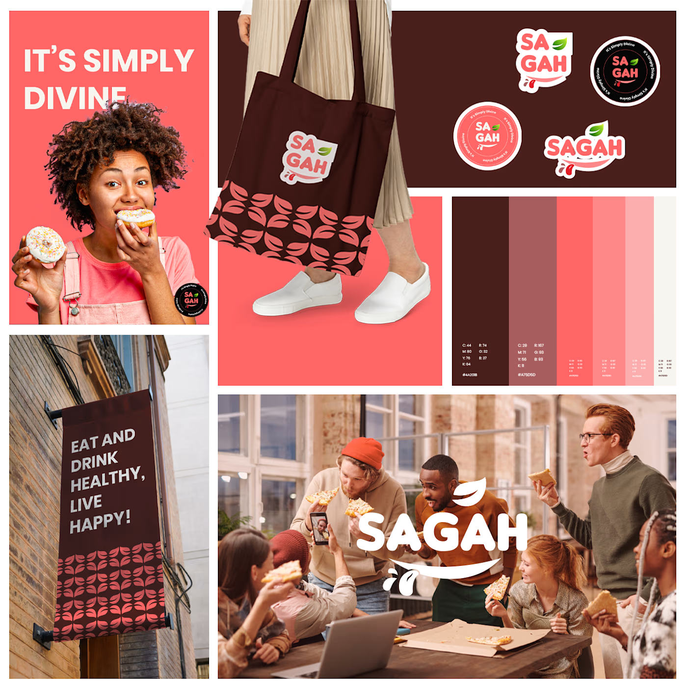
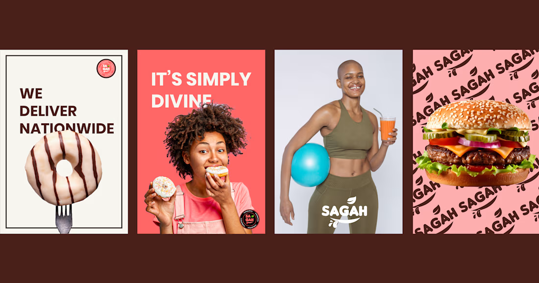
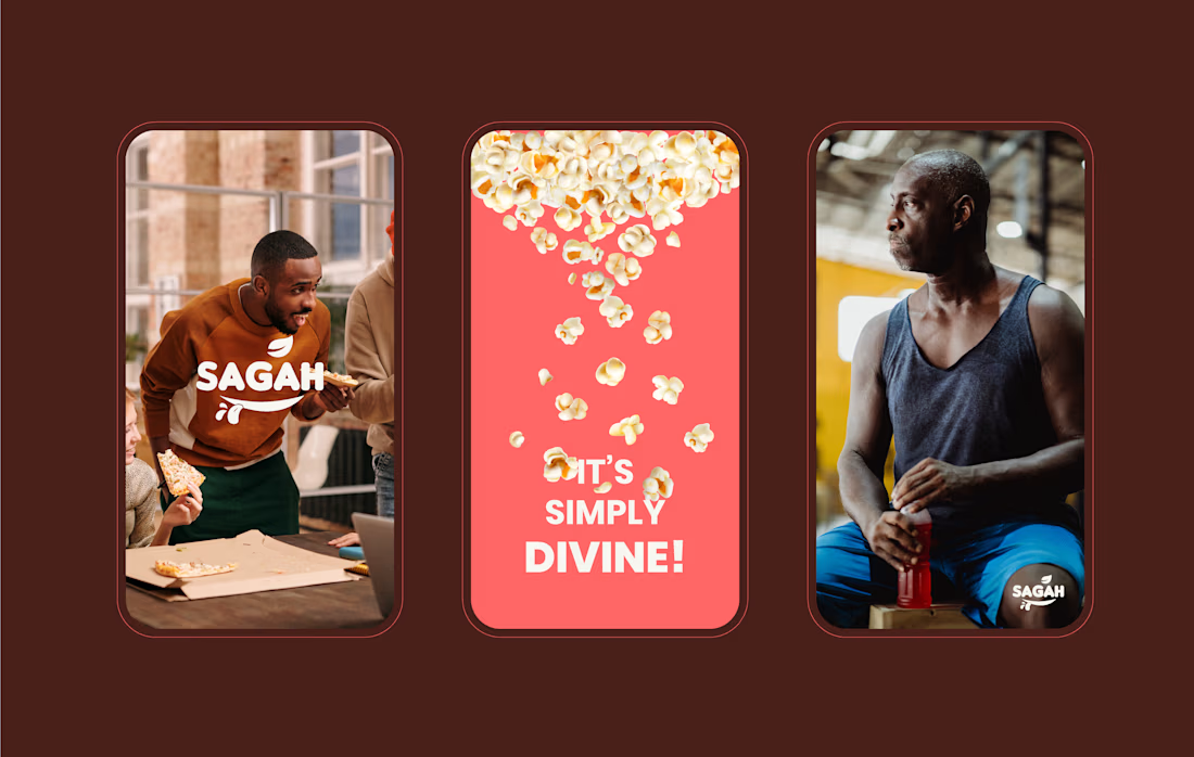
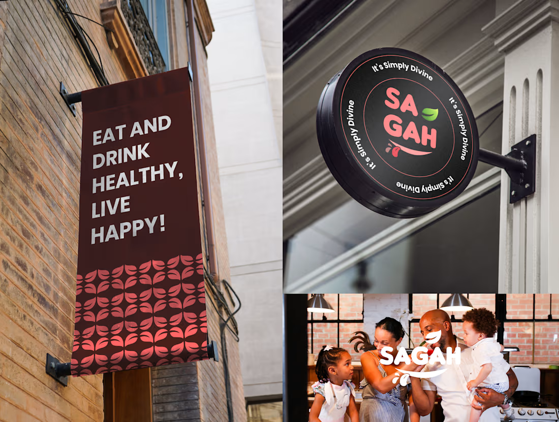

Really love this SAGAH branding! The color palette and the tote bag mockup look super clean and consistent. Great work on the overall identity 👏