The network for creativity
Join 1.25M professional creatives like you
Connect with clients, get discovered, and run your business 100% commission-free
Creatives on Contra have earned over $150M and we are just getting started
Back to feedPost
Bold before/after split-screen thumbnail for a room makeover video brush typography, expressive face, directional arrow, warm vs cool contrast.


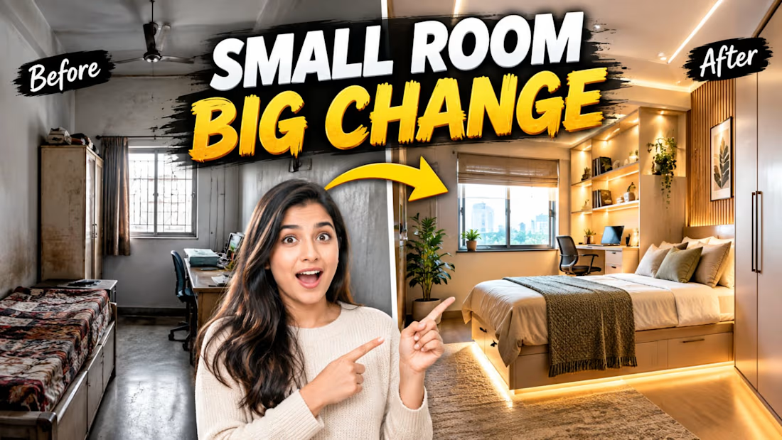

SMALL ROOM BIG CHANGE with the before and after split is a classic click-worthy thumbnail formula. The brush typography and yellow arrow carry the transformation story well. Strong YouTube design instincts.

Thank you I really appreciate the feedback. I wanted the before and after contrast, bold typography, and yellow arrow to communicate the transformation instantly and make the thumbnail visually engaging. Glad you liked the concept
The network for creativity
Join 1.25M professional creatives like you
Connect with clients, get discovered, and run your business 100% commission-free
Creatives on Contra have earned over $150M and we are just getting started








Related posts

From the cover to what’s inside 👀
Thank you to everyone who voted in my cover test. This time, I’m trying two short previews of DCS 654: my library of 654 dessert-inspired colors and matching textures, with ready-made palettes for your own design work.
Which video makes you more curious to explore the library: A or B?
And what made you choose that one?
You can take a closer look here: https://dcs.mariya.design/

36 voted
61%
23 voted
39%
59 votes
Closed


I’d pick B. It makes the colors and textures feel more engaging and makes me want to explore the full library.

Covers are my weakest muscle. I can build a whole visual world, and then freeze at one thumbnail 😅
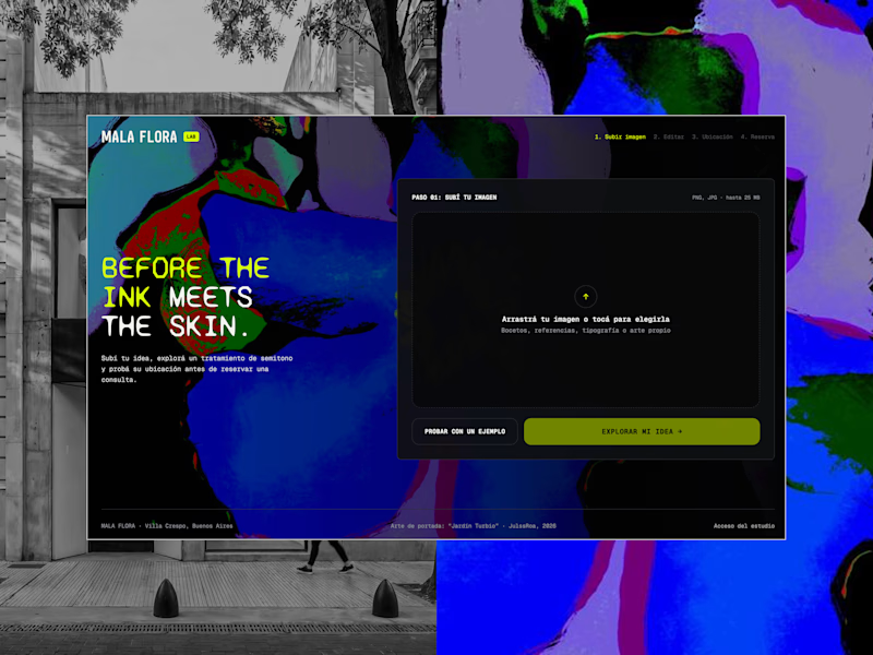
MALA FLORA: a tattoo studio + gallery built from my painting Jardín Turbio. A shows the site on the street, B shows the flow in motion.
Which one makes you want to click?
3 voted
20%
12 voted
80%
15 votes
Closed


B, the tattoo frames moving made me stop scrolling where A reads more like a site screenshot

New case study added!
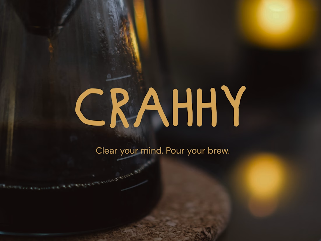
Crahhy is a speciality coffee brand rooted in the relatable human psychology of coffee cravings.
The objective was to design a brand that is minimal on the outside yet delightfully chaotic on the inside, blending specialty coffee aesthetics with honest, humorous storytelling.

minimal outside chaotic inside is the right brief for coffee