The network for creativity
Join 1.25M professional creatives like you
Connect with clients, get discovered, and run your business 100% commission-free
Creatives on Contra have earned over $150M and we are just getting started
Back to feedPost

BURGY — Bold Burger Restaurant Website Concept 🍔✨
BURGY is a vibrant restaurant website concept designed to make the food feel impossible to ignore.
The idea was to bring the energy of a modern burger brand into the digital experience — bold, playful, appetite-driven, and built around one clear action: getting users closer to their next order.
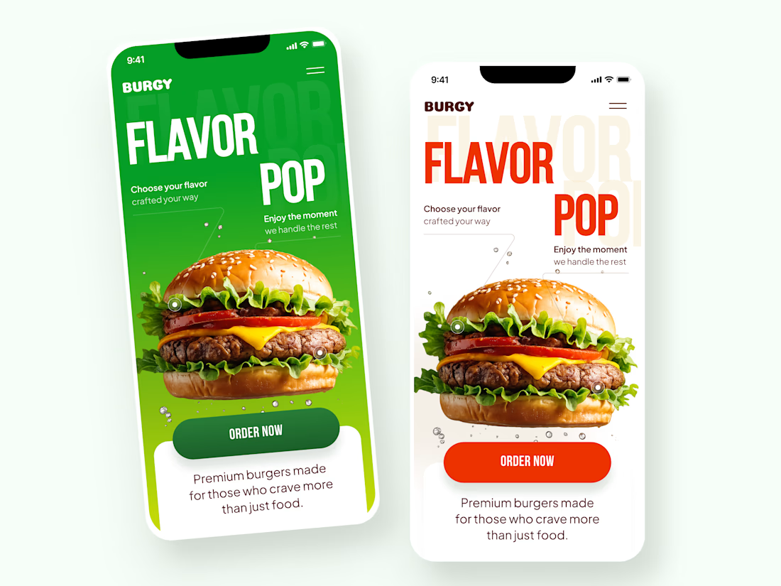
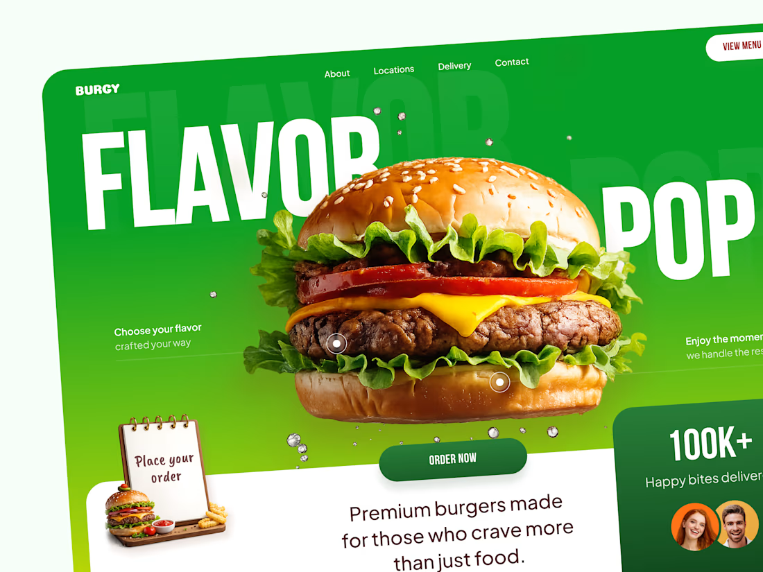
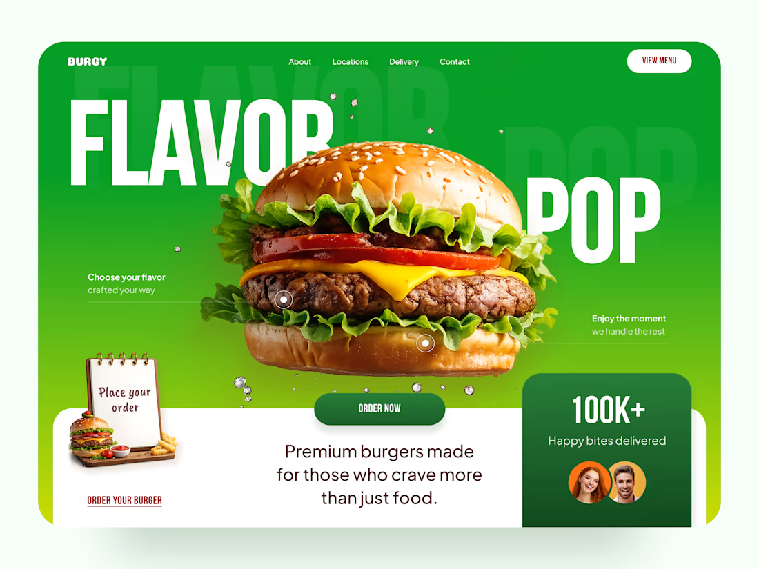
The visual direction combines oversized typography, vivid green tones, high-impact food photography, and playful graphic details to give the brand a strong personality from the very first screen.
Special attention was given to:
• a product-first hero section that puts the burger at the center of attention;
• oversized typography that adds personality without competing with the food imagery;
• strong “Order Now” and menu CTAs that stay easy to spot;
• social proof elements that build trust around the brand;
• responsive mobile layouts that preserve the same bold visual character;
• alternative color directions to explore how the identity can adapt across different brand applications.
The result is a restaurant experience that feels energetic, memorable, and built to turn appetite into action 🍔
Looking to create a bold digital experience for your restaurant, food delivery service, or F&B brand?
Let’s make something people crave before they even place an order 🌶️



Looks so fresh 🔥

That burger definitely grabs attention 😄

Love the colors here 💚

Love how bold the typography feels without taking attention away from the product.

Love this one! 🍔

Green is an unconventional choice for a burger brand — most food sites lean red/orange for appetite appeal — but keeping the "Order Now" button red against that green background means it's the one warm accent left, so it still pulls the eye first.

The green works so well with the food photography.

Wow... Dope work! Love the color, font and background...

The oversized type paired with one hero burger is exactly right for appetite. The thing I would test next is a sticky Order Now that rides the scroll, since on food sites the craving usually peaks mid page rather than at the very top.

The mobile version keeps the same energy really well 👏


A tasty looking site, love how playful the whole thing feels

Absolutely amazing!👌
The appetite-driven energy really lands here, the color and bold type do a lot of the work. If I were pushing it further I would add a subtle motion moment on the hero burger shot, since that is the one element that would make it genuinely impossible to scroll past.

Green, One of my favorite colors 💚

Love the vivrant colors!
The network for creativity
Join 1.25M professional creatives like you
Connect with clients, get discovered, and run your business 100% commission-free
Creatives on Contra have earned over $150M and we are just getting started

Challenges
View all


Related posts




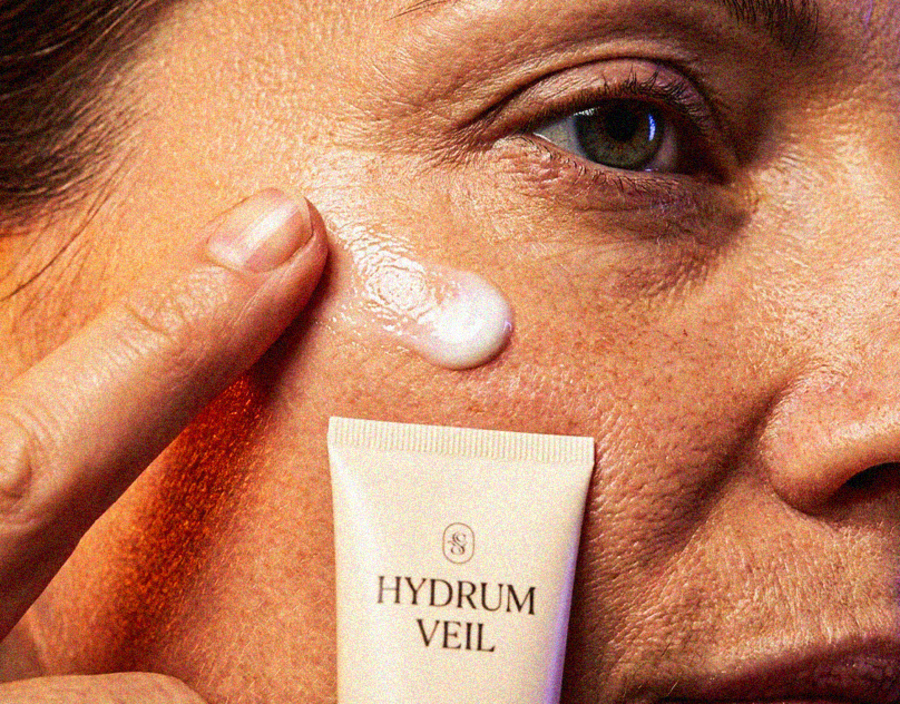
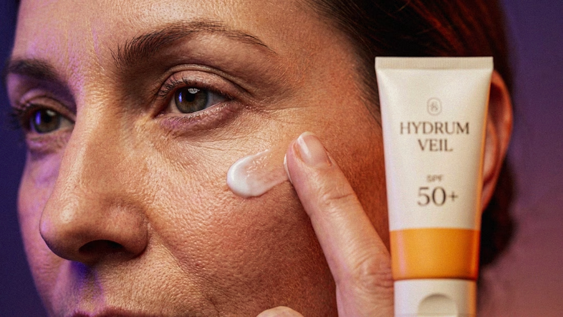
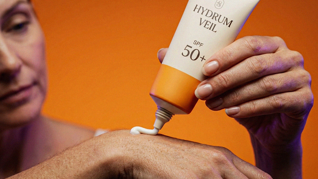
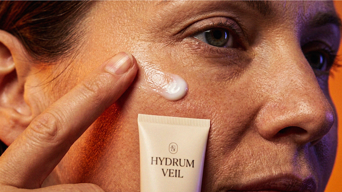
I Just Created HYDRUM VEIL 🔥
HYDRUM VEIL is a skincare brand built around a premium SPF 50+ sunscreen, developed as a complete brand identity, packaging design, and seasonal advertising campaign.
The project explores a question most seasonal beauty work gets wrong: how do you make a limited-edition campaign feel festive without making it feel cheap?
Instead of stacking decorative props, the campaign holds a strict visual system - vivid pumpkin orange, deep twilight violet, warm cream, and restrained black and lets a single product carry every frame.
Drop your replies in cmnts.....!!!!! 🙌
branddesignertastetestBrand DesignGraphic DesignPackaging DesignAdobe IllustratorAdobe PhotoshopClaude