The network for creativity
Join 1.25M professional creatives like you
Connect with clients, get discovered, and run your business 100% commission-free
Creatives on Contra have earned over $150M and we are just getting started
Back to feedPost
Just wrapped up an AI agency website on Framer for a recent client project.
The goal was to create something clean, modern, and conversion-focusedwhile still keeping that “tech/AI” feel without making it overly complex.
I focused on:
• Clear structure and flow
• Strong visual hierarchy
• Responsive design across devices
• Subtle interactions to keep it engaging
I’d really appreciate some honest feedback from the community especially on:
– Overall design and layout
– User experience and flow
– Anything that could improve conversions
Always looking to refine and improve my work.
https://medcalla.com/
Thanks in advance 🙏
Framer Website DesignfreelancerlifeportfolioreviewcreativeaiflowFramer Plugin DeveloperFramer Website DevelopmentFigmaFramerFrameship


Thanks Nagaraj😍

The site is clean and efficient. My one and only feedback is the continuity between the hero and the navbar confuses users initially, making them wonder if they loaded the page pre-scrolled.
You deserved that review, its great work!

Great feedback for a job well done
Thanks so much💯 😍
You are welcome

Thanks for the feedback i really appreciate
The network for creativity
Join 1.25M professional creatives like you
Connect with clients, get discovered, and run your business 100% commission-free
Creatives on Contra have earned over $150M and we are just getting started








Related posts

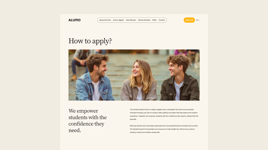
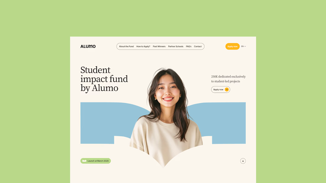
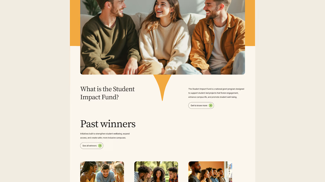
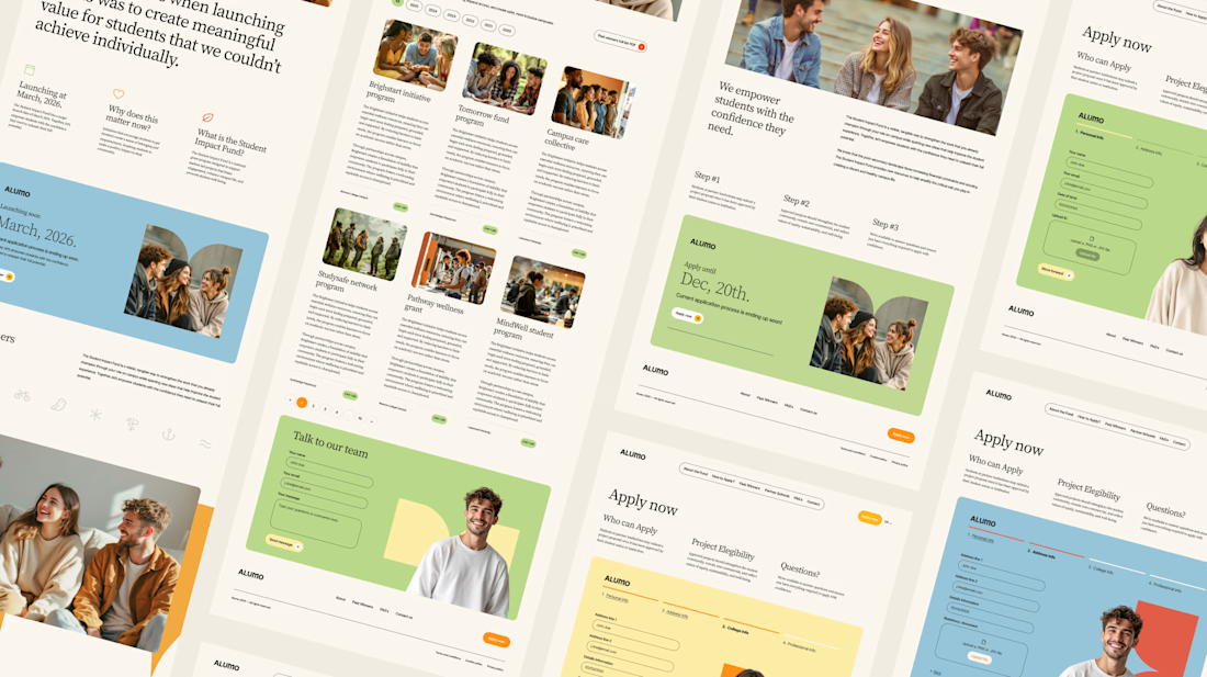
The Client: Alumo is a student impact fund that pools collective influence from influencers and partner schools to deliver a $250,000 annual grant program for student-led projects across Canada.
The Issue: The fund needed a website that could communicate trust and purpose to two very different audiences — students applying for grants and partner schools or influencers considering joining — while also showcasing past winners and guiding applicants through the process clearly.
The Solution: A multi-page website was designed with a warm, approachable visual identity using earthy tones, generous imagery, and clear information hierarchy. Each section — About, Past Winners, and How to Apply — was structured to reduce friction and build confidence, making it easy for students to understand eligibility and take action before the deadline.

Love how you're tackling trust + purpose for a $250K fund - that's a tough balance with two audiences. Communicating credibility for a student-led initiative across Canada is huge. Would love to see how you solved it!

I Built "My Perfect Interior" an Interior Design company website.
This website combines a premium, editorial design experience with AI-powered room visualization. Visitors upload a photo of their empty room, describe their vision, and receive a generated design concept. Each submission is automatically saved to a studio dashboard with the client's email, original photo, generated concept, and design brief.
This addresses a key challenge in interior design: translating a client's imagination into something a designer can understand and act on. By automating early-stage visualization and enquiry collection, the platform helps interior design businesses understand client needs faster, reduce repetitive consultations, and turn ideas into actionable project leads—all within a beautifully designed, responsive experience.


Solving the imagination translation problem is the smart move here, Charles. Letting visitors upload a room photo and get back a generated design concept turns the early consultation into something genuinely productive, and saving every brief to the studio dashboard makes the whole flow work like a real business.

Juice & Beverage Shopping App UI/UX Design
A fresh and modern juice and beverage shopping app designed to deliver a smooth and engaging shopping experience. Featuring vibrant product visuals, intuitive navigation, interactive animations, and a clickable prototype, this design makes it easy for users to explore beverages and enjoy a seamless ordering journey.
The project combines clean UI, thoughtful UX, and engaging micro-interactions to create a visually appealing and user-friendly mobile shopping experience.

