The network for creativity
Join 1.25M professional creatives like you
Connect with clients, get discovered, and run your business 100% commission-free
Creatives on Contra have earned over $150M and we are just getting started
Back to feedPost

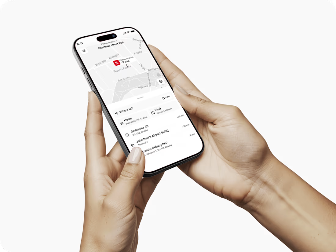
Fresh mobile app case study is up.
Started as a JTBD workshop exercise and turned into a full taxi booking flow redesign — with 12 screens, clearer ETA visibility, faster address input, smarter tariff selection, and better pickup details. Check it out

The network for creativity
Join 1.25M professional creatives like you
Connect with clients, get discovered, and run your business 100% commission-free
Creatives on Contra have earned over $150M and we are just getting started












Related posts

15 seconds of smooth UI, editorial layouts, and micro-interactions.
Kept the micro-interactions snappy, typography expressive, and transitions buttery smooth.
Rate this UI animation from 1 to 10 in the comments, or tell me what you’d improve! 😉


Solid 10/10 bro! 🔥 Micro-interactions are super snappy and transitions are buttery smooth indeed. Editorial layout game is strong. Keep it up!

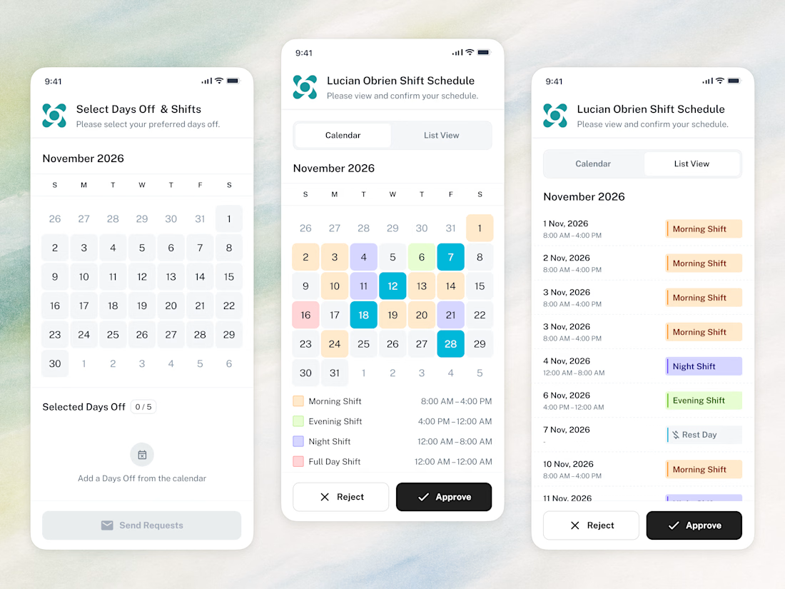
📱 The whole employee experience, right on the phone. Scheduling that goes wherever the team goes.



Amazing work

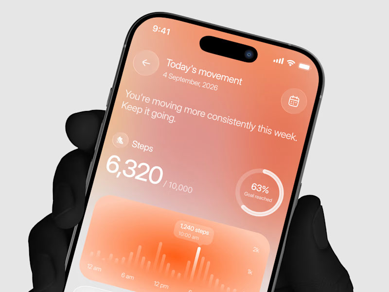
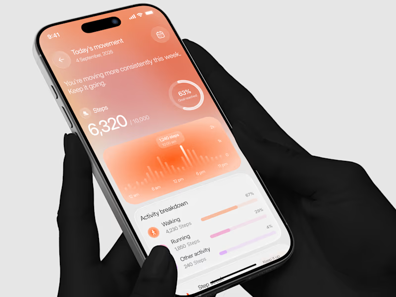
Designed a step tracking screen where you can see your daily progress and weekly trend in one glance.
Same screen, two shots. Which one would stop your scroll? 👀
11 voted
73%
4 voted
27%
15 votes
Closed
