The network for creativity
Join 1.25M professional creatives like you
Connect with clients, get discovered, and run your business 100% commission-free
Creatives on Contra have earned over $150M and we are just getting started
Back to feedPost

New course site for NUDDA, a martial-arts school, live at nudda.com since 1 October 2026.
I built it from scratch on LearnDash. You buy the course without creating an account first: one consent box, then a card payment through Stripe.
The step I was most careful with was the switch to the live domain. I swapped folders, so the old site and its database stayed untouched next to the new one as the way back, and a script then ran 14 checks from outside and passed all 14. Six people who had bought on the old site came over with their existing passwords, so nobody got a reset email.
PageSpeed Insights on 28 October: Performance 97 on mobile and 100 on desktop, plus 100 for accessibility, best practices and SEO.

nudda.com
NUDDA | dirty boxing smart fighting
NUDDA Dirty Boxing is a structured, boxing-based close-range fighting system. Learn the method through online courses and one-on-one coaching.
The network for creativity
Join 1.25M professional creatives like you
Connect with clients, get discovered, and run your business 100% commission-free
Creatives on Contra have earned over $150M and we are just getting started



Related posts

The biggest myth in practitioner web design: your homepage needs to explain everything you do.
It does not. And trying to do that is usually what makes practitioner homepages fail.
I built the homepage for Catherine Melo, a licensed clinical social worker. Her instinct at the start was to explain her modalities, her training, her approach, her specialisms, all on the first page. Understandable. She has worked hard for every qualification she holds.
But here is the thing about someone landing on a therapist’s homepage for the first time. They are not there to read a professional profile. They are there because something in their life is not working and they are quietly, carefully, trying to figure out if this person is safe enough to talk to.
The homepage has one job: make that person feel understood fast enough that they do not leave.
Everything else, the modalities, the training, the specific approaches, belongs on other pages. The homepage is the door. It should make the right person feel like they are in the right place. Nothing more.
When we rebuilt Catherine’s homepage around that principle, the length halved and the clarity doubled.
Your homepage is not a CV. It is a first conversation.
berniceebenezer.com/blog/the-homepage-formula-that-actually-works-for-practitioner-websites



Coursewell is out on Figma Community.
We designed it for founders, designers and agencies building course platforms. It covers the admin side of an online academy, from building courses to selling them, in Light and Dark.
The look stays calm on purpose, with one ember orange kept for what needs attention today.
Get Coursewell on Figma Community: https://www.figma.com/community/file/1696934146588062044


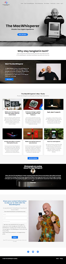
The MacWhisperer | Kajabi Website Design for Online Courses & Memberships
I designed The MacWhisperer website using Kajabi, creating a professional online platform that helps users learn how to use Apple technology with greater confidence, simplify everyday tasks, and improve productivity.
The design focuses on making technology education approachable through a clear website structure, engaging content sections, and a user-friendly experience. I aimed to help visitors understand the value of the training, explore educational resources, and discover the available courses and membership opportunities.
What I Focused On
Kajabi Website Design: A professional website layout aligned with the brand's identity and educational mission.
Course Presentation: Clear organization of learning content to help visitors explore technology training.
Membership Experience: Structured presentation of membership benefits and learning opportunities.
User-Friendly Navigation: An intuitive browsing experience that makes important information easy to find.
Trust Building: Strategic presentation of testimonials, brand information, and service benefits.
Conversion-Focused Design: Clear calls to action that encourage visitors to explore courses, memberships, and contact options.
The goal was to create an engaging digital learning platform that builds trust, communicates the value of online education, and makes it easier for visitors to take the next step.
Platform: Kajabi
Service: Website Design
Industry: Technology Education, Online Courses & Memberships


For technology training, I’d make the course-versus-membership choice explicit: solve one specific problem with a course, or get ongoing help through membership. Showing who each path suits beside its CTA could reduce the decision load for someone who already feels unsure about the technology.