The network for creativity
Join 1.25M professional creatives like you
Connect with clients, get discovered, and run your business 100% commission-free
Creatives on Contra have earned over $150M and we are just getting started
Back to feedPost

Hot Noonchi's Brand Identity and Visual Language
Short overview
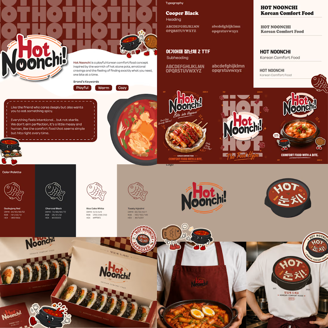
Hot Noonchi is a playful Korean comfort food brand concept built around warmth, familiarity, and a slightly cheeky personality.
I developed the brand identity as a complete visual system — combining expressive typography, a warm food-inspired colour palette, mascot elements, supporting graphics, packaging, and environmental applications to create a brand that feels memorable, approachable, and full of character.
The challenge
The goal was to create a Korean food identity that felt playful and contemporary without relying too heavily on predictable K-food visual clichés. I wanted the brand to feel comforting and casual, while still having enough structure to remain recognizable across packaging, signage, apparel, and promotional materials.
Creative direction
The visual direction balances bold, rounded typography with warm reds, charcoal, cream, and toasted neutral tones inspired by Korean comfort food.
Supporting illustrations, stamps, checkerboard details, and mascot characters add personality while giving the identity a flexible graphic language that can expand across different touchpoints.
My role : Brand Designer · Visual Identity · Art Direction · Packaging Design


The network for creativity
Join 1.25M professional creatives like you
Connect with clients, get discovered, and run your business 100% commission-free
Creatives on Contra have earned over $150M and we are just getting started




Related posts

⁕ Full Brand Identity for Trace™
One of the project's greatest challenges was creating an identity that is instantly recognizable and inspires investor confidence, while balancing a futuristic aesthetic with the sense of reliability intrinsic to the brand's values.
The core concept draws inspiration from the cosmos and the brand's drive to transcend boundaries; no matter the distance, the delivery is guaranteed. We translated this visually through patterns forming paths that lead to a destination, a motif that extends to every corner of the visual language.

"The Trace" is one of your best branding works. fantastic execution man

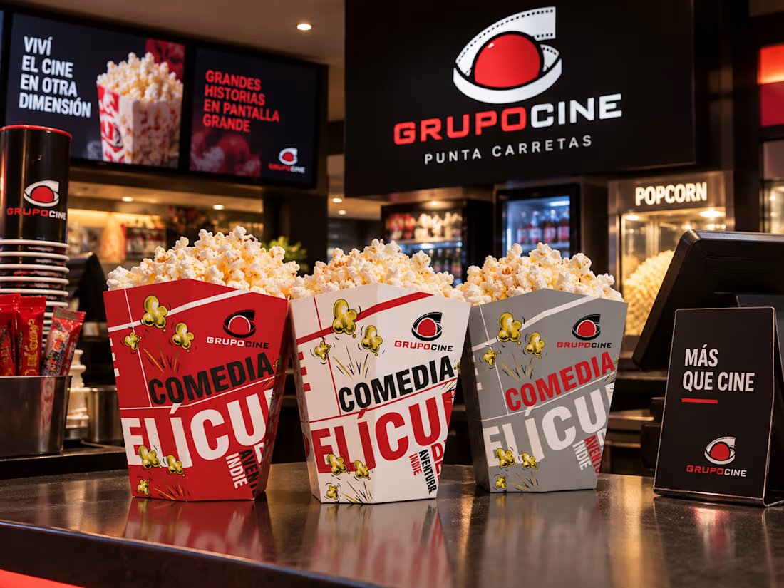
Packaging concept created for GrupoCine, exploring a bold and playful visual identity for its popcorn containers. The project uses typography, color and comic-inspired graphics to create a distinctive design connected to different movie genres and the cinema experience.

the grey one's my favourite. how many genres did you do in the end?

Nova — Clinical & Wellness Web Design
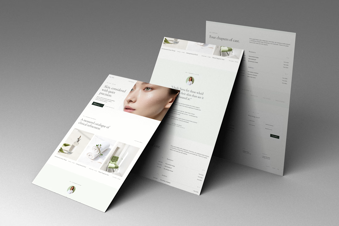
A refined website concept for Nova, a modern clinical and skincare brand focused on precision, care, and a premium patient experience.
The design combines editorial typography, soft neutral tones, spacious layouts, and refined imagery to create a calm and sophisticated digital presence. The website presents Nova’s services, treatments, philosophy, and clinical expertise through a clean, highly intentional visual system.
Focus: Web Design · UI/UX · Art Direction · Luxury Healthcare · Skincare · Editorial Design
#WebDesign #UIDesign #UXDesign #HealthcareDesign #Skincare #WebDesignInspiration #ArtDirection #EditorialDesign