The network for creativity
Join 1.25M professional creatives like you
Connect with clients, get discovered, and run your business 100% commission-free
Creatives on Contra have earned over $150M and we are just getting started
Back to feedPost

NoteWise: Landing Page Design for a Study App
The Setup
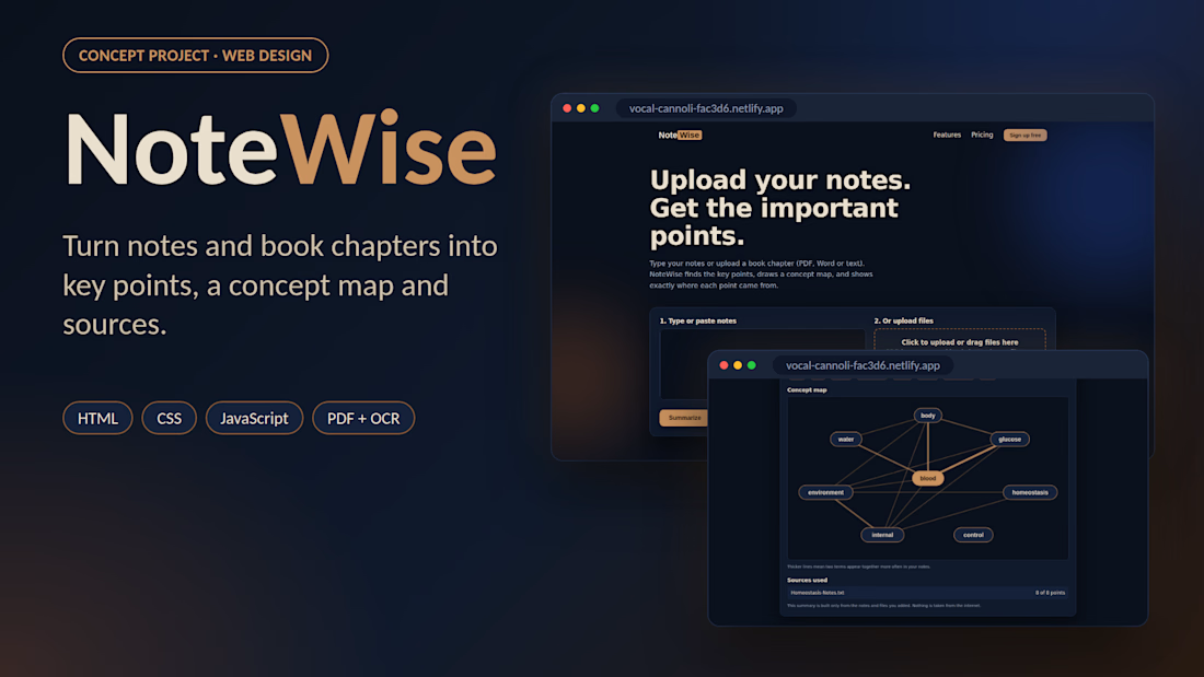
NoteWise is a concept website for a study app that helps students turn long notes and book chapters into short, clear key points.
The Tension
Students spend hours rereading chapters. A study tool needs to feel simple, calm and easy to trust, or they stop using it.
The Decision
I designed a dark blue and copper interface that is easy on the eyes during long study sessions. The layout puts the upload area first, then shows important points with their sources and a concept map that links the key terms.
The Result
A fully designed and coded, mobile-friendly landing page with an upload section, key points layout, concept map, features and pricing.
The Takeaway
A study tool should make the next step obvious: upload your notes, read the key points, move on.
Tools: HTML, CSS, JavaScript, Netlify, Claude (AI-assisted coding)
This is a concept project made to showcase my web design and front-end development.

Nice idea for a study tool.
The network for creativity
Join 1.25M professional creatives like you
Connect with clients, get discovered, and run your business 100% commission-free
Creatives on Contra have earned over $150M and we are just getting started
Related posts




Awesome dude


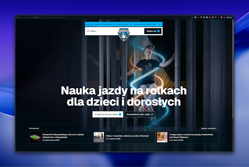
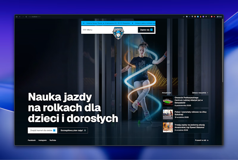

Left aligned for me. With that much body copy next to the headline it reads cleaner.

AI can generate a dashboard. But can it give a product its own identity?
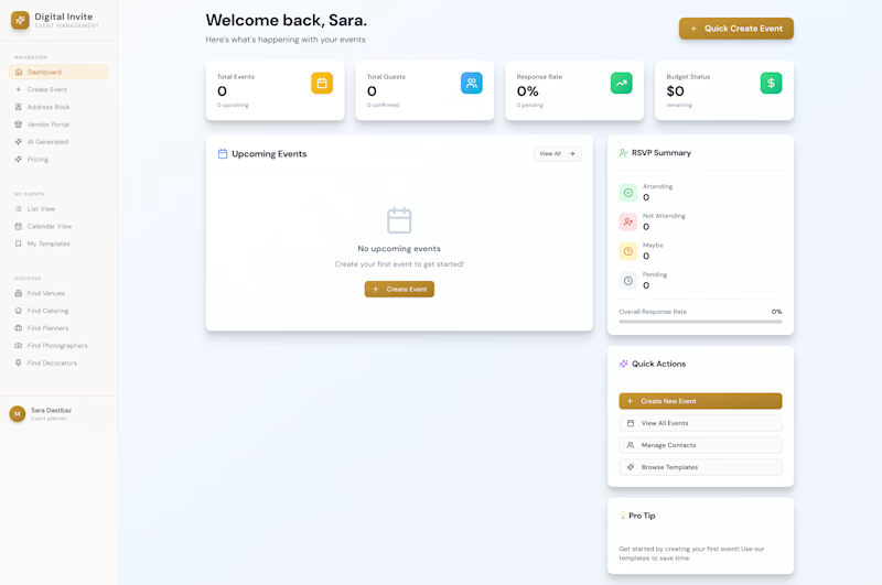
The first design was created by my client using AI a familiar dashboard style you've probably seen across countless AI-generated products.
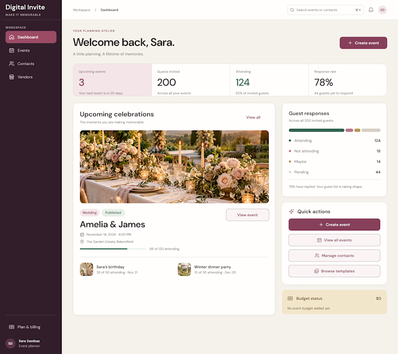
I redesigned it to feel less generic and more intentional, with a distinctive visual identity, clearer hierarchy, and an experience built around meaningful celebrations.
The goal wasn't just to make it look better. It was to make it feel like its own product.
What do you think is missing from most AI-generated interfaces?
#ProductDesign #UIDesign #AI
5 voted
23%
17 voted
77%
22 votes
Closed

I think personality is what makes a product stand out. A clean design is good, but it should also feel unique and memorable. 👏