The network for creativity
Join 1.25M professional creatives like you
Connect with clients, get discovered, and run your business 100% commission-free
Creatives on Contra have earned over $150M and we are just getting started
Back to feedPost

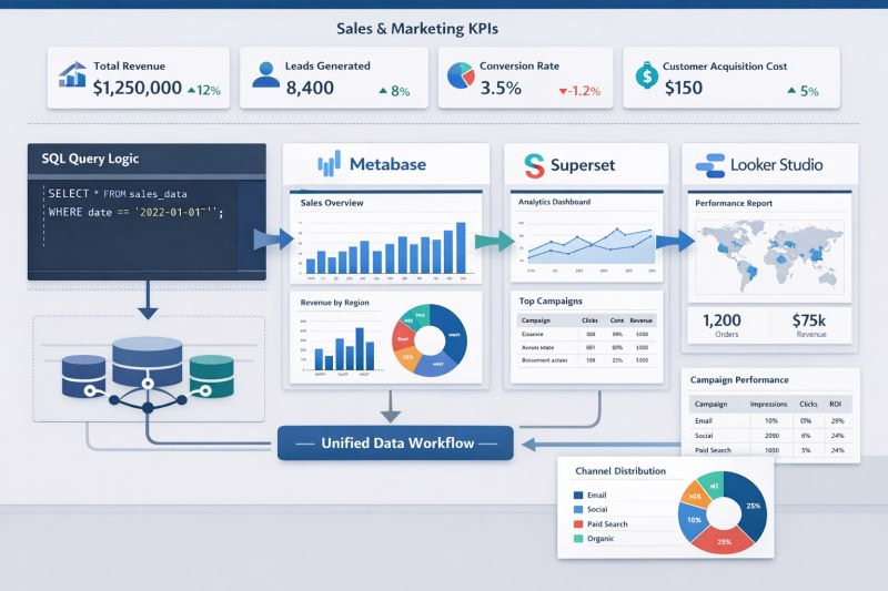
Most businesses gather massive amounts of data, yet their teams spend hours chasing down reports from scattered sources. The result? Decision-makers miss out on timely insights.
One of the most effective solutions I've deployed is the transition to truly automated reporting dashboards. Tools like Metabase, Superset, and Looker Studio allow you to unify data from SQL databases, GA4, and marketing platforms into interactive dashboards—updating automatically without manual effort.
The difference is immediate: less time wrangling spreadsheets, more time acting on real performance data. Deploying these dashboards not only saves hours each week but also creates a culture of data-driven decision-making.
The network for creativity
Join 1.25M professional creatives like you
Connect with clients, get discovered, and run your business 100% commission-free
Creatives on Contra have earned over $150M and we are just getting started





Related posts

Revlane Revenue: SaaS Dashboard Animation (Concept)
A concept animation for Revlane, a fictional revenue dashboard. The KPIs count up, the week's bars rise, and a trend line draws across. A "New record" toast slides in and the camera pushes in on the numbers. Then the cursor clicks Sunday's bar to open its value, and the view pulls back to the full dashboard.
Made in Jitter with Counter, mask reveals, and Scale and Move for the camera. Custom UI sound. 12-second loop.


The KPI count-up + bar rise + trend draw is a classic SaaS hero beat — the “new record” toast is a nice narrative punctuation before the camera push.

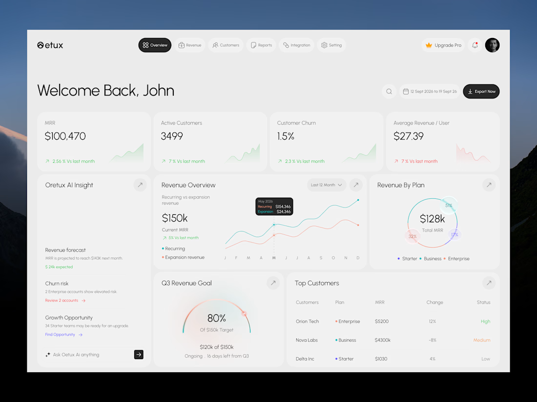
Oetux – SaaS Revenue Analytics Dashboard
The client had a lot of data, but the real problem was making sense of it.
MRR, revenue, churn, active customers, growth, customer performance, goals. Every metric was important, but when everything gets the same attention, users don’t know where to look first.
The existing experience made users spend too much time switching between information and trying to connect the numbers.
So we focused on how SaaS teams actually read their business data. We structured Oetux around the questions that matter most.
How is revenue performing?
Are we growing?
Are customers staying?
Where are we losing revenue?
What needs attention right now?
Then we organized KPIs, revenue trends, customer performance, churn insights, goals, and AI powered insights into one clear experience.
The goal wasn’t to remove data.
It was to organize the data so users could understand it faster.
That’s what we solved with Oetux.
Turning a data heavy SaaS dashboard into an experience that helps teams see their business clearly and make better decisions.



Love the clean layout.


clean work