The network for creativity
Join 1.25M professional creatives like you
Connect with clients, get discovered, and run your business 100% commission-free
Creatives on Contra have earned over $150M and we are just getting started
Back to feedPost

Had some fun creating these brand cards and a hand-drawn typographic mark for Between! ✨
Really enjoyed bringing these little details to life.
What do you guys think? 😊
The network for creativity
Join 1.25M professional creatives like you
Connect with clients, get discovered, and run your business 100% commission-free
Creatives on Contra have earned over $150M and we are just getting started



Related posts


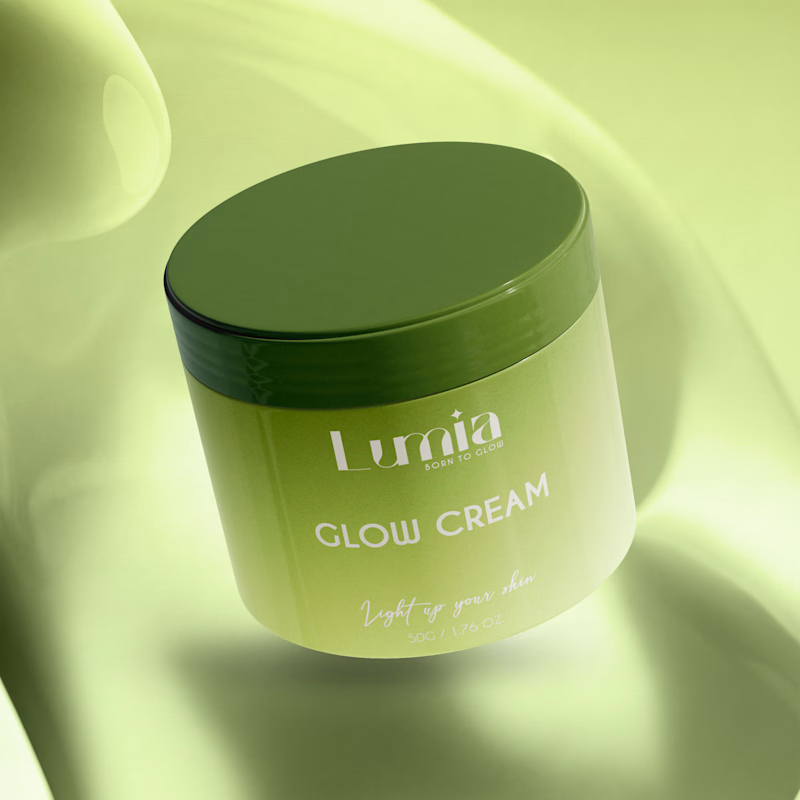
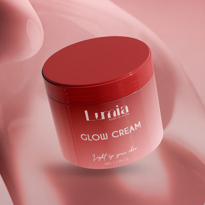
Which packaging color catches your eye first?

6 voted
46%
7 voted
54%
13 votes
Closed

The green version catches my eye first: the dark olive lid gives the lighter jar a clear focal point. I would also test the small white label text at thumbnail size, since the soft lighting reduces its contrast in both versions.

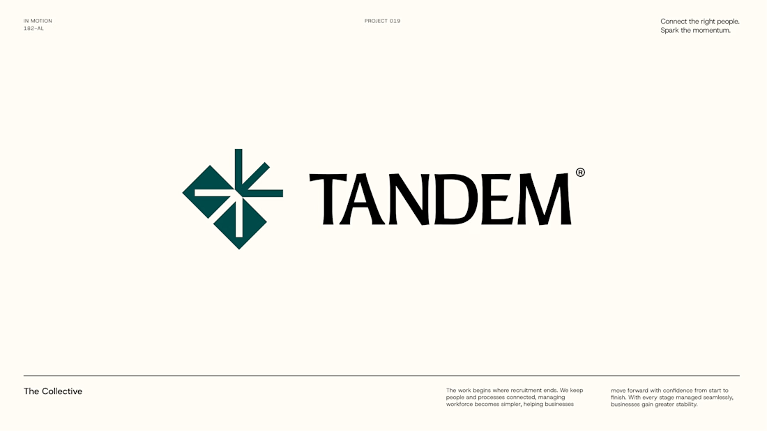
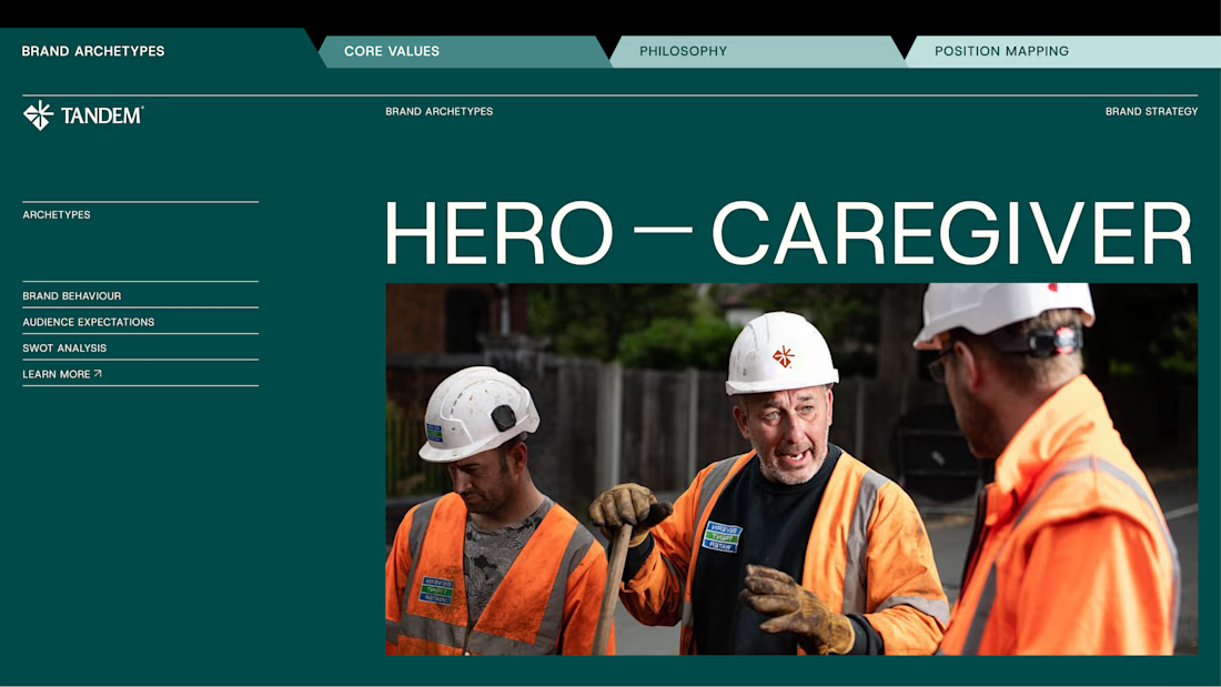
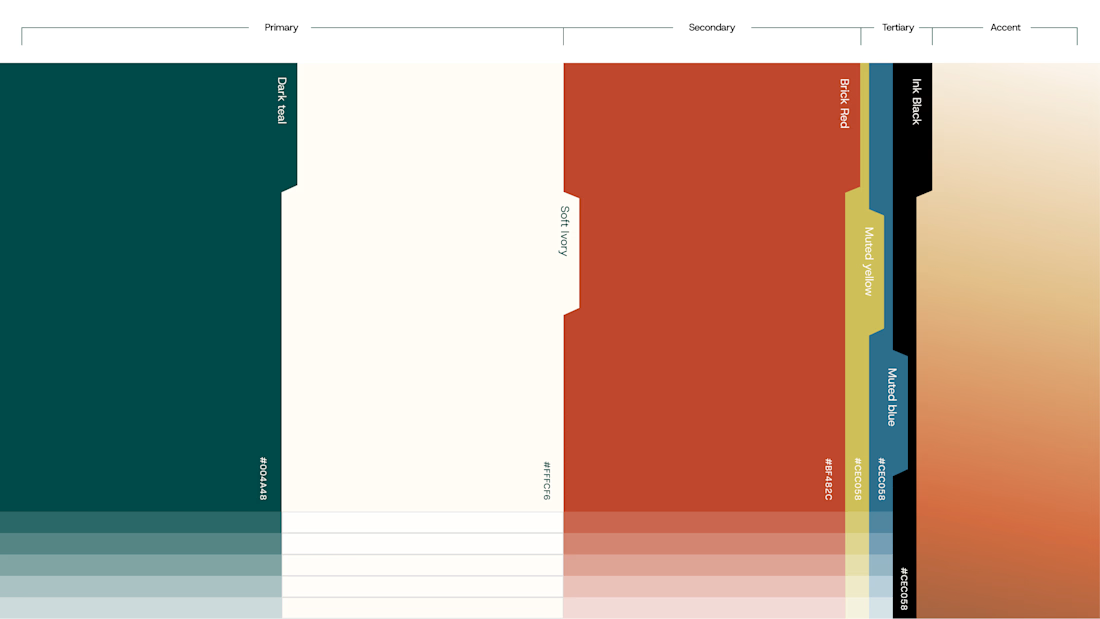
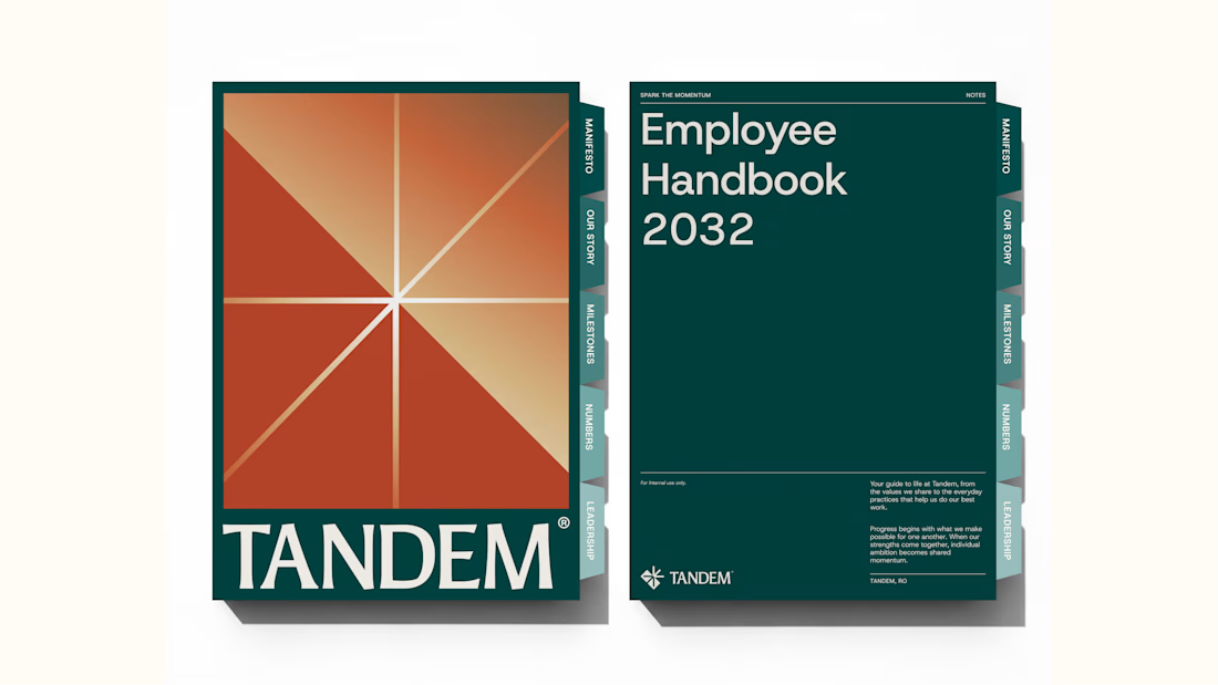
Wrapping up another brand identity project for a workforce management company.
We're currently putting together the full case study, but here's an early look at some of the visuals. Really pleased with how this one has come together!
We explored several distinct creative directions before arriving at the final identity. And there's plenty of interesting work that didn't make the cut.
While we prepare the full case study, I'm thinking of sharing some of those rejected directions and the thinking behind them.
Would you be interested in seeing what didn't make it?