The network for creativity
Join 1.25M professional creatives like you
Connect with clients, get discovered, and run your business 100% commission-free
Creatives on Contra have earned over $150M and we are just getting started
Back to feedPost

How to Stay Productive While Working From Home
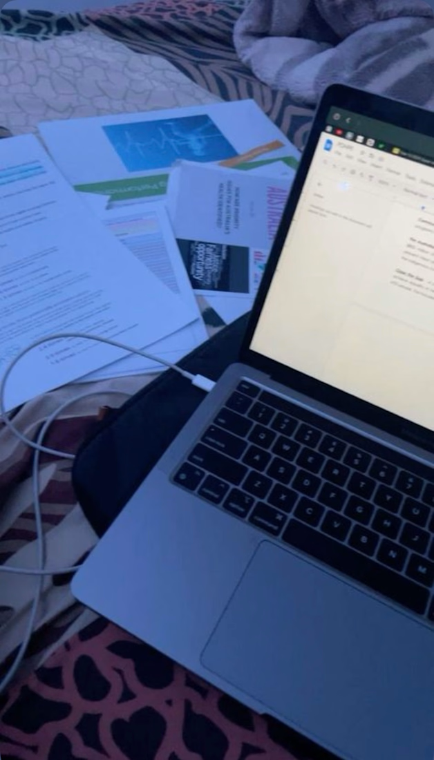
Working from home sounds easy, but staying focused can be hard. Here are 3 simple tips that help me every day:
Start Your Day Early
I wake up by 6am, make my bed, and plan my tasks for the day. When you have a plan, you don't waste time thinking what to do next.
Create a Small Workspace
You don't need a big office. Even a small table and chair in a quiet corner can help. I keep my space clean so I can think clearly.
Take Short Breaks
Working non-stop will make you tired. I work for 50 minutes, then take a 10-minute break to stretch, drink water, or check my phone. This keeps me fresh.
Working from home is about discipline. If you stay consistent, you will do more in less time.
Written by Janet | Freelance Writer from Calabar, cross river state


The network for creativity
Join 1.25M professional creatives like you
Connect with clients, get discovered, and run your business 100% commission-free
Creatives on Contra have earned over $150M and we are just getting started










Related posts

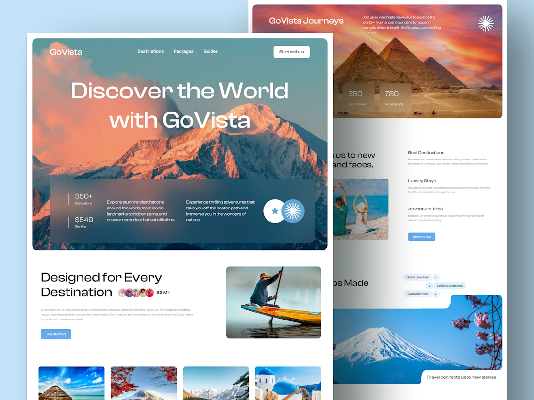
GoVista Journeys - A travel landing page designed to make people dream of their next destination.
A travel company based in Leicester, UK, needed a visually engaging landing page to showcase its destinations and travel experiences while its larger website was being prepared.
The goal was simple: make a strong first impression through beautiful travel imagery, a clean layout, and a design that makes people want to explore more.
Because in travel, the journey can begin long before the booking. ✈️
What catches your attention first on a travel website: the images, the destinations, or the overall design? 👇


I like this very much, very good concept

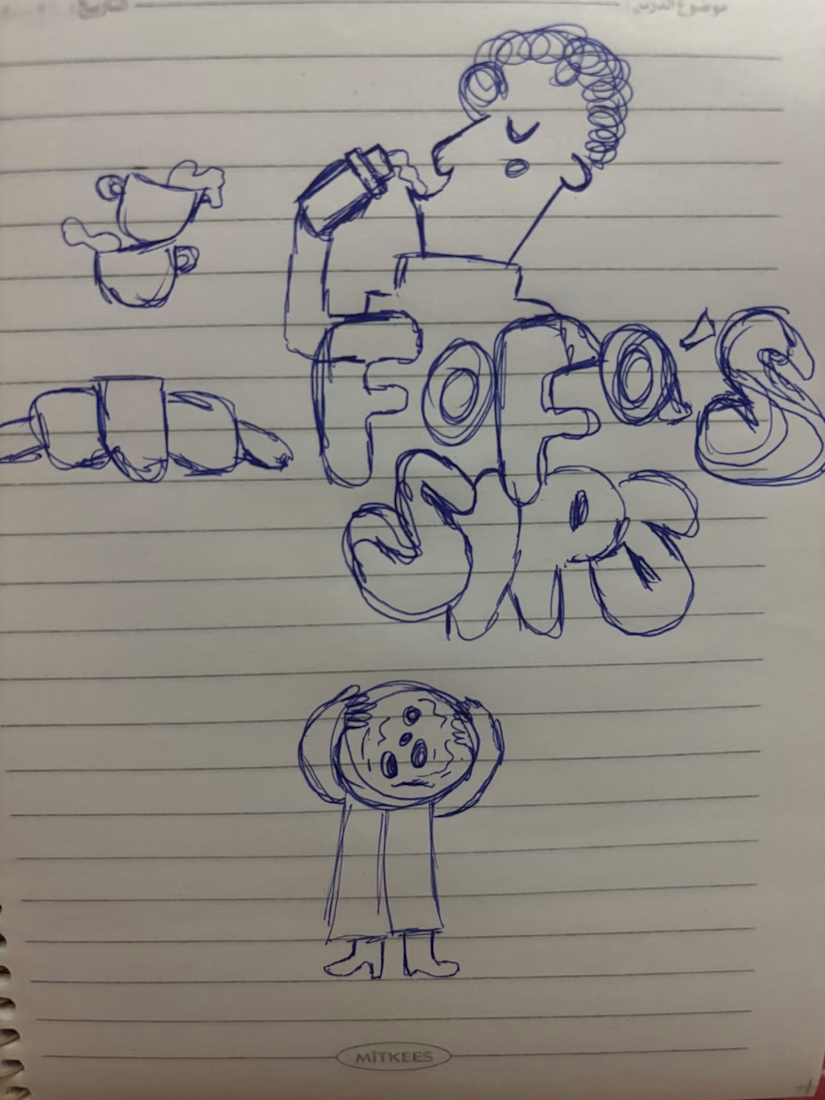
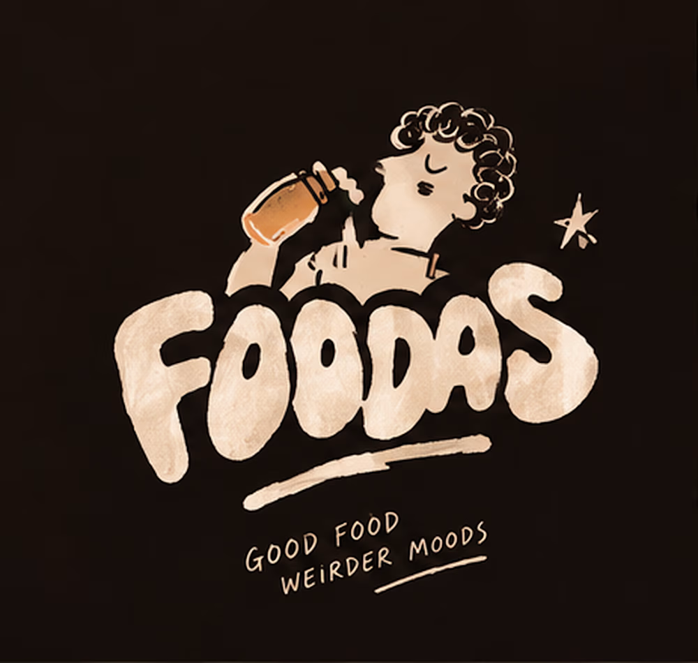
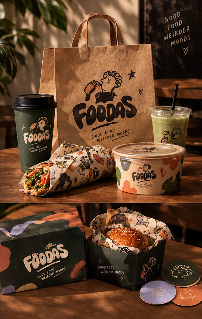
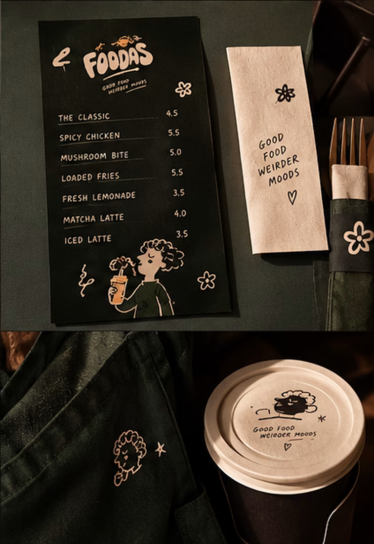
I turned one of my notebook doodles into a whole brand identity. And honestly this was way more fun than I expected I usually work on UI/UX and digital products so I wanted to take a step back from screens and explore something completely different: illustration-led branding.
I took my original FOODAS sketch and built an entire visual world around it from the logo and mascot illustrations to the color palette packaging, cups, and menus
The goal wasn't to make it look perfectly polished and predictable I wanted it to feel playful, a little weird, and still premium.
Now I'm curious about one thing:
Can playful, imperfect illustrations make a brand feel more premium or do you think premium branding needs to be more minimal?
I have a feeling designers will disagree on this one



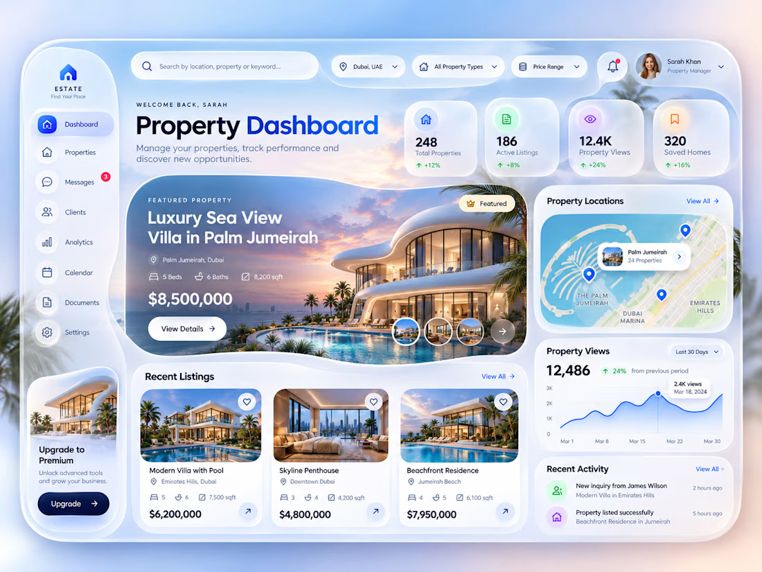
Luxury Real Estate Dashboard, a modern property management dashboard concept designed in Figma.
The idea was to create a premium digital experience that makes managing properties, exploring listings, and tracking performance feel simple and intuitive.
The design combines a soft glassmorphism style, elegant typography, immersive property imagery, and a clean dashboard layout.
Key Features:
Property management dashboard
Luxury property listings
Interactive-style property location map
Property analytics and performance insights
Recent activities and client inquiries
Modern glassmorphism UI
Tool: Figma
Focus: UI/UX Design | Real Estate SaaS | Dashboard Design | Web App Design | Product Design
Have a SaaS platform, dashboard, or digital product in mind?
Open to freelance UI/UX projects and collaborations.


Clean and elegant concept. I like how the analytics and property listings come together in one intuitive dashboard.