The network for creativity
Join 1.25M professional creatives like you
Connect with clients, get discovered, and run your business 100% commission-free
Creatives on Contra have earned over $150M and we are just getting started
Back to feedPost


The network for creativity
Join 1.25M professional creatives like you
Connect with clients, get discovered, and run your business 100% commission-free
Creatives on Contra have earned over $150M and we are just getting started





Related posts

Light or refined - which E-Bike product breakdown section design would you choose?
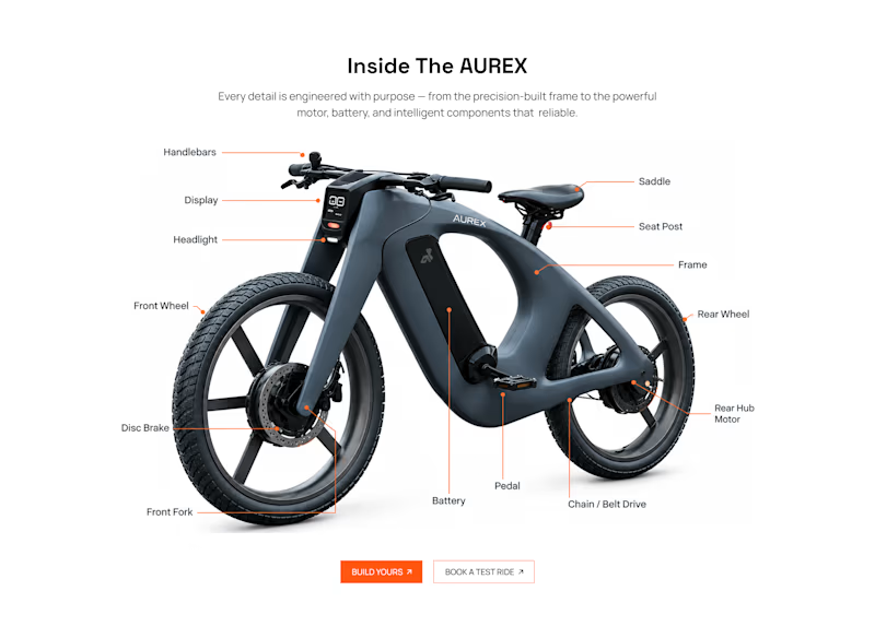
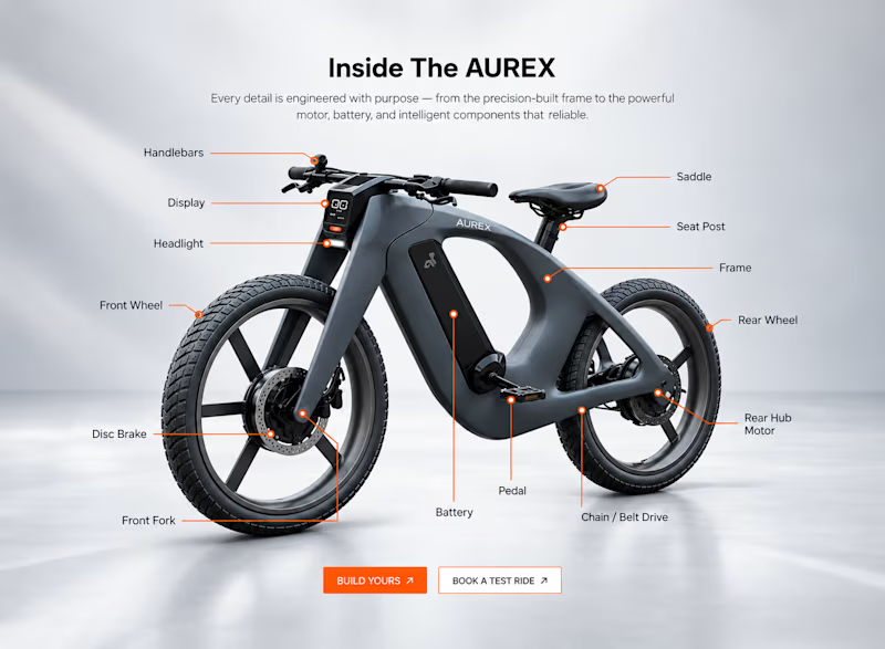
Two concepts for the same AUREX e-bike. Same product, same components, two different presentation styles:
A - Soft Studio: subtle gray depth, larger product focus, and a more premium visual feel.
B - Clean Minimal: bright white background, tighter spacing, and a more technical editorial layout.
Which direction feels stronger for a premium e-bike brand and why?


5 voted
31%
11 voted
69%
16 votes
Closed

A feels more premium to me. The soft gray depth and bigger product focus make the bike feel like something special. B is great for specs, but A sells the feeling

Contra Community Post
Day 17/30: COMMON ROOM
What if a library card could reveal belonging instead of simply proving access?
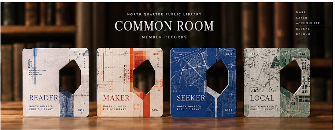
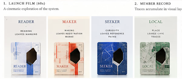
I built COMMON ROOM, a speculative membership system for the fictional North Quarter Public Library.
Instead of asking members to choose an identity or complete a personality quiz, the system lets their actual behavior inside the library leave the evidence.
Read in the Stacks → leave a margin.
Make in the Workshop → leave a registration mark.
Follow a question through the Index → leave a reference path.
Explore the Quarter → leave a civic trace.
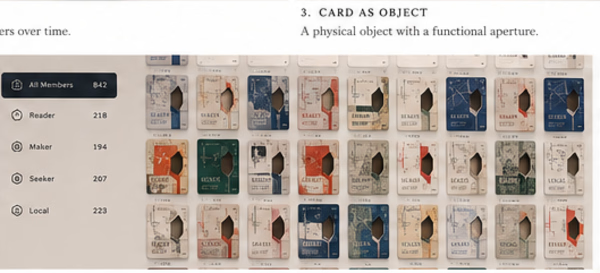
Those traces gradually build a unique Member Record.
The card remembers in layers. Its physical Accession Aperture later becomes a lens into hidden library memory, and completed cards can optionally become part of a Living Collection that begins to reveal the shape of the neighborhood itself.
The project eventually became a system about:
BEHAVIOR → EVIDENCE → OBJECT → MEMORY → COMMUNITY
And the line that defined the whole thing:
You don’t receive a card. You accumulate one.
I also built the launch film around the same visual logic instead of doing a traditional product walkthrough using the card’s traces, layers and aperture as the motion language.
Would love feedback on one thing in particular:
Does the relationship between behavior, the physical card, and belonging read clearly without needing the concept explained first?
Day 17 of my 30 Days of Real Business Problems challenge.
#ProductDesign #InteractionDesign #CreativeDevelopment #DesignEngineering #MotionDesign #CreativeCoding #ThreeJS #Remotion



what inspired the maker and seeker split?

Patitas & Tijeras: from "can I book?" to "you're booked" for a solo dog groomer in Lima
One-line problem: Mariela grooms one dog at a time in Surco, Lima, and loses about 2 hours a day on WhatsApp while 1 in 5 clients never show up.
THE BUSINESS
Patitas & Tijeras is a one-woman grooming studio in Santiago de Surco, Lima. Its quirks shape the whole product:
One dog at a time, never in a cage, so the calendar can never double-book
Slot length depends on the dog: a chihuahua takes 45 min, a matted golden takes 3 h
15 protected minutes between dogs to clean the table
Saturdays fill first; weekdays have room
Clients pay a deposit by Yape (Peru's most used payment app) to hold a slot The business is fictional. The problem is real for thousands of small shops in Lima.
FOR CLIENTS
Book in about a minute: breed, size and coat set the exact slot length, so only times that really fit are shown
A Yape deposit holds the slot. A booking can't be confirmed until the deposit arrives
Every booking gets its own page with a QR code and clear next steps
Waitlist and reminders; returning clients are recognized by phone number
Spanish and English, detected automatically
FOR MARIELA
Inquiry inbox: "got a slot Saturday?" gets real times back in one tap
QR check-in on arrival, with clear warnings for codes from another day, cancelled or already used
Regulars with no no-shows in the last 90 days can rebook without a deposit
A dashboard with revenue, occupancy, no-shows and hours saved
In the demo data, no-shows drop from 21% to 4%
HOW IT'S BUILT
Built entirely in Lovable on Lovable Cloud (Postgres, auth, storage): 21 versions in about 18 hours. Overlapping bookings are blocked by the database itself, not just the interface. Most fixes came from testing it on my phone as a real client would.
TRY IT
Live app: https://patitas-y-tijeras.lovable.app
Owner view: "Studio login" → "Enter the demo as Mariela" (demo data resets every night)
Lovable project: https://lovable.dev/projects/2549d272-0442-42a4-b7b3-52122c971817
Process video: https://x.com/Sebas_TZ_/status/2104022416062312659
Social post: https://www.instagram.com/p/DdxTkJYmmTa/?img_index=1
Built with @Lovable #lovablechallenge


How does the app know a Yape deposit has arrived before it confirms the booking? Does Mariela confirm it from her phone, or does the app read the payment itself?