The network for creativity
Join 1.25M professional creatives like you
Connect with clients, get discovered, and run your business 100% commission-free
Creatives on Contra have earned over $150M and we are just getting started
Back to feedPost
Taste Test

What style do you personally prefer — A or B?
I’m working on an animation for a personal art project, and I’m curious to understand which visual direction people respond to more.
7 voted
41%

10 voted
59%

17 votes
Closed


I love A. Bright and Attractive

Will go for A the cel shaded


in my opinion, the image on the right feels softer and more pleasant =)
The network for creativity
Join 1.25M professional creatives like you
Connect with clients, get discovered, and run your business 100% commission-free
Creatives on Contra have earned over $150M and we are just getting started









Related posts

ELEVATOR PITCH — My submission for the #SVGatorChallenge!
9 seconds. 3 floors. 1 unforgettable product reveal.
Every product deserves a moment to shine. So for this challenge, I built something that turns a simple product advertisement into an elevator ride.
The idea? Each floor tells a part of your product's story.
✨ Floor 01 — FOCUS: Grab attention.
⚡ Floor 02 — FLOW: Build momentum.
🎯 Floor 03 — SILENCE: Let the message land.
Then comes the express ascent. The doors open, revealing your product, branding, and call to action.
But I didn't want to create just another beautiful animation. I wanted to create something any brand or creator could make their own.
That's why I designed ELEVATOR PITCH as a fully reusable SVGator template.
✅ Edit three benefit words
✅ Swap your product image and logo
✅ Customize the CTA and brand color
✅ Keep all the animations and transitions intact
I also tested the template with three different brands- AERA, MORROW, and NEST- to demonstrate how one animation can tell completely different stories.
🎬 Built in SVGator | Seamless 9-second loop | Animated SVG, GIF & MP4
My goal was simple: Build the elevator once. Let everyone else take their ideas higher. ❤️
🔗 Explore the project: https://app.svgator.com/editor#/3abed361ce3d4a7093af87d1270d2762
#svgatorchallenge #SVGator #MotionDesign #Animation @SVGator

Unbelievable animation this is! Well Done!

Same content, different experience. A few thoughtful design choices can completely change how a presentation feels, flows, and communicates. Which version would you choose?

11 voted
31%
24 voted
69%
35 votes
Closed

Verde Vista 1 is more modern and futuristic specially with blue colors and robotic hand❤️
Great job Rasid🎉🎉🔥🔥

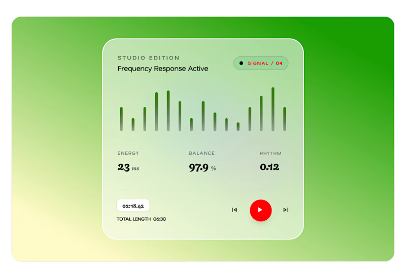
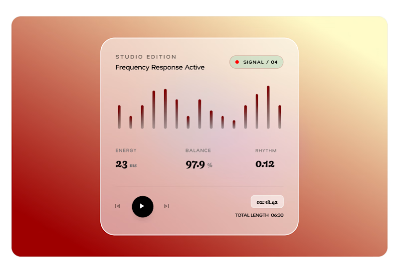
A card design, two ways.
Card A or Card B?
Which version wins?
2 voted
29%
5 voted
71%
7 votes
Closed

Card B is perfect man