The network for creativity
Join 1.25M professional creatives like you
Connect with clients, get discovered, and run your business 100% commission-free
Creatives on Contra have earned over $150M and we are just getting started
Back to feedPost
Taste Test

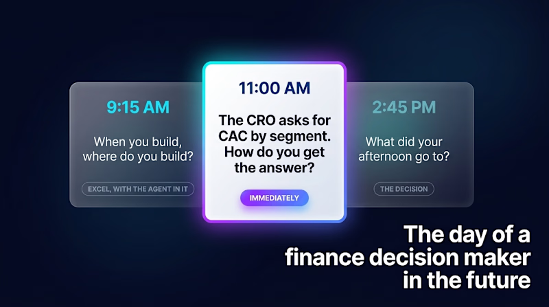
A viewer gives a screen about a second to decide whether to keep watching. So this frame has one job: show where to look first.
Purple or dark: which one gets your vote, and why?

5 votes
Ends in 1d

In the Purple version, the text is much easier to read. This my choice
Good point! Readability was a big factor for me

Love the framing Elvira! "A viewer gives a screen about a second to decide" - so true. That one job principle: show where to look first is spot on. For me purple wins, it creates better depth and draws eye to that CRO question card instantly while still feeling futuristic for...
Thank you! I’m glad the framing works for you. And yes, purple really helps guide the eye where it needs to go 💜

Purple one..because it looks clean

love the branding colors.
The network for creativity
Join 1.25M professional creatives like you
Connect with clients, get discovered, and run your business 100% commission-free
Creatives on Contra have earned over $150M and we are just getting started



Related posts


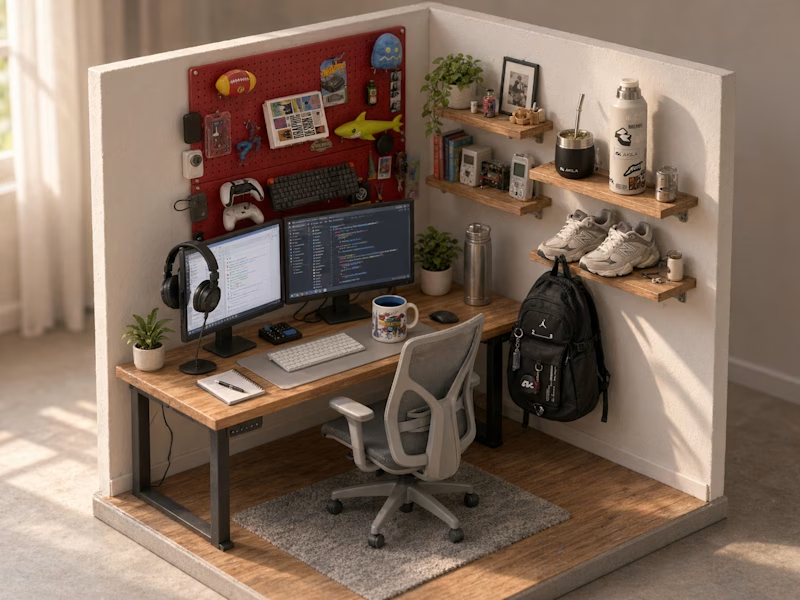
Turned my real desk into a tiny clay diorama ☕️
Made with FLUX 3 Klein running locally, using 10 photos of my actual setup as references: the pegboard wall, headphones, mug, shelves...
Which one do you like more, A or B?
21 voted
58%

15 voted
42%
36 votes
Closed
Did small pano animation too


Last week: a logo with a name and a dot.
This week: a two weird wordmarks.
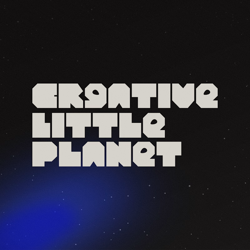
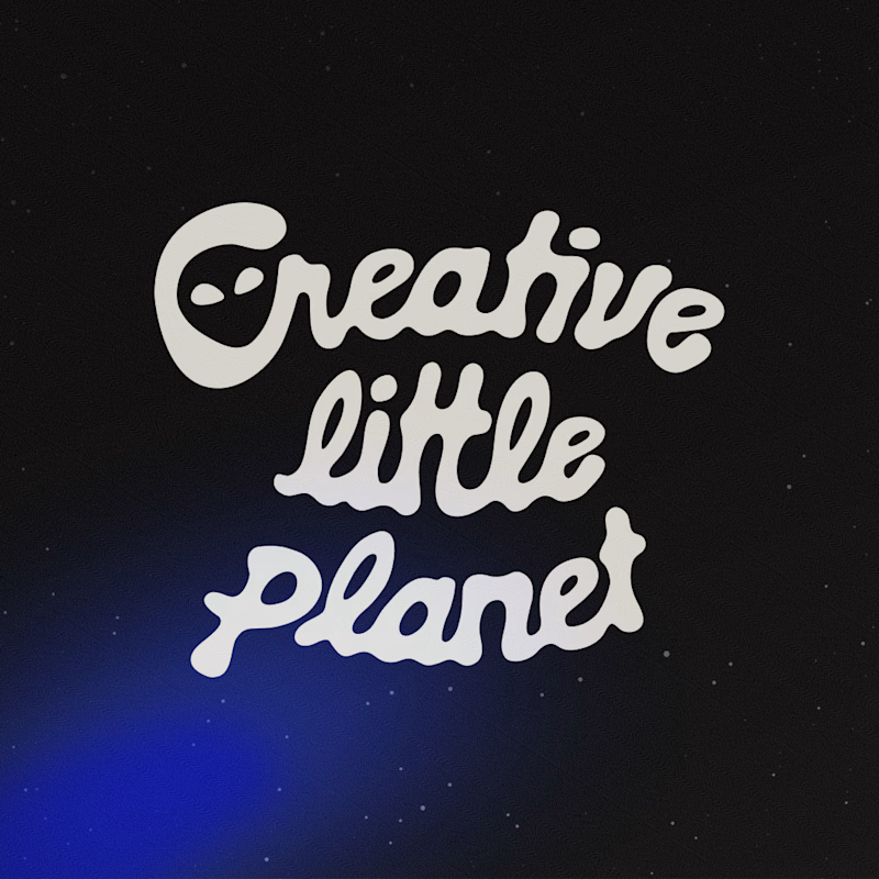
Creative Little Planet is a marketing agency for B2B clients brave enough to hire weird humans. A studio selling weird can’t look like any other SaaS, right? So I pushed weird two ways!! Which one do you prefer? 👽
A. Machined geometric & blocky letters
B. Melted script letters
Vote below! 👀
8 voted
22%
28 voted
78%
36 votes
Closed

the melted script plus the alien detail is absolutely brilliant!

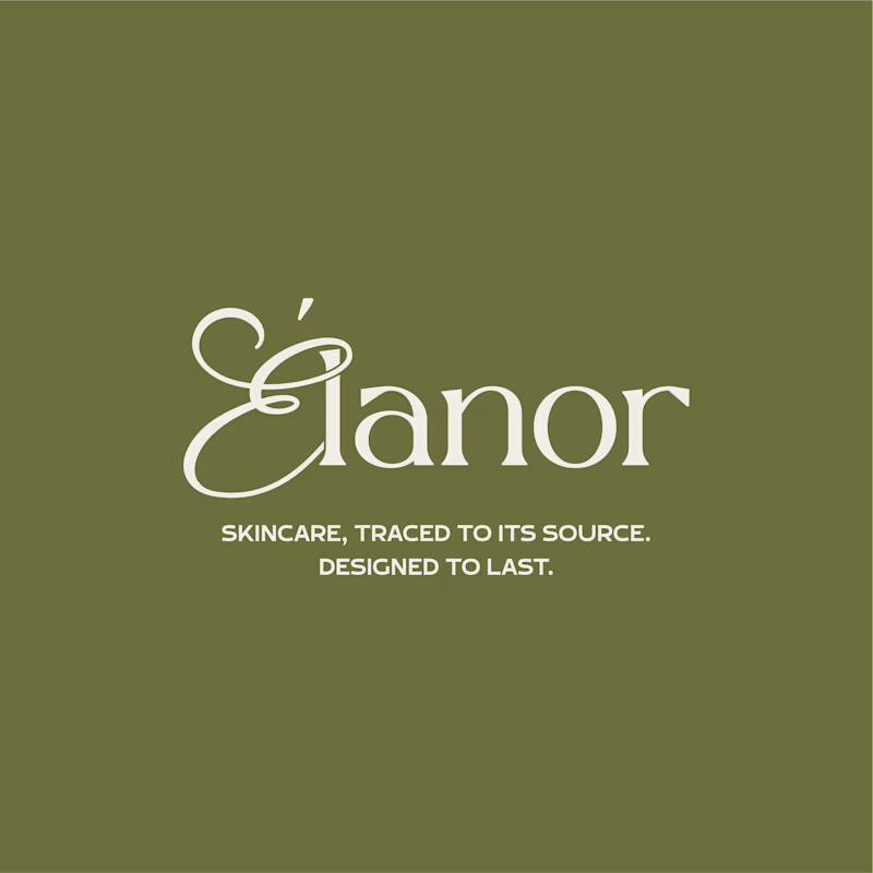
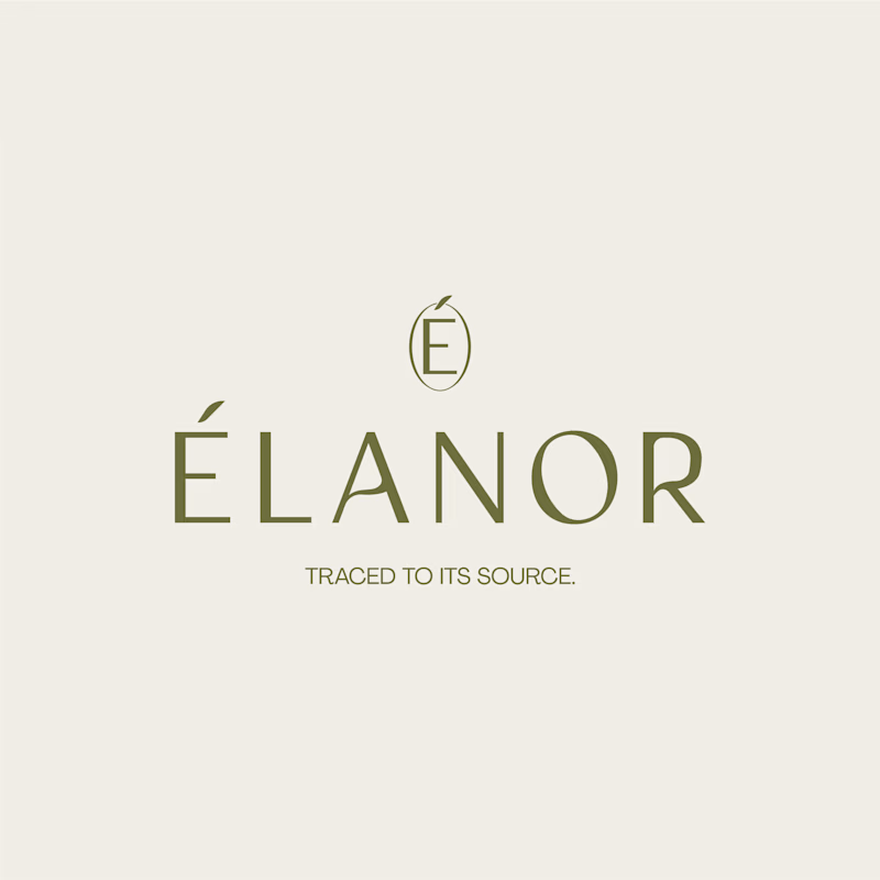
Can two different typographic directions change how you perceive the same skincare brand? 👀
For Elanor, a skincare brand I’ve worked on, I’m putting two wordmark directions head to head.
A. Script Combo brings more personality and a distinctive, expressive touch.
B. Contemporary feels cleaner, more restrained, and modern.
Now I want your honest opinion: A or B? Which direction feels right for Elanor, and why?
26 voted
58%
19 voted
42%
45 votes
Closed
Absolutely! Typography changes everything. For Élanor, I love the contemporary direction - it feels elegant, clean and very premium for a skincare brand like this. The É icon on top is a beautiful touch! Script has personality but contemporary feels more timeless for skincare. Great exploration!