The network for creativity
Join 1.25M professional creatives like you
Connect with clients, get discovered, and run your business 100% commission-free
Creatives on Contra have earned over $150M and we are just getting started
Back to feedPost

NextCouture – Personalized Luxury Fashion E-commerce


The network for creativity
Join 1.25M professional creatives like you
Connect with clients, get discovered, and run your business 100% commission-free
Creatives on Contra have earned over $150M and we are just getting started








Related posts

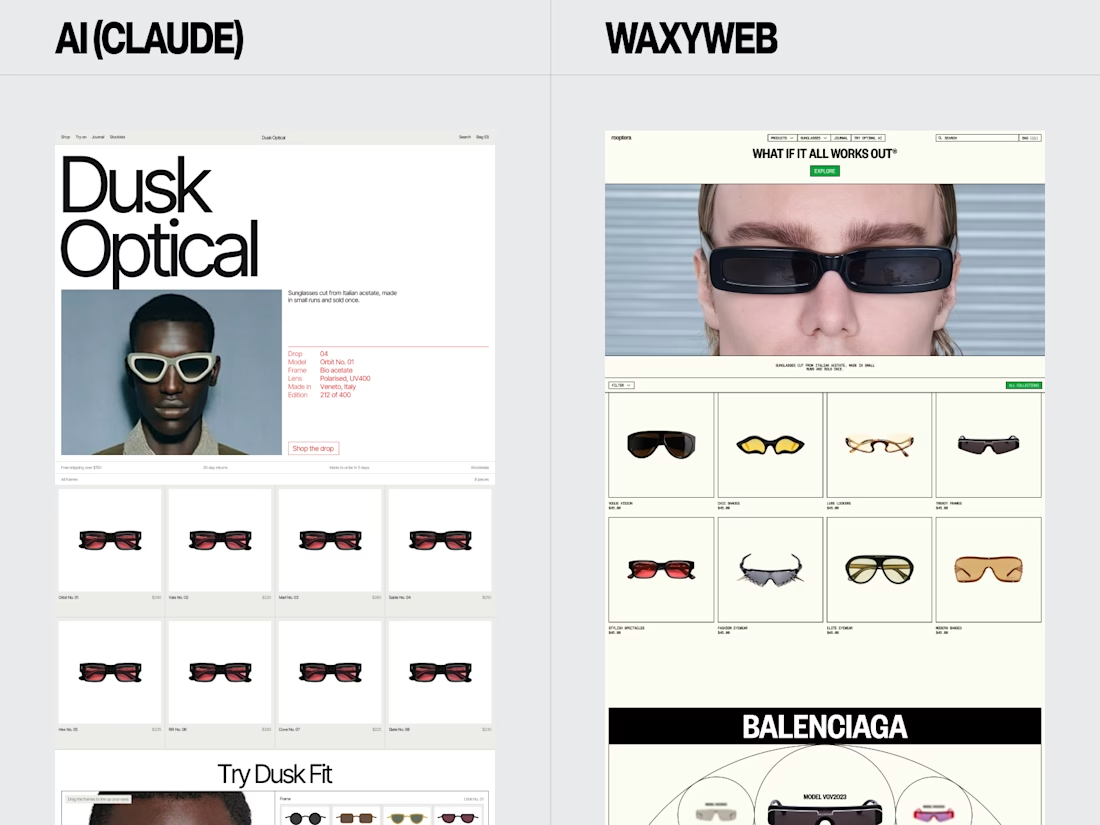
Eyewear Ecommerce Website Redesign — AI vs. WaxyWeb
A side-by-side design comparison exploring two approaches to an online eyewear store.
The WaxyWeb redesign focuses on the relationship between product presentation, collection browsing, editorial imagery, and the store’s visual identity.
Design considerations:
Eyewear product presentation
Ecommerce layout and hierarchy
Collection and product discovery
Fashion-focused visual direction
Consistent online shopping experience
For fashion, eyewear, and lifestyle brands, the goal is to create a store that presents products clearly while giving the brand a recognisable visual presence.
Website design and development: www.waxyweb.com



WaxyWeb

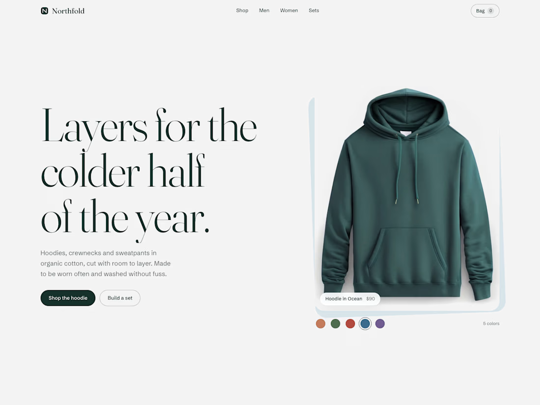
Built a headless Shopify storefront straight from the Storefront API. Next.js handles the routing and rendering, the API feeds in 23 products from Shopify's sample catalog, photos and prices included.
Color swatches swap the product shot and the price on click. Filters sit in the URL, so a filtered collection page is a shareable link. There's a set builder: pick three pieces, 15% off.
The cart is real. Add items, change quantities, close the tab, come back a month later. Still there (30-day cookie). Checkout is a mock, no payment.
Also wrote three Liquid sections for Dawn and ran them through theme-check. Zero issues.
100 on accessibility, best practices and SEO on Lighthouse desktop.


Impressive build. The shareable filters and persistent cart show great attention to the shopping experience.

I designed and developed this landing page for Stereo Fest: Eclipse, the upcoming youth event for @caminodevida.
The visual concept comes from a simple truth: the moon has no light of its own, it only reflects the light of the sun.
In the same way, we weren’t made to generate our own light, but to reflect Jesus.
The cool part: as you scroll, you control the movement of the moon. Right at the core phrase, the eclipse happens, showing that in the darkness, the Glory of God is revealed.
Check it out here: stereofest.com


That's really special it feels like space war game landing page great job Misael🔥🔥🔥