The network for creativity
Join 1.25M professional creatives like you
Connect with clients, get discovered, and run your business 100% commission-free
Creatives on Contra have earned over $150M and we are just getting started
Back to feedPost
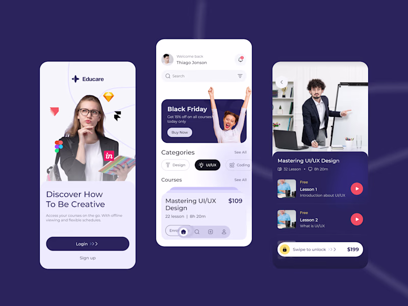
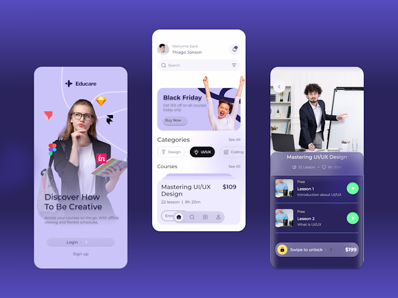
Taste Test
Exploring visual directions for a new course discovery screen.
Version A: High contrast, dark background.
Version B: Soft gradients, monochromatic flow.
I'm curious to hear from the community, which layout provides the better overall UX and visual hierarchy?
Cast your vote and let's discuss in the comments.
2 voted
100%
0 voted
0%
2 votes
Closed
Have you considered a hybrid where the onboarding uses B’s soft flow to feel welcoming, but the actual discovery catalog switches to A’s high contrast for better legibility?
The network for creativity
Join 1.25M professional creatives like you
Connect with clients, get discovered, and run your business 100% commission-free
Creatives on Contra have earned over $150M and we are just getting started
Related posts
The Female Focused feels more engaging
⚡️ Clientwise App Design. > It's all in the details. How do you feel about this dark mode setup with neon accents? Let me know! 👇
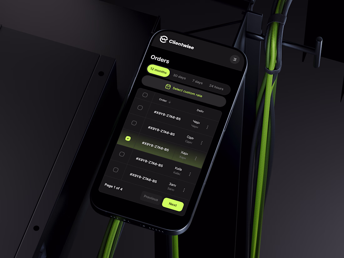
The visual style definitely catches the eye, but what interests me even more is how it supports usability.
Did the dark mode and neon accents come from user preferences, brand direction, or a specific product goal?
Ciao, Contra! 🚀
New here and currently filling out my profile — so please excuse the work in progress 😄
I'm a UX/UI designer based in Kyiv. I have 3+ years of experience in design, and I'm here to connect, collaborate, be inspired and grow. Design for me is not just about making things look good, it's about making them feel right. Outside of work I exploring AI tools, travel whenever I can, paint on the walls, grow flowers, and drive with no particular destination in mind. And yes, I jumped out of planes 🪂😂 So taking on new challenges? Never been a problem.
I'm open to projects in different areas. I genuinely enjoy working across industries because every new field brings a fresh perspective.
Looking forward to connecting with fellow designers, creatives, and businesses of all kinds on this platform. Whether it's a new project or just a conversation - I'm here for it🙌
Together I think we can make things a little more functional, a little more beautiful, and a little more human😊
So, your turn! Tell me a bit about yourself)
Let`s start! See you around🚀
Welcome aboard! 🚀
Love your approach to new challenges. As someone who's been DJing since 2004, I can relate to the idea that the best experiences often happen when you step outside your comfort zone.
That said... skydiving is still a level above most of my adventures 😄
What's...
Trending
Claude
Claude has entered the design space. How are you using Claude Design?
Contra University
Learn from expert creatives how to earn more using next-gen AI tools.
MagicPath
The canvas is infinite, and exploration is becoming the workflow. How are you using MagicPath?
creativeaiflow
Creative AI workflows are evolving. What tools do you use, and what are their strengths and weaknesses?
freelancerlife
Freelancer life is wins, pivots, and everything in between. What’s yours right now?