The network for creativity
Join 1.25M professional creatives like you
Connect with clients, get discovered, and run your business 100% commission-free
Creatives on Contra have earned over $150M and we are just getting started
Back to feedPost
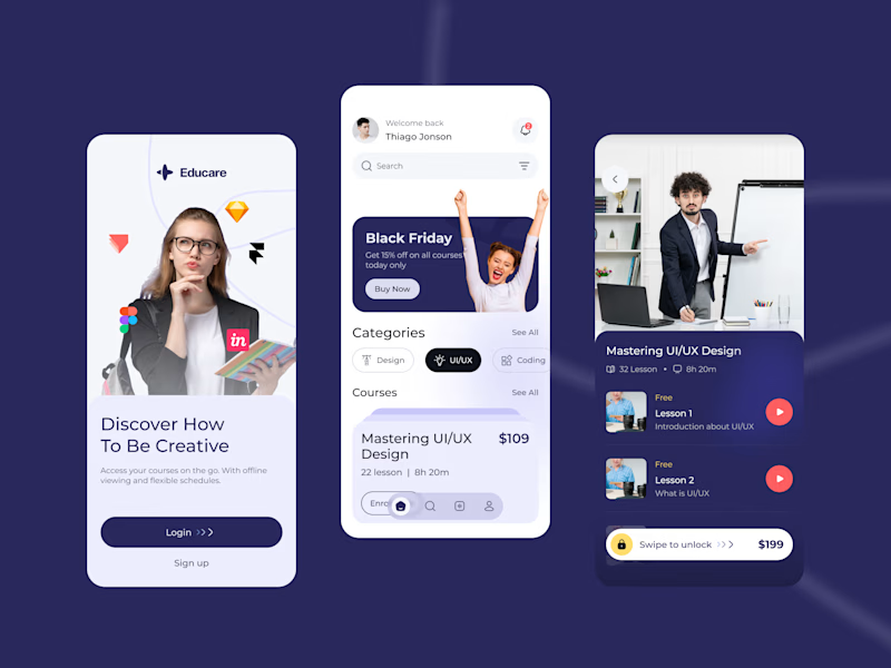
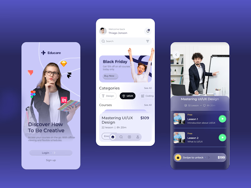
Taste Test

Exploring visual directions for a new course discovery screen.
Version A: High contrast, dark background.
Version B: Soft gradients, monochromatic flow.
I'm curious to hear from the community, which layout provides the better overall UX and visual hierarchy?
Cast your vote and let's discuss in the comments.
2 voted
100%
0 voted
0%
2 votes
Closed


Have you considered a hybrid where the onboarding uses B’s soft flow to feel welcoming, but the actual discovery catalog switches to A’s high contrast for better legibility?
The network for creativity
Join 1.25M professional creatives like you
Connect with clients, get discovered, and run your business 100% commission-free
Creatives on Contra have earned over $150M and we are just getting started





Related posts

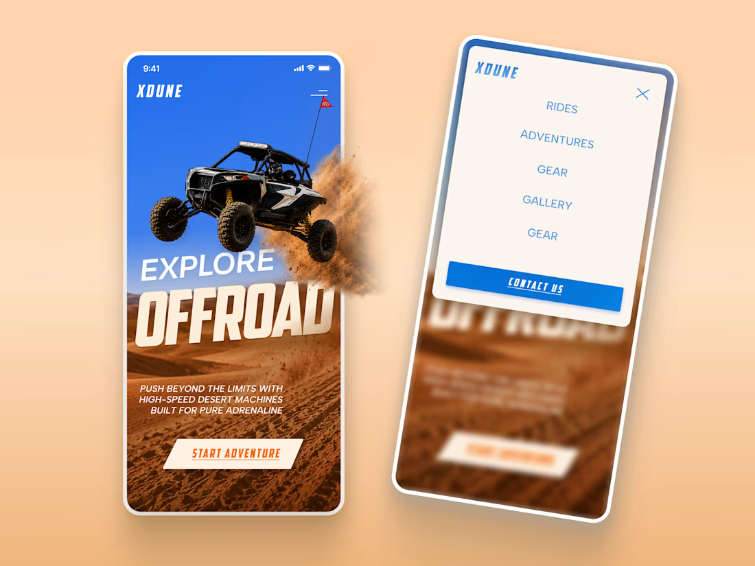
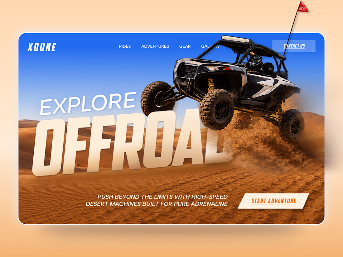
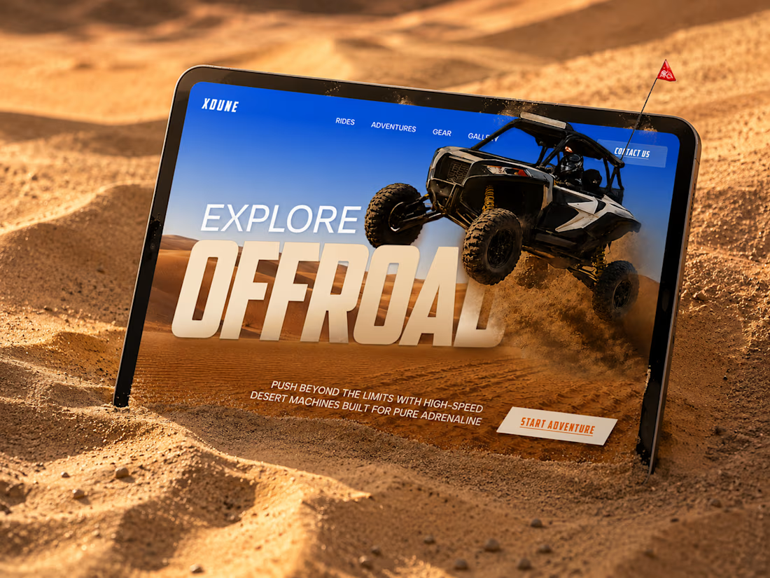
XDUNE — Off-Road Adventure Landing Page
A bold landing page concept built around speed, freedom, and off-road adventure 🔥
The visual direction combines desert landscapes, oversized typography, and a dynamic vehicle composition to make the experience feel energetic from the first screen
Special attention was given to:
• Strong action-focused hero composition
• Bold typography and clear hierarchy
• Desert-inspired visual atmosphere
• Adventure-focused CTA
• Responsive mobile experience
• Simple and clean navigation
The result is a high-energy landing page that feels fast, adventurous, and made for people who want to get off the road
Looking to create a bold website for an automotive, outdoor, or adventure brand? Let’s connect 🚀




love the vibe


Booking Calendar: Compact or Expanded?
I’m testing two calendar layouts for booking a spa hotel stay.
Version A - Compact. The calendar, selected dates, number of nights, and button remain inside one card.
Version B - Expanded. After the check-in date is selected, a separate booking summary card appears below the calendar.
The functionality is the same - only the presentation and visual hierarchy are different.
Which version feels clearer and easier to use?
17 voted
49%
18 voted
51%
35 votes
Closed

How do you create videos like these?

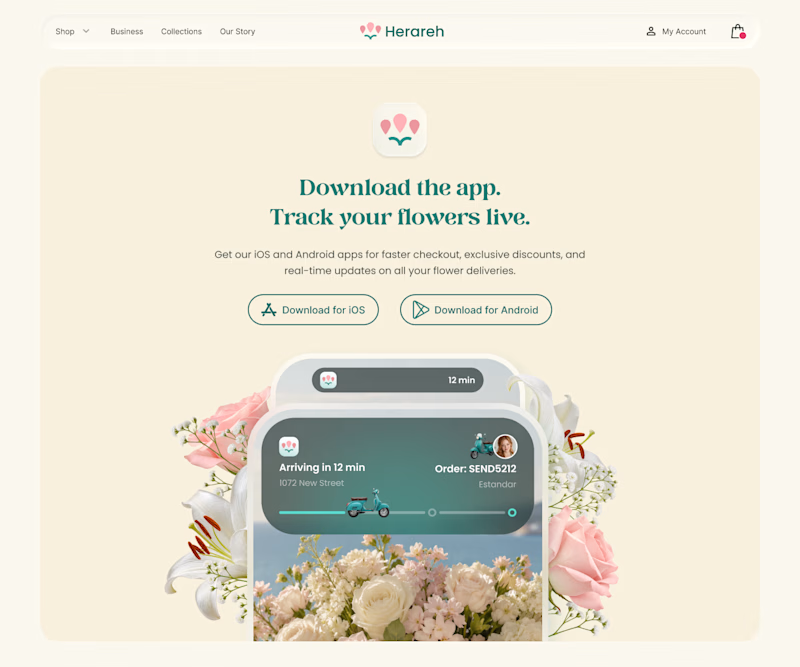
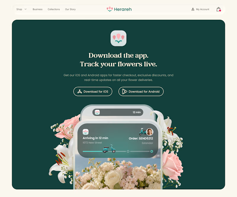
Which version makes you want to download the app? 🌸
I’m exploring two color directions for Herareh’s app download section. Vote A or B and tell me why—I’d love your perspective!
4 voted
24%
13 voted
76%
17 votes
Closed

deep green feels so lovely, good work