The network for creativity
Join 1.25M professional creatives like you
Connect with clients, get discovered, and run your business 100% commission-free
Creatives on Contra have earned over $150M and we are just getting started
Back to feedPost

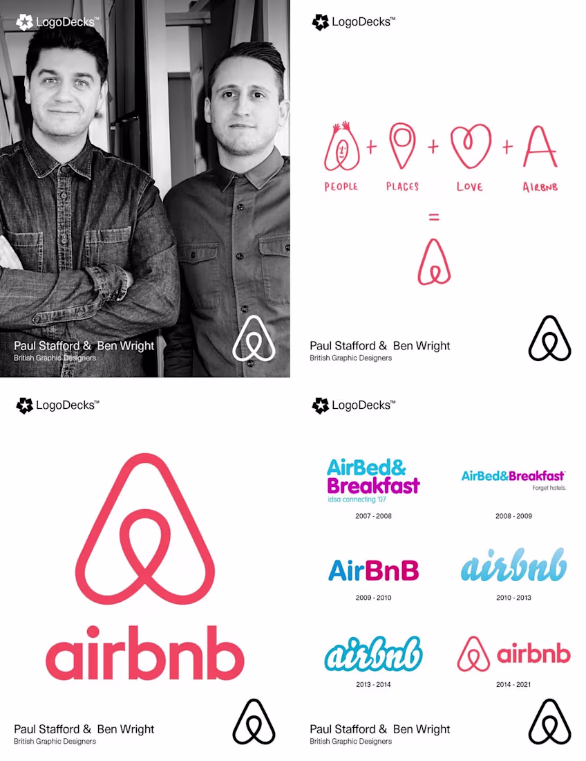
🚀 DAY 14 - POSTING LEGENDARY DESIGNS HISTORY - FOLLOW FOR MORE 🚀
The 2014 Airbnb rebrand by British designers Paul Stafford and Ben Wright is a landmark in modern identity design. Moving away from the company’s original blue script, they introduced the "Bélo," a minimalist symbol representing "belonging." To capture the brand's soul, the duo embedded their team at Airbnb’s headquarters and sent designers to stay with hosts across four continents. The resulting logo is a synthesis of four icons: a head, a location pin, an inverted heart for love, and the letter ‘A’. However, the launch was met with controversy over its striking similarity to the 1975 logo for the Azuma Drive-In, designed by Akisato Ueda.
The network for creativity
Join 1.25M professional creatives like you
Connect with clients, get discovered, and run your business 100% commission-free
Creatives on Contra have earned over $150M and we are just getting started
Related posts

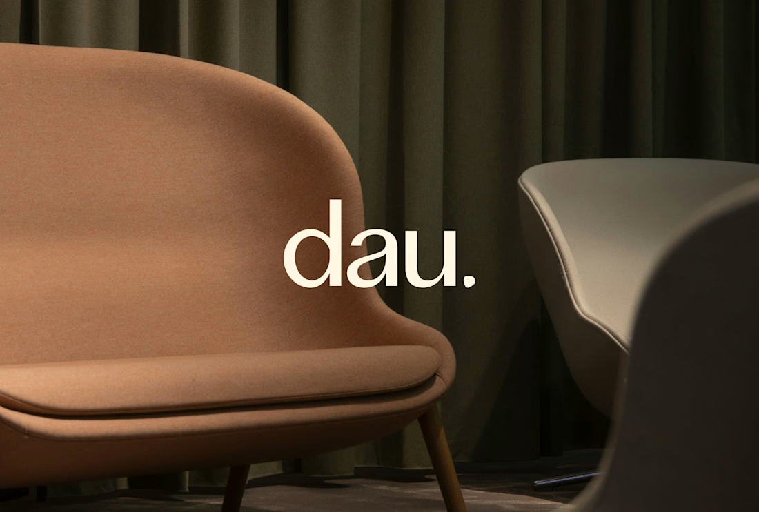
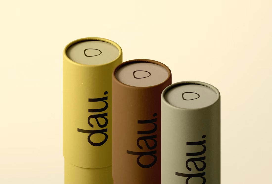
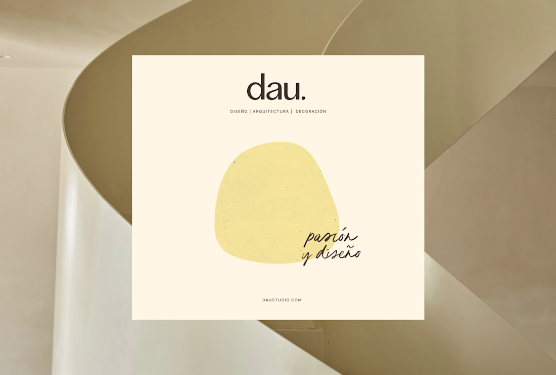
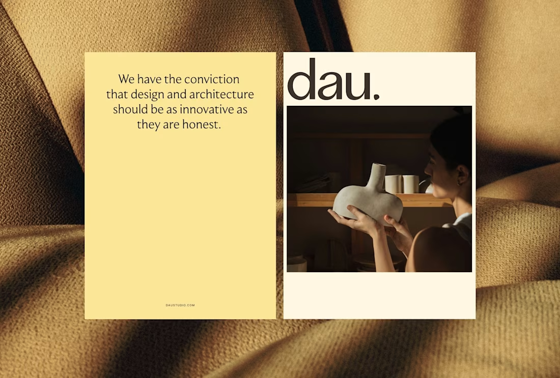
Sometimes a small detail can shape the entire identity.
An architecture and interior design studio, wanted a brand that felt more approachable within the industry.
One small detail became key: the dot in the name.
Instead of keeping it perfectly geometric, we softened it. Made it more fluid. From there, it evolved into a linear form that helped shape the brand icon, reflecting the idea of transforming a space.
That same point, combined with textures, became a recurring element across the identity. A simple detail, but one that makes the brand feel more recognizable and cohesive.
Do you usually find concepts in small details like this, or start from something bigger?
branddesignerbrandingstudioarchitecturebrandingBrand DesignBrand StrategyAdobe IllustratorAdobe InDesignFigma


The colors are so perfect!!!🔥 🙌

JAMMED- Branding & Packaging Design
A contemporary jam brand exploring the intersection of
food, fashion, and visual culture.
Built through a bold identity system and expressive imagery.
See more → @ThinkOnTheEdge
What flavor are you choosing? :)


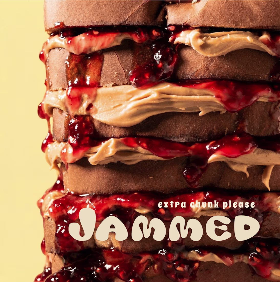
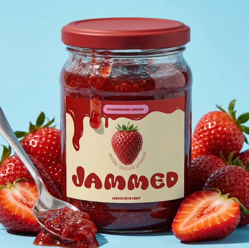
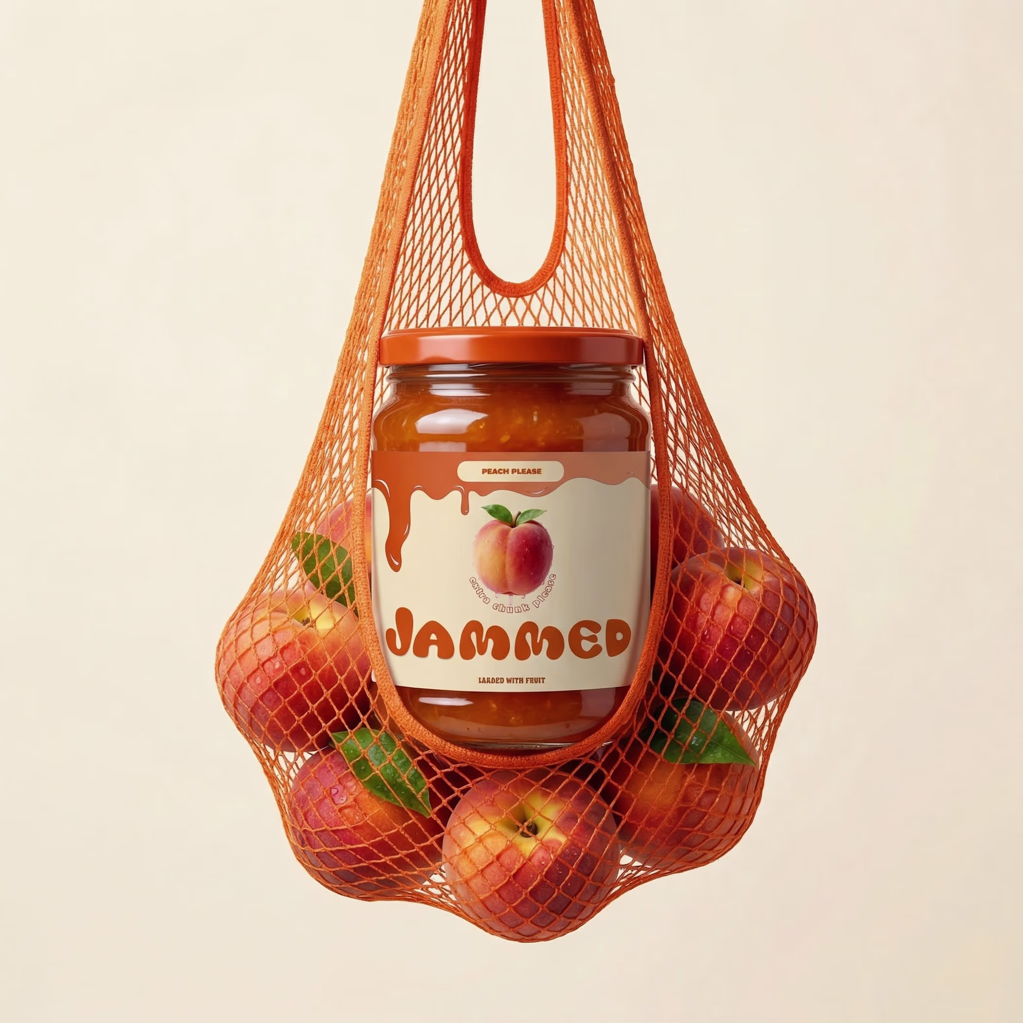

JAMMED is such a fun brand concept. The identity is loud and playful in the best way. That strawberry packaging is so good

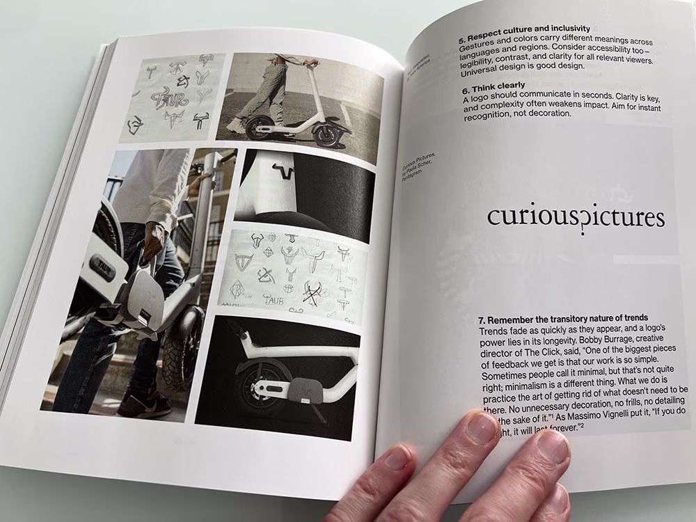
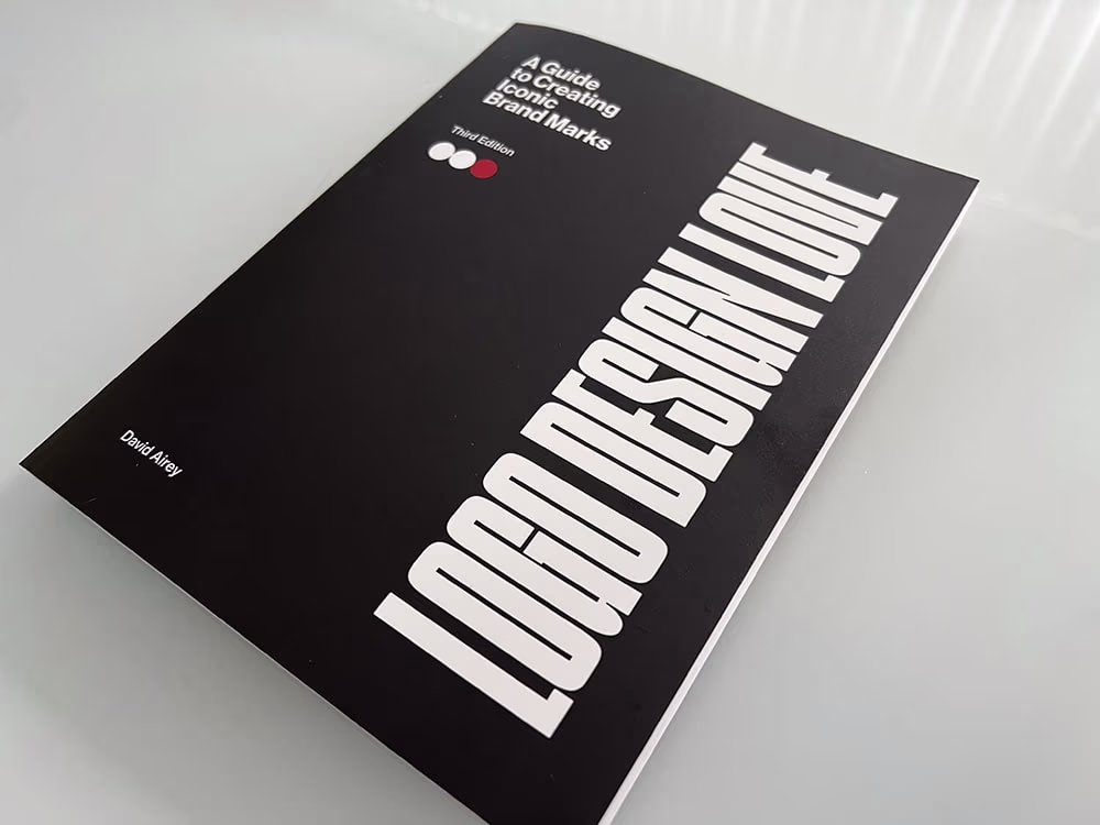
I've been lucky to be featured in a few books over the years, but when David Airey asked me to be in his new book, I jumped at the chance!
I've been a huge fan of his previous work, two of which I own.
Identity Designed: The Process
Identity Designed
So, to be in his new 'Logo Design Love - A Guide to Creating Iconic Brand Marks' is nothing short of awesome!
If you're not already familiar with his, I recommend getting at least one. His books are the kind you buy for yourself and then end up gifting to everyone you know. Identity Designed and Identity Designed: The Process are industry staples that shaped how alot of us think about brand identity.
And if that wasn't enough, I'm placed right next to Paula Scher! I had to read that twice. 🙏
I can't wait to dig through these pages!

love this


Trending


Figma Make
Go from idea to prototype in minutes. What are you designing?
brandguidelines
Brand guidelines are becoming living systems, not static documents. What are you building for your clients?
aivideo
AI video tools are moving at warp speed. Which ones are you experimenting with?
illustration
Handcrafted illustration is bubbling up across the web. What are you drawing lately?
freelancerlife
Freelancer life is wins, pivots, and everything in between. What’s yours right now?