The network for creativity
Join 1.25M professional creatives like you
Connect with clients, get discovered, and run your business 100% commission-free
Creatives on Contra have earned over $150M and we are just getting started
Back to feedPost

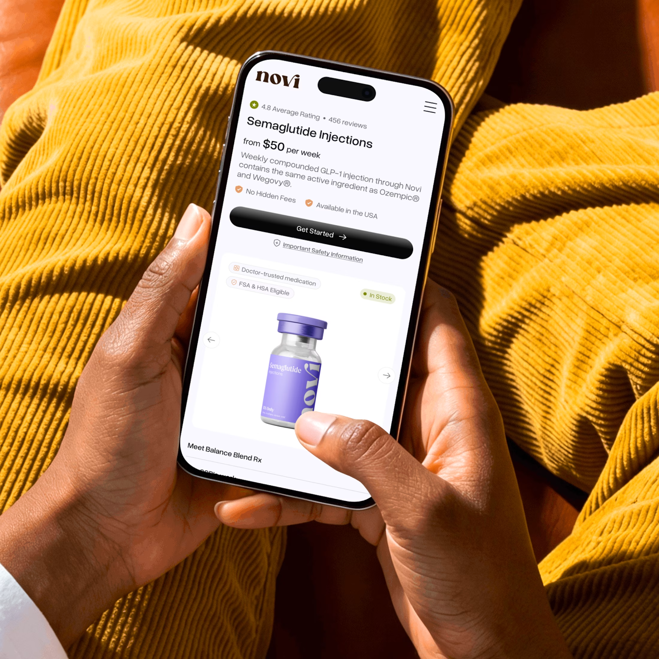
A lot of telehealth e-commerce brands lose sales on the product page, not the homepage.
More than 85% of customers browse on mobile. They click an ad, land on a product page, and the first thing they see is a huge image pushing the price and “Get Started” button below the fold.
The more effort it takes to find the next step, the more likely potential customers are to leave before starting the intake form.
Nobody complains. They just close the tab and go to a competitor.
The fix is often simpler than you think:
→ Keep the price and CTA visible without scrolling
→ Show the key benefits upfront
→ Add social proof close to the decision point
If your store gets plenty of traffic but struggles to convert, open your best-selling product page on your phone.
How quickly can you find the price, key benefits, and “Get Started” button?
Need help improving your website’s conversion rate? DM me. Let’s turn more of your traffic into customers.
#Telehealth #Ecommerce #UXDesign #ConversionRateOptimization #MobileFirst


The network for creativity
Join 1.25M professional creatives like you
Connect with clients, get discovered, and run your business 100% commission-free
Creatives on Contra have earned over $150M and we are just getting started



Related posts




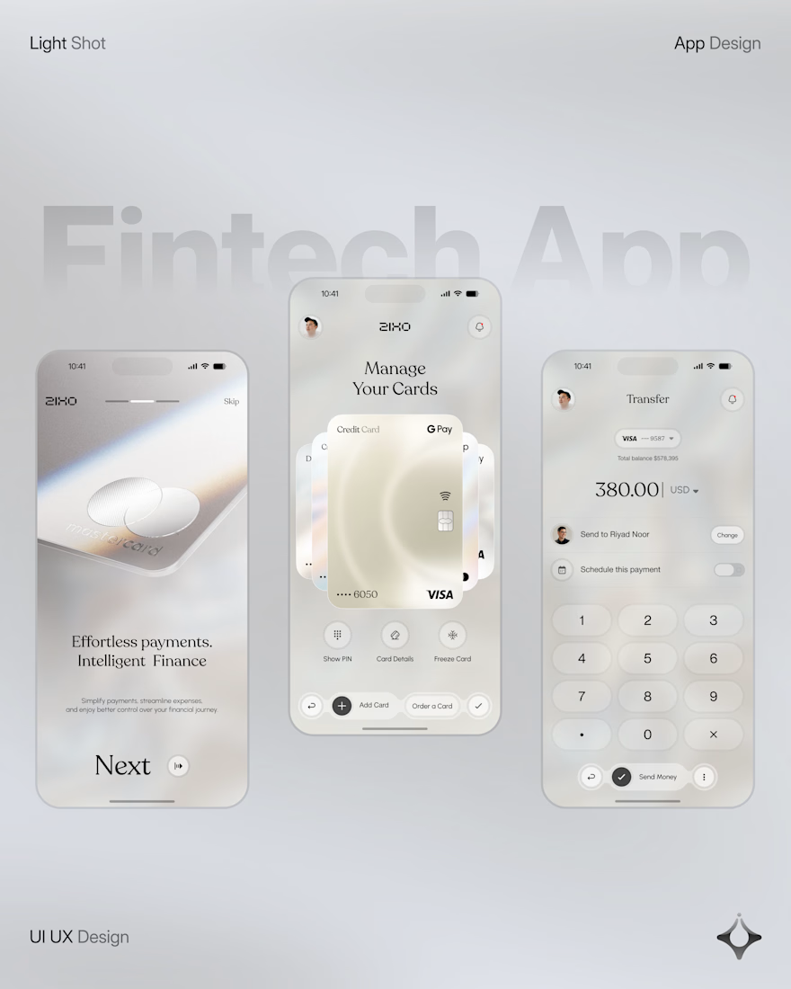
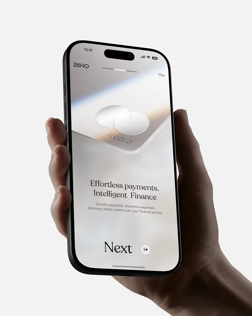
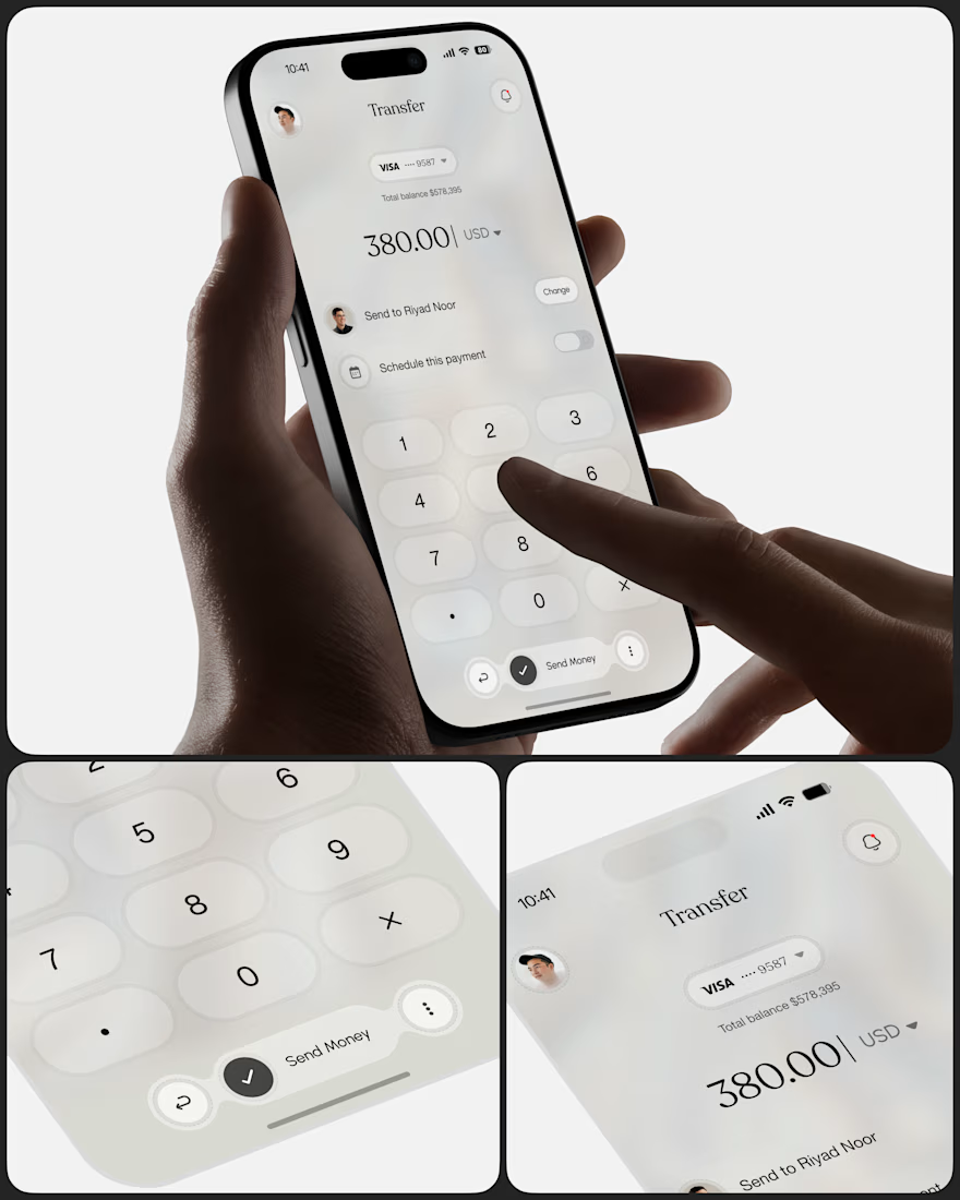
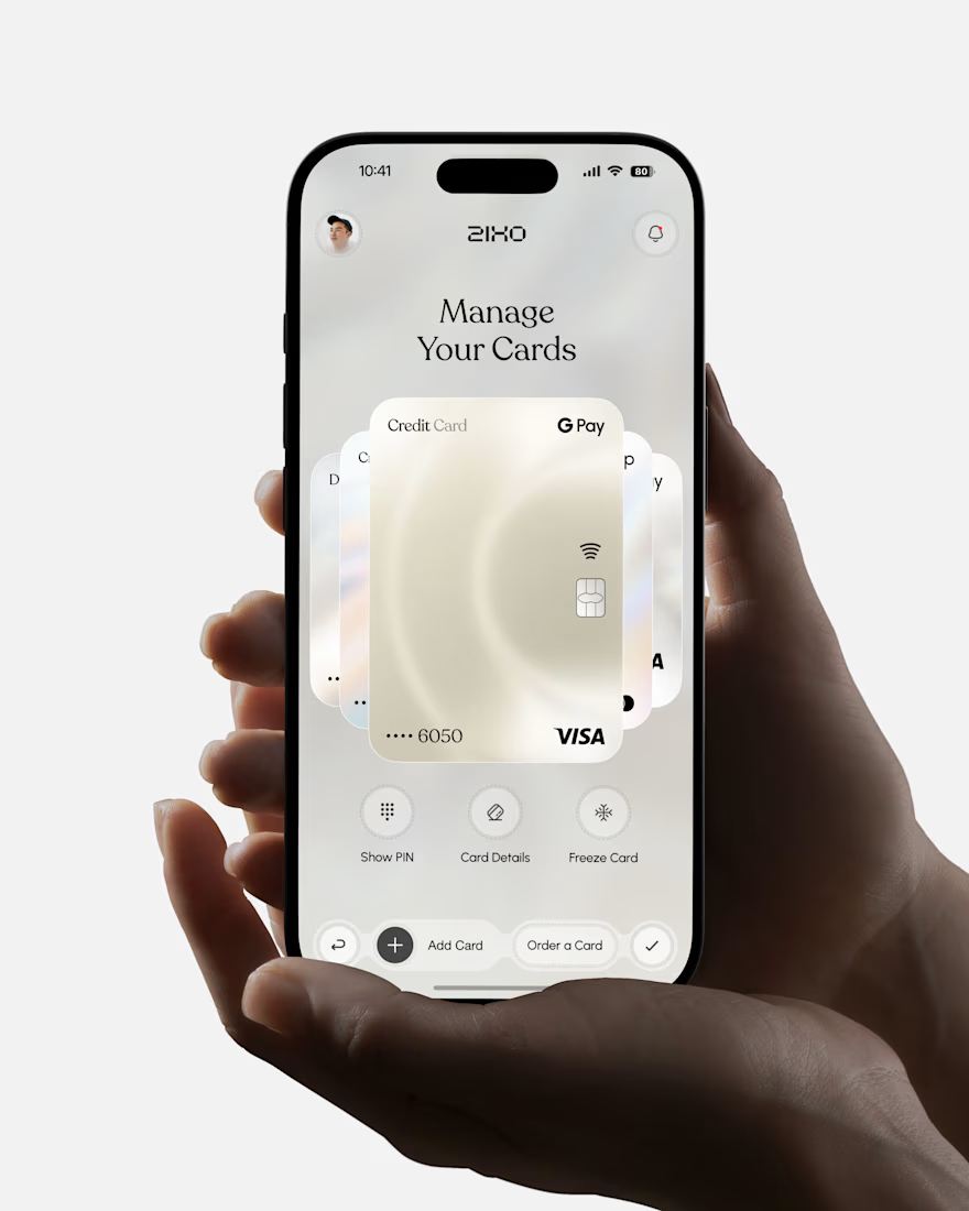
People don’t just want a banking app. They want to feel in control of their money.
Great fintech design doesn’t just look premium. It makes money feel simpler, safer, and easier to control.
Meet Ziko, a mobile banking concept where every interaction is designed to reduce friction and build trust.
What wins your trust first: 🔒 Security, ✨ Simplicity, or ⚡ Speed?



Stunning