The network for creativity
Join 1.25M professional creatives like you
Connect with clients, get discovered, and run your business 100% commission-free
Creatives on Contra have earned over $150M and we are just getting started
Back to feedPost
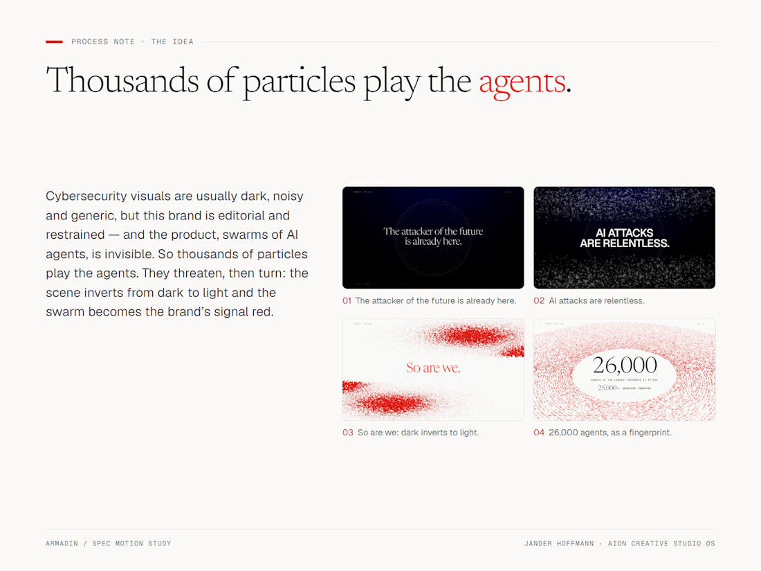
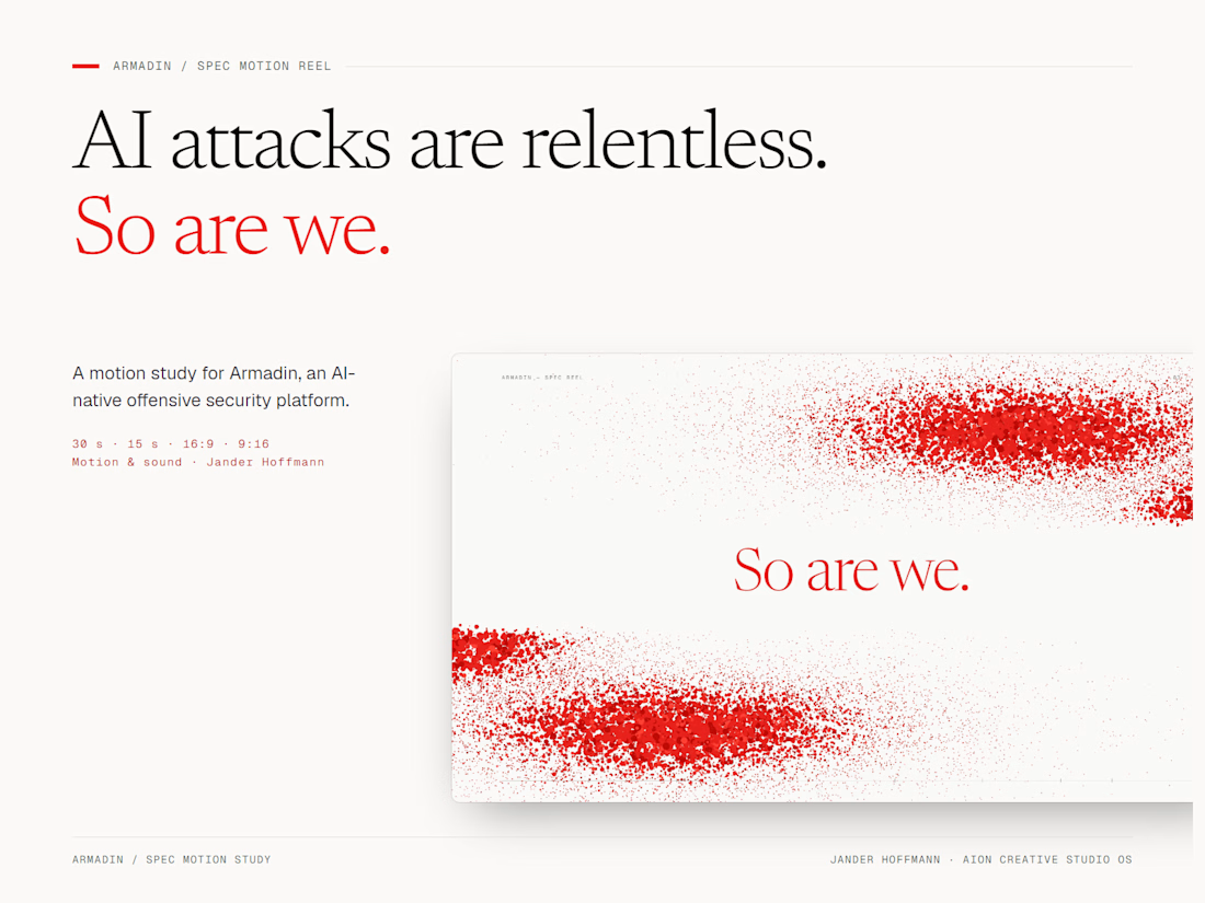
Cybersecurity doesn’t have to look like a hacker movie.
Armadin’s brand is editorial and restrained, so the film avoids the usual dark noise. The agents are a single particle system [swarm, fingerprint, 3D attack map] and the only colour is the brand’s signal red.
What cliché would you ban from your category?
The network for creativity
Join 1.25M professional creatives like you
Connect with clients, get discovered, and run your business 100% commission-free
Creatives on Contra have earned over $150M and we are just getting started
Related posts

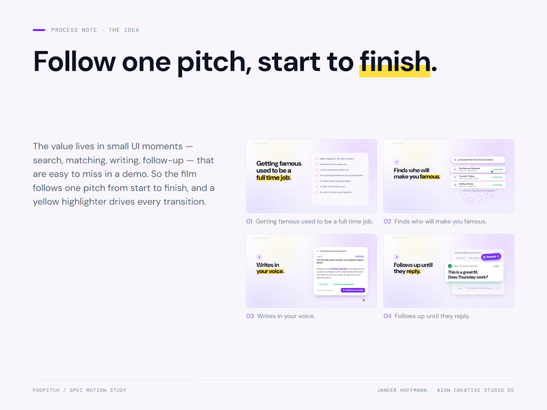
Small UI moments get lost in demos.
Search, matching, writing and follow-up. Each is a few pixels in a real product. So instead of a tour, the film follows a single pitch from start to finish, and every step gets its own beat.
What’s the one gesture your product could own?

The yellow highlights are a lovely touch.

Testing doesn't have to slow your team down.
A motion design concept for Hostable focused on simplifying the testing workflow.
A flowing gradient path, glowing UI elements, and smooth transitions turn a technical process into a simple and visually engaging experience.

The gradient path leading the eye to Run workflow works well. Did you build the loop in After Effects?

Smart glasses UI, but make it calm.
Most HUDs look like someone spilled a spreadsheet on a fighter jet. We wanted something you’d actually want an inch from your eyeball.
So we went big and quiet. Giant type hides behind the people and objects, so the interface and the picture become one thing. The tennis player steps in front of the score like he owns it. Lucy just gets to be Lucy.
Then we got a little obsessive: tiny coordinates, tracking boxes chasing a ball, an “MVP” tag floating next to a trophy, just because. Nobody will read it all. That’s the point.
Only one moment gets to be loud: the call screen. Pink on one edge, green on the other. Decline, accept. Our favourite thing in the set, and yes, we’re a bit in love with it.
Sound on. Tell us what you’d cut, what you’d keep, and what you’d make even bigger.

