The network for creativity
Join 1.25M professional creatives like you
Connect with clients, get discovered, and run your business 100% commission-free
Creatives on Contra have earned over $150M and we are just getting started
Back to feedPost

Full wireframing, web layout and UX concept, with full, from-scratch copy and coordination of work with the graphic designers and HubSpot developers.


The network for creativity
Join 1.25M professional creatives like you
Connect with clients, get discovered, and run your business 100% commission-free
Creatives on Contra have earned over $150M and we are just getting started





Related posts

Which hero direction feels right for this founder-focused brand?
While working on the homepage for Sean Parsons, a brand focused on empowering non-technical founders to launch tech startups, I explored two different visual directions for the hero section. Same message, same structure, just a different mood and color system.
Option 1 - Warm Olive. Dark, grounded, and editorial, giving a warm, established, expert feel.
Option 2 - Light Purple. Clean, modern, and vibrant, giving a fresh, SaaS-like, approachable feel.
Would love your honest UX/UI take, which direction feels more trustworthy, engaging, and aligned with a founder-focused brand, and why?
25 voted
69%
11 voted
31%
36 votes
Closed

I like worm Olive most because it has different personality

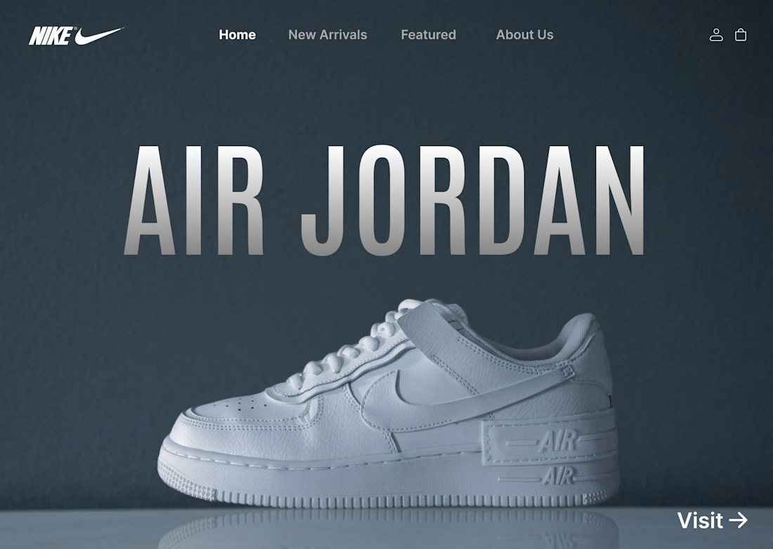
I designed a clean, minimalist e-commerce concept for Nike centered around the iconic Air Jordan series. The goal was to create a bold, modern hero section that instantly grabs attention while keeping the navigation effortless for shoppers.
Key Highlights:
Hero Visual: Featured high-resolution shoe imagery paired with bold display typography.
Minimal Layout: Dark, muted color scheme that makes the product pop without visual noise.
Streamlined UI: Essential navigation tabs paired with a direct CTA for seamless user flow.
#UIDesign #UXDesign #Figma #WebDesign #NikeConcept #LandingPage #DesignShowcase #UXUI #ECommerceDesign

From problem to polished product.
I started by identifying the UX problems, then refined the same product through better structure, hierarchy, spacinga navigation, and interactions making the experience clearersimpler, and easier to use.
1 voted
50%
1 voted
50%
2 votes
Closed