The network for creativity
Join 1.25M professional creatives like you
Connect with clients, get discovered, and run your business 100% commission-free
Creatives on Contra have earned over $150M and we are just getting started
Back to feedPost

Brand Design Exploration — PRODA 🥤
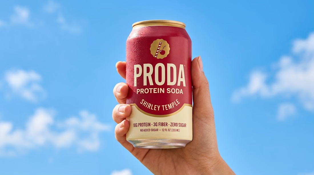
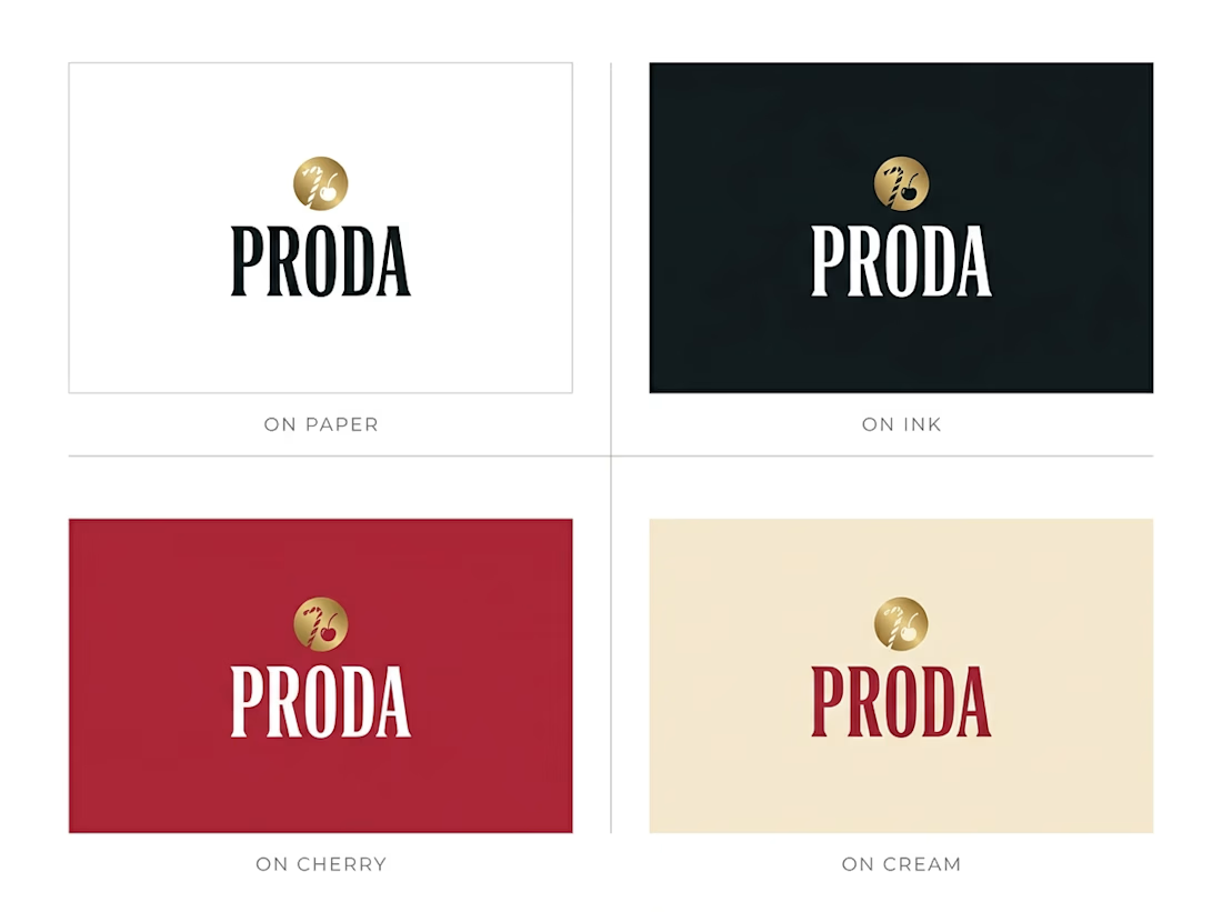
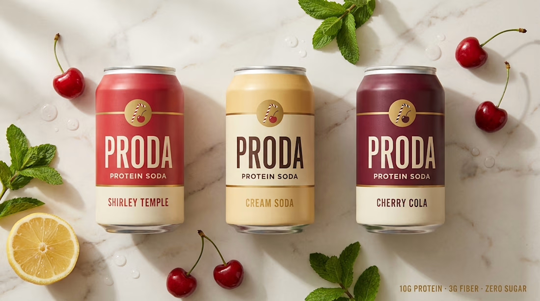
I explored a bold visual direction for PRODA, a new protein soda built around a simple idea: make functional nutrition feel genuinely fun.
10g protein. 3g fiber. Zero sugar.
Nostalgic flavors. Modern positioning.
The challenge was to create a brand world that could sit somewhere between better-for-you nutrition and nostalgic soda culture — energetic, playful, confident, and unmistakably contemporary.
I developed the visual direction using Higgsfield + Claude MCP, exploring how AI-assisted creative workflows can push brand identity, art direction, and product storytelling further.
From the packaging language to the overall visual system, the goal was simple:
Make protein feel exciting. Not clinical.
A personal exploration in building a consumer brand with a strong shelf presence and an even stronger personality.
#BrandDesign #BrandIdentity #PackagingDesign #CreativeDirection #ArtDirection #ConsumerBrands #CPG #AIForDesign #Higgsfield #Claude #Contra #GraphicDesign


The network for creativity
Join 1.25M professional creatives like you
Connect with clients, get discovered, and run your business 100% commission-free
Creatives on Contra have earned over $150M and we are just getting started





Related posts





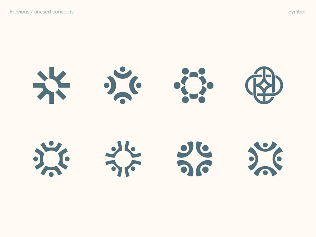
Rejected logo concepts exploring collaboration, shared expertise & working side by side

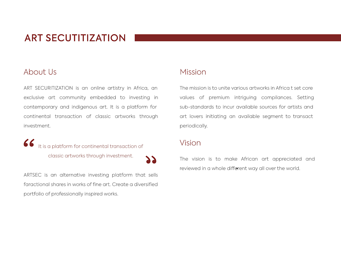
ARTSEC is an art investment platform focused on making African contemporary and indigenous art more accessible to collectors and investors.
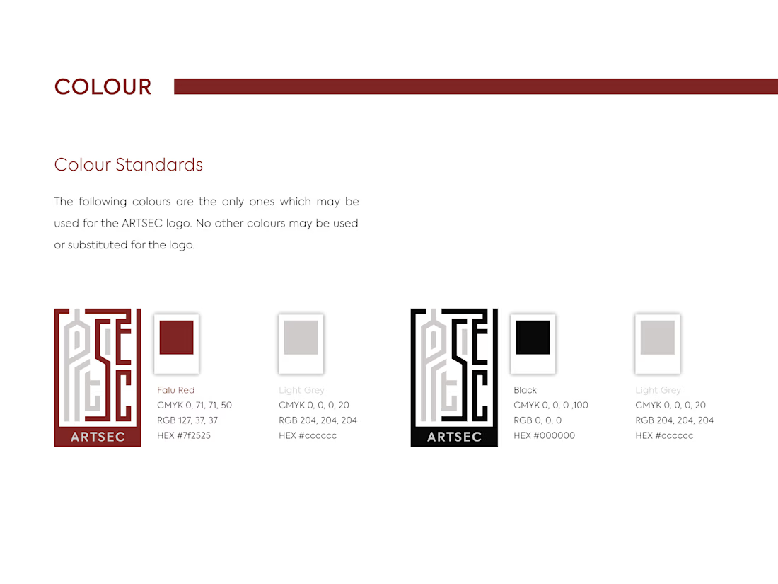
I developed a complete visual identity system for the brand, including the logo, colour palette, typography and usage guidelines.
The identity was designed to give ARTSEC a distinctive, consistent visual presence while reflecting its connection to African art and culture across print and digital applications.

Can't stop looking at this! 😍