The network for creativity
Join 1.25M professional creatives like you
Connect with clients, get discovered, and run your business 100% commission-free
Creatives on Contra have earned over $150M and we are just getting started
Back to feedPost
Fruitea — Turning a Summer Craving into a Brand
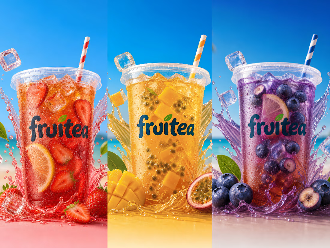
For this challenge, I created Fruitea—a fictional tropical iced tea brand inspired by a simple summer craving.
On a 40°C day, I was craving something cold, colorful, and refreshing. I don't live anywhere near a beach, so instead of chasing that feeling, I decided to create it.
The goal wasn't just to design an iced tea brand. I wanted to create something that would make people crave the drink before they even took the first sip.
Creative Direction
I started by collecting inspiration on Pinterest before creating a quick vision board with ChatGPT to visualize the idea.
From there, I refined the concept into a clean, minimal identity where the drinks became the hero. Every decision—from the logo and flavors to the packaging and animations—was guided by one question:
"Does this make you want to reach for the drink?"
Using Envato
Envato became the primary creative toolkit behind Fruitea.
I used:
- ImageGen AI to create and refine the brand identity.
- VideoGen AI to animate the drinks.
- Stock footage to build the tropical atmosphere.
- Music to reinforce the mood.
- Canva to assemble the final campaign and workflow.
Human by Design
The most important part of this project wasn't generating images—it was making creative decisions.
Some of the biggest moments included:
- Refining the logo until it felt playful instead of generic.
- Reworking the drinks until they looked like refreshing iced tea instead of juice.
- Spending the most time refining the strawberry flavor until its animation matched the realism and movement of the other drinks.
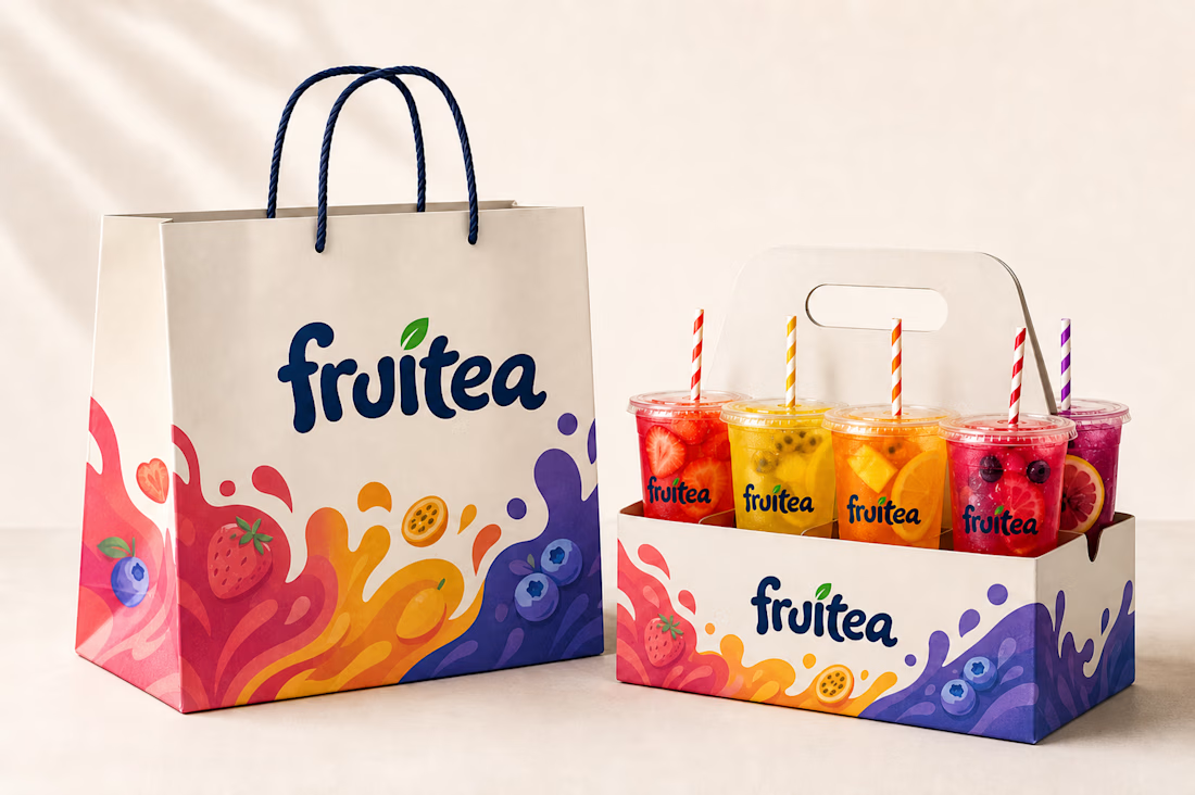
- Keeping the packaging minimal so the drinks remained the hero.
- Opening the promo with fresh ingredients before revealing each drink to build anticipation and help viewers imagine the flavor.
Those decisions couldn't be made with a single prompt. They came from continuously refining, rejecting, and improving the work until it matched the feeling I had imagined from the very beginning.
The Project Includes:
- Brand Identity
- Logo Design
- Packaging Design
- Three Signature Drink Concepts
- Animated Product Visuals
- Promotional Campaign
- Workflow & Creative Process
Created using Envato
Envato tools used:
- ImageGen AI
- VideoGen AI
- Stock Footage
- Music
I couldn't have that perfect tropical drink...
...so I created it.
Instagram: https://www.instagram.com/nirvanadigitals.1/p/Da3LkFFDG1V/
Youtube: https://youtu.be/S9HpFx3-ZaU
X: https://x.com/Appleginger1234/status/2077815195750265145?s=20
LinkedIn: https://www.linkedin.com/posts/aqsaa-khalid_envatochallenge-humanbydesign-creative-ugcPost-7483578124627070976-WqQv/?utm_source=share&utm_medium=member_desktop&rcm=ACoAAEZi-pAB9ZlLL_xc_QCxLVaiZEUfqV09kuo
@envato
#EnvatoChallenge #HumanByDesign #Creative



Love how this isn't just a collection of AI outputs, it actually documents the creative decisions behind them. The refinement from the early concepts to the final brand really shows the "Human by Design" theme. Great work.

Thank you so much! It means a lot to hear that. I wanted the workflow to tell the story behind every decision.
Which one are you grabbing first?
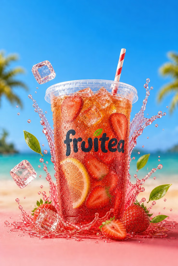
🍓 Strawberry Lemon
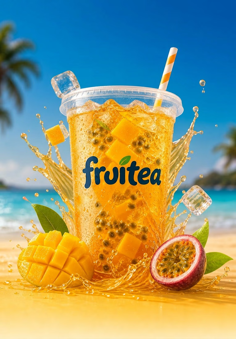
🥭 Mango Passionfruit
🫐 Blueberry
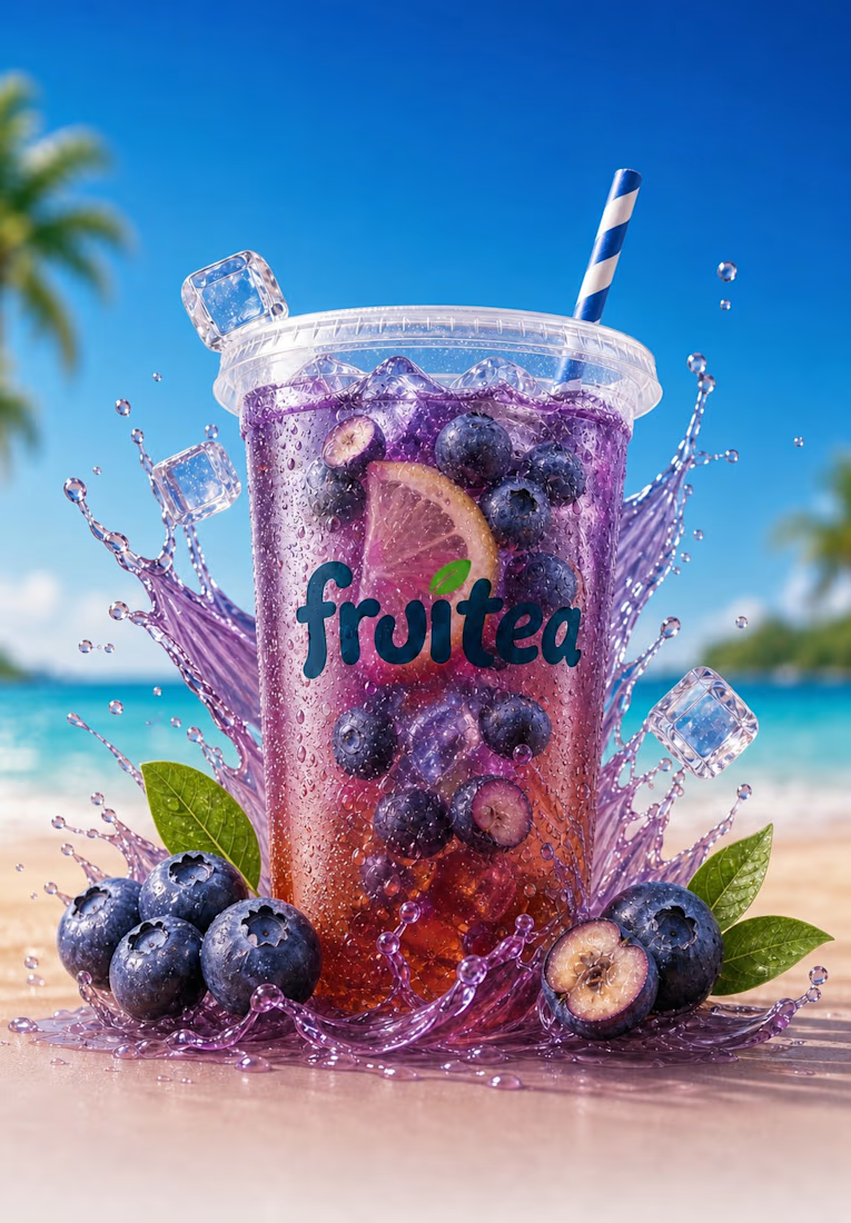


I NEVER skip anything blueberry!

Definitely Strawberry!
Thank you! That consistency was one of my biggest goals throughout the project.
The strawberry evolution was my favorite part. Seeing how much you refined it before settling on the final version really highlights the value of creative direction over simply accepting the first AI result.
Thank you! Strawberry definitely tested my patience, but getting it right was worth it.
The idea of turning a summer craving into a complete brand is such a simple but memorable concept. It gives the whole project a clear story instead of just looking like another AI showcase.
Thank you so much! I'm really happy the story came across that was the heart of the project.

The promo instantly made me crave an iced tea. Mission accomplished!
I feel proud of myself! 😂


Fantastic work!
Thanks!

Aqsa fantastic work 🫠
Appreciated Salman!

I watched the whole workflow, and it never felt boring. That's impressive.
That means alot💕

The branding is so cohesive. Everything feels like it belongs together.

This honestly feels like a brand I'd expect to see on a store shelf. Great work!

Love the summer vibes! ☀️🍹
🏖☀️🍹

This came together beautifully!
Thank you Qirrat!

Thanks David

Grate work
Thanks Adeyemi


This looks clean and well thought out. How long did it take you to bring everything together?
It took me 5 days, as it was my first time using envato.
Great !!

great design
Thanks Subrata


Fantastic
Thanks Zakari!

I love this

So soothing to watch👌
Thanks!

Good work. Keep it up
The network for creativity
Join 1.25M professional creatives like you
Connect with clients, get discovered, and run your business 100% commission-free
Creatives on Contra have earned over $150M and we are just getting started

Challenges
View all


Related posts

One of my first identity projects from 2021. 🥹

SVNT was a skincare brand built around inclusivity, accessibility, and shaping the future of beauty. My goal was to reflect that through a futuristic but clean visual identity, keeping the system modern and simple while giving the brand room to celebrate individuality.
Looking back at this project four years later, it’s interesting to see what decisions still feel relevant to me today.
Do you ever revisit your early work and realize your design instincts were already there?

Curious - how did you approach making futuristic not feel cold, to keep the inclusivity/accessibility warm? The balance here is really nice.

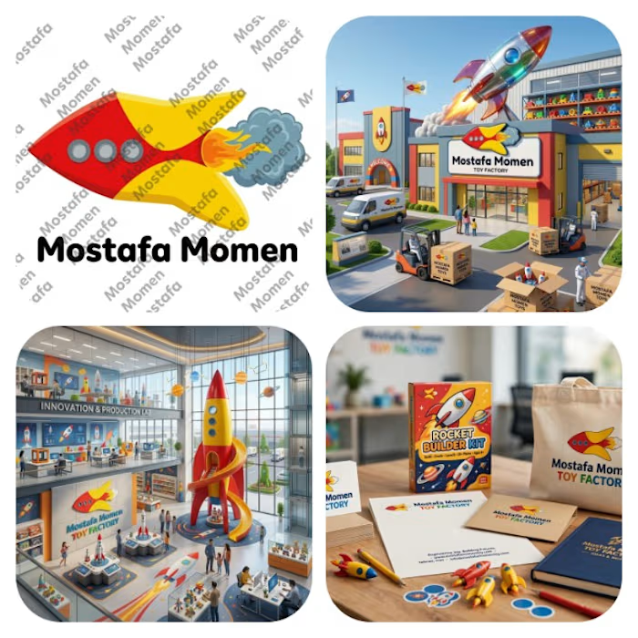
That's my modern minimalist joyful logo that's my case study for it Everything has its joy and kids toys has its own I design this logo because I want to try something different
This logo is mix between vibrant pure yellow and red colors with bold curvy cartoony rocket with cartoony fire and smoke
this logo focus on emotion fun and joy it help to solve the problem of (building trust, showing professionalism & value of brand, memorization, recognition) specially creating attention to attract kids and potential clients




Real Estate Agency Logo
A brand identity concept for a modern real estate agency, designed to create a professional and recognizable presence across digital and physical touchpoints.
The logo system focuses on simplicity, scalability and distinctiveness — allowing the identity to work across property listings, signage, stationery, social media and web applications.
The goal was to create a mark that feels established without falling into familiar real estate branding clichés.
Design focus:
• Logo Design
• Real Estate Branding
• Brand Identity
• Visual Identity
• Brand Applications
• Art Direction
Designed by WaxyWeb.
Brand DesignGraphic DesignAdobe IllustratorAdobe PhotoshoprealestatelogoLogo Designbrandinggraphicdesign


Good!