The network for creativity
Join 1.25M professional creatives like you
Connect with clients, get discovered, and run your business 100% commission-free
Creatives on Contra have earned over $150M and we are just getting started
Back to feedPost



The network for creativity
Join 1.25M professional creatives like you
Connect with clients, get discovered, and run your business 100% commission-free
Creatives on Contra have earned over $150M and we are just getting started




Related posts

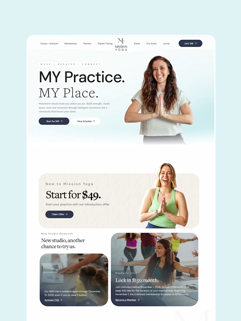
A yoga studio website shouldn’t feel like a fitness website.
I designed Mission Yoga around three things:
A calm, editorial visual experience
Clear paths to classes, memberships, and teacher training
Strong CTAs without making the experience feel overly sales-driven
The lesson: Good wellness design isn’t just about looking calm — it should make people feel comfortable enough to take the next step.
What do you think matters more for a wellness website: visual calm or clear conversion paths?


They aren't opposites visual calm is the conversion path here. If a yoga site feels cluttered or rushed people drop off before they even look at prices.

I just published a new @Framer template for nutritionists and health coaches.
Most wellness sites are either clinical and cold or sage green with leaf illustrations. I went warmer. Cream, wheat, terracotta, print magazine spacing.






Looks Clean and Clear.

Strategic SEO & High-Quality Backlink Building
"Executed a comprehensive link-building campaign to secure high-authority backlinks for the client's website. Focused on driving organic traffic, improving search engine rankings, and boosting domain authority through white-hat SEO strategies."
Live Backlink Deliverables:
Blog / Article (Medium):
Business Directory (Sulekha):
Sulekha Business https://share.google/oGVxExA2rkWWbWGN4
Events Platform (AllEvents):
Q&A Platform (Quora):

medium.com
Unlocking Team Potential: How Escape Rooms Are Redefining Corporate Bonding in Bangalore
In today’s fast-paced business landscape, workplace dynamics have transformed dramatically. Traditional corporate team-building exercises…