The network for creativity
Join 1.25M professional creatives like you
Connect with clients, get discovered, and run your business 100% commission-free
Creatives on Contra have earned over $150M and we are just getting started
Back to feedPost

Aura — 4 Flavor CGI Beverage Commercial | Hyper Motion


The network for creativity
Join 1.25M professional creatives like you
Connect with clients, get discovered, and run your business 100% commission-free
Creatives on Contra have earned over $150M and we are just getting started



Related posts

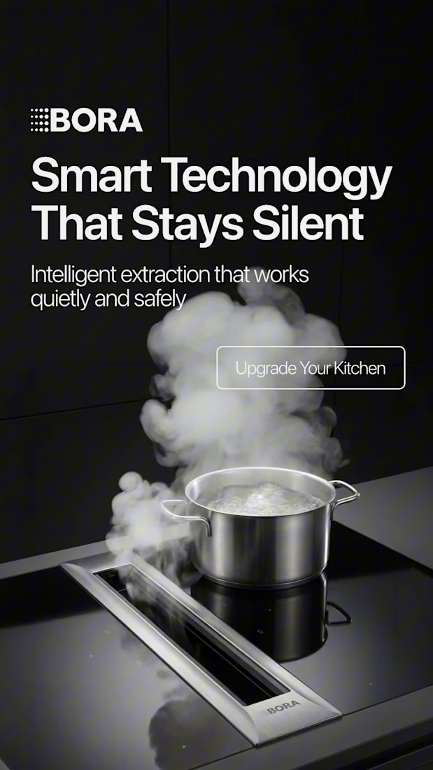
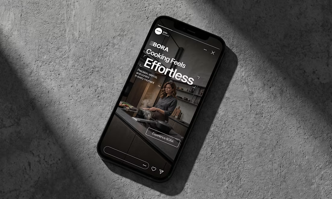
BORA – Ad Creative Concept
Most kitchen appliance ads sell you the warm family dinner. I wanted to try the opposite.
Built this BORA concept as a portfolio piece, treating the product like architecture instead of tech – dark marble, concrete, no hands, no food styling. Just a pot, steam, and silence.
The steam does all the movement in the motion piece. Typography stays out of the way – one line, low CTA, nothing fighting the composition. Turns out when you strip out the lifestyle, the price point sells itself.



Treating the appliance like architecture is a strong direction.

Exploring 3D interactions and brutalist scale for Kinetix — a portfolio concept centered on design systems and digital products.
Focused on balancing heavy typography with fluid, tactile motion so the 3D element feels integrated rather than decorative.
Curious to hear your thoughts: does the 3D rotating showcase feel smooth and intuitive, or do you prefer flat, high-speed interactions for portfolio heroes?

The rotating 3D works here precisely because you kept it integrated, not decorative, so it reads as intent rather than showing off. For a portfolio hero I usually lean flat and fast, but this earns the motion. That heavy Kinetix wordmark has real physical weight.

Animated Event Video Poster | Tag der Clubkultur
Dynamic motion design and video poster created for the "COREspecs" event as part of Berlin's official Tag der Clubkultur festival series.
The visual concept merges an authentic underground Berlin aesthetic—featuring iconic transit motifs, gritty textures, and acid neon accents—with clean, structured typographic hierarchy and a fully synchronized lineup reveal.
Software & Tools: Adobe After Effects (motion design, compositing, visual effects, and expression-driven audio reactivity), Suno AI (custom industrial/EBM sound design and score).
Deliverable: Vertical looping video teaser optimized for social media promotion and digital event boards.
#


the yellow train going across the top is my favourite bit. is that real footage or did you animate it?
