The network for creativity
Join 1.25M professional creatives like you
Connect with clients, get discovered, and run your business 100% commission-free
Creatives on Contra have earned over $150M and we are just getting started
Back to feedPost
Taste Test

The network for creativity
Join 1.25M professional creatives like you
Connect with clients, get discovered, and run your business 100% commission-free
Creatives on Contra have earned over $150M and we are just getting started






Related posts

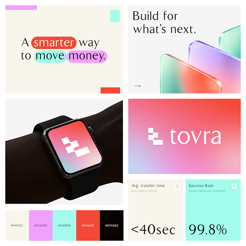
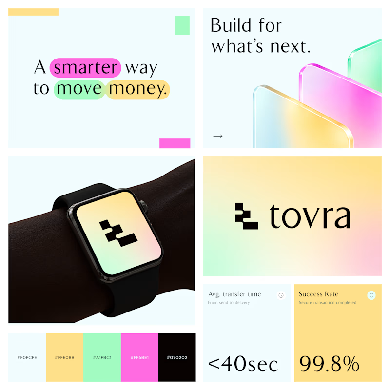
Two Color Directions. One Brand Identity.
Exploring two visual directions for Toyra, a modern fintech brand focused on making money movement smarter and simpler.
Both concepts feature bold typography, vibrant colors, playful gradients, and a clean visual identity.
Which color direction works better for Brand Option A or Option B? 👀
19 voted
40%
29 voted
60%
48 votes
Closed


Which design would make you more likely to join this botanical watercolor course?
Two new AI-generated Kajabi landing-page concepts for Petal & Pigment: soft editorial or bold studio. Same course, two different first impressions. Pick your favorite below—what made the difference?

18 voted
39%
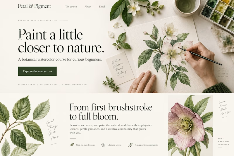
28 voted
61%
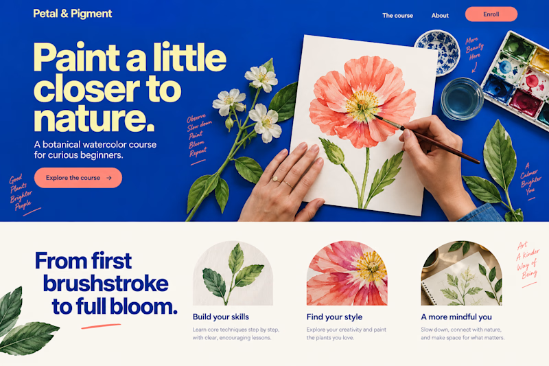
46 votes
Closed

✨ Two styles. One campaign. Which Daymade design hits differently?
I explored two creative directions for Daymade, combining lifestyle storytelling with bold typography and fresh, energetic colors. ☀️🥤
💛 Option 1: Fresh & Minimal 💗 Option 2: Bold & Playful
Which one grabs your attention? 👀
Cast your vote! 🗳️👇
25 voted
26%
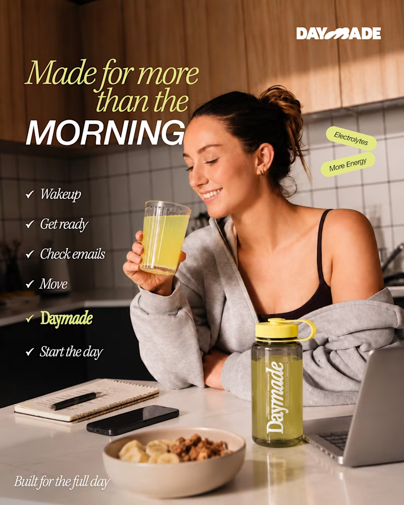
73 voted
74%
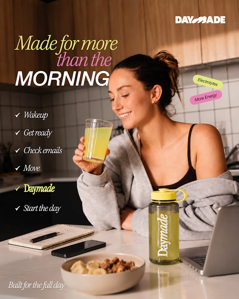
98 votes
Closed

Option 2 looks better