The network for creativity
Join 1.25M professional creatives like you
Connect with clients, get discovered, and run your business 100% commission-free
Creatives on Contra have earned over $150M and we are just getting started
Back to feedPost

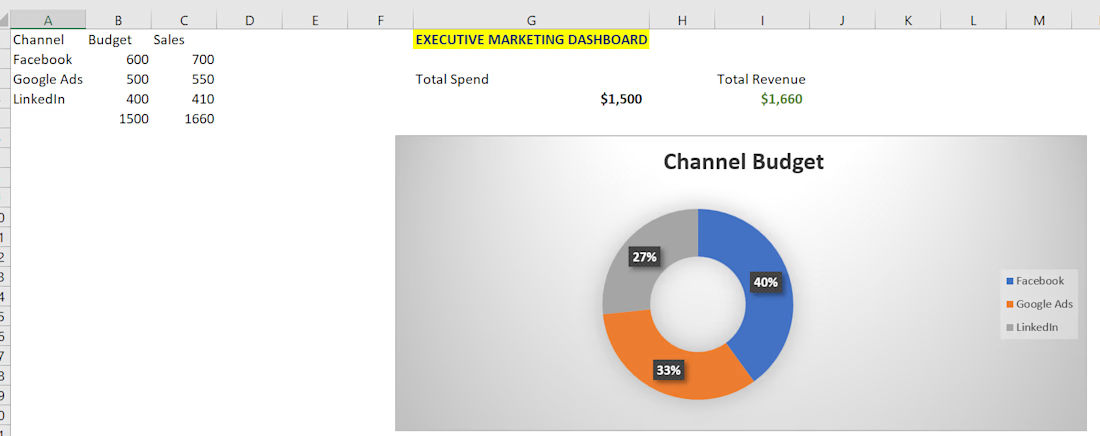
📊 Executive Marketing & Sales Dashboard | Data Visualization Project
Hey Contra Community! 👋
Here is a quick look at a high-fidelity Executive Performance Dashboard I designed to clean and present core business metrics seamlessly.
Key Frameworks Demonstrated:
KPI Summary Cards: Clean layout displaying Total Marketing Spend and Revenue Generated for instant C-level insights.
Channel Distribution: Built a customized Doughnut Chart with real-time percentage tracking to visualize budget allocation across digital channels (Facebook, Google Ads, LinkedIn).
Premium UI Design: Hidden gridlines and a sleek grey accent palette to deliver a modern SaaS-like data tool.
🚀 Available for freelance contracts and long-term roles in:
Advanced Excel Dashboard Design & KPI Tracking
Statistical Data Organization & Modeling
Accurate Data Entry & Spreadsheet Optimization
Let's turn your benched data into clear, functional assets! DM me directly or comment below to collaborate. 📈✨
The network for creativity
Join 1.25M professional creatives like you
Connect with clients, get discovered, and run your business 100% commission-free
Creatives on Contra have earned over $150M and we are just getting started





Related posts

Revlane Revenue: SaaS Dashboard Animation (Concept)
A concept animation for Revlane, a fictional revenue dashboard. The KPIs count up, the week's bars rise, and a trend line draws across. A "New record" toast slides in and the camera pushes in on the numbers. Then the cursor clicks Sunday's bar to open its value, and the view pulls back to the full dashboard.
Made in Jitter with Counter, mask reveals, and Scale and Move for the camera. Custom UI sound. 12-second loop.


The KPI count-up + bar rise + trend draw is a classic SaaS hero beat — the “new record” toast is a nice narrative punctuation before the camera push.


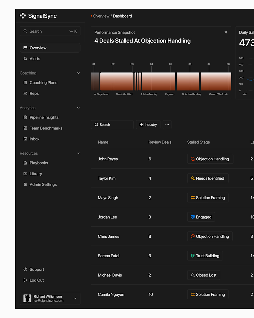

Super clean work!


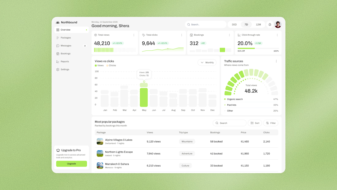

clean work