The network for creativity
Join 1.25M professional creatives like you
Connect with clients, get discovered, and run your business 100% commission-free
Creatives on Contra have earned over $150M and we are just getting started
Back to feedPost

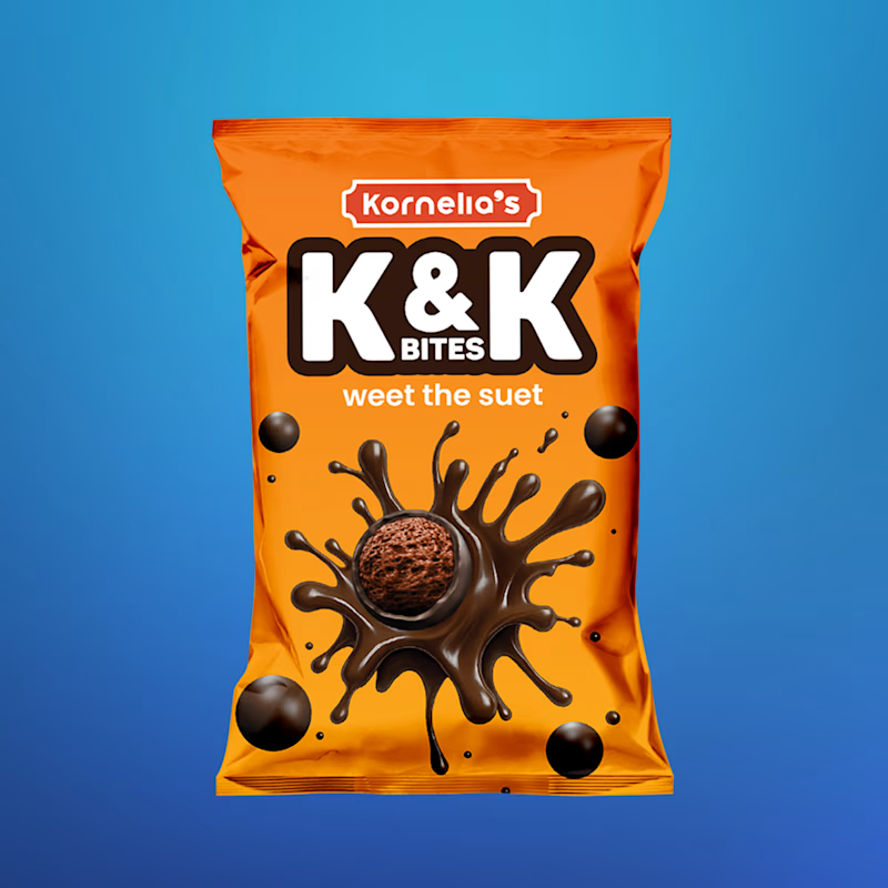
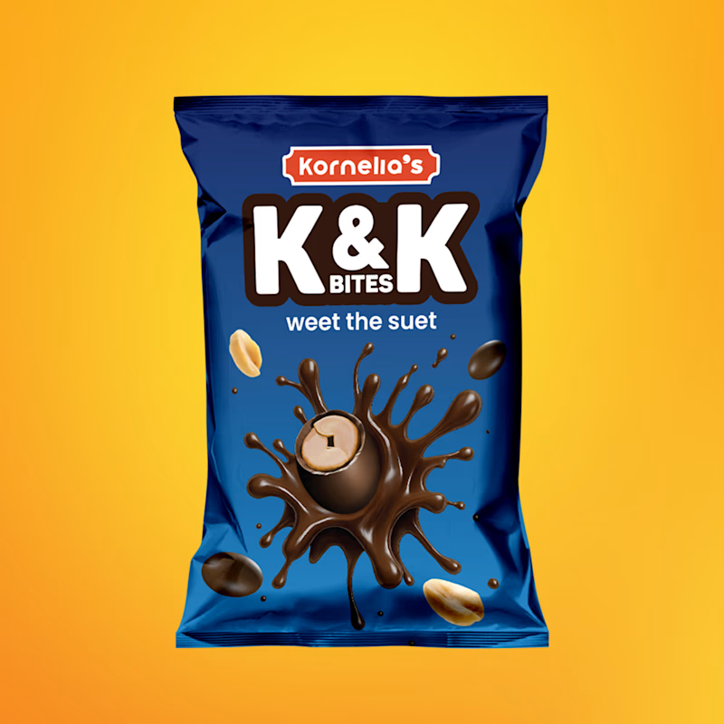
The color contrast on these is 🔥 Both versions stand out immediately, and the branding feels fun, bold, and memorable. Really solid packaging work!

Taking a packaging project from zero assets to a finished product is always a fun challenge.
For K&K Bites, I built out the sub-brand identity completely from scratch. We went with a bold, high-contrast palette, electric orange and royal blue, to make sure these pouches actually...
7 voted
78%
2 voted
22%
9 votes
Closed
The network for creativity
Join 1.25M professional creatives like you
Connect with clients, get discovered, and run your business 100% commission-free
Creatives on Contra have earned over $150M and we are just getting started
Trending
retrofuturism
Share your favorite designs from the past exploring the distant future. Or your own take on the aesthetic 🚀
halftone
Dots. Texture. Grain. Let's see your designs using the halftone technique.

Midjourney
Creatives are showing off what they're making with Midjourney.
colorgrade
Video editors sound off: How do you enhance the mood of your video in color grading?





Related posts


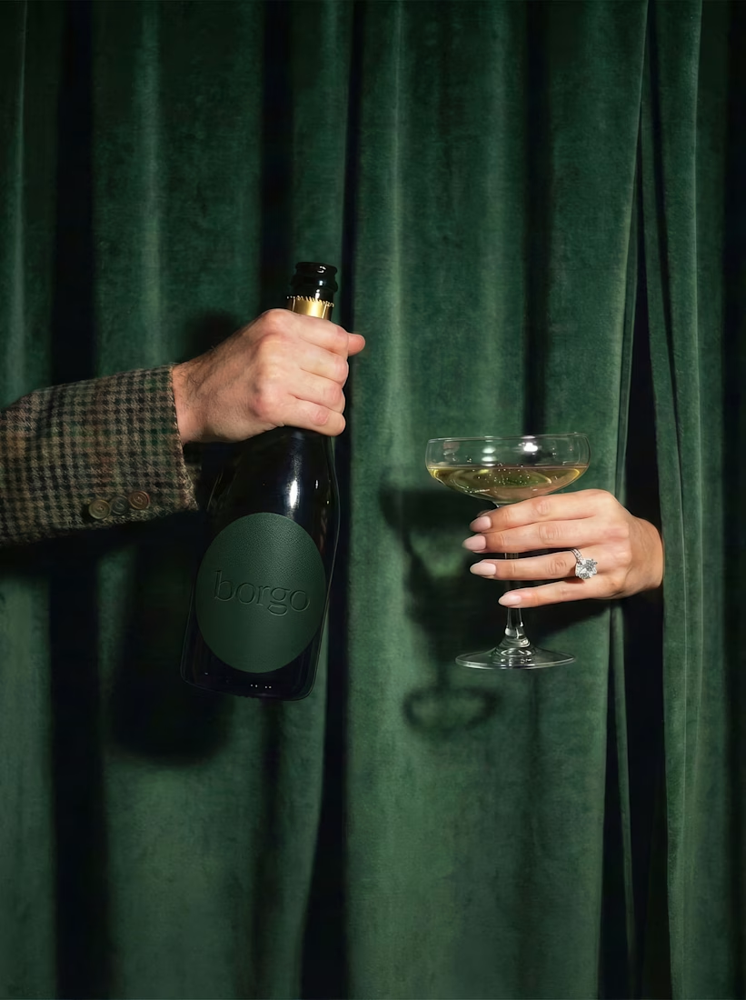
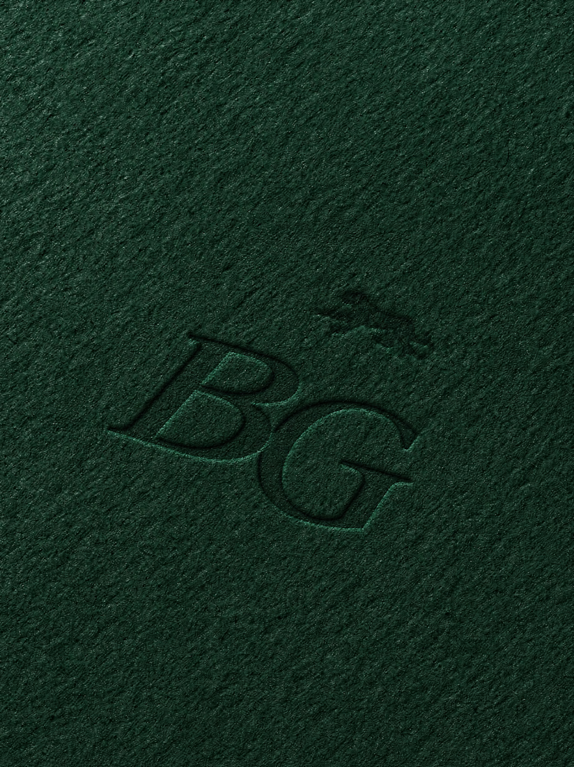

The dark green + subtle embossing is such a premium combo.💖🔥

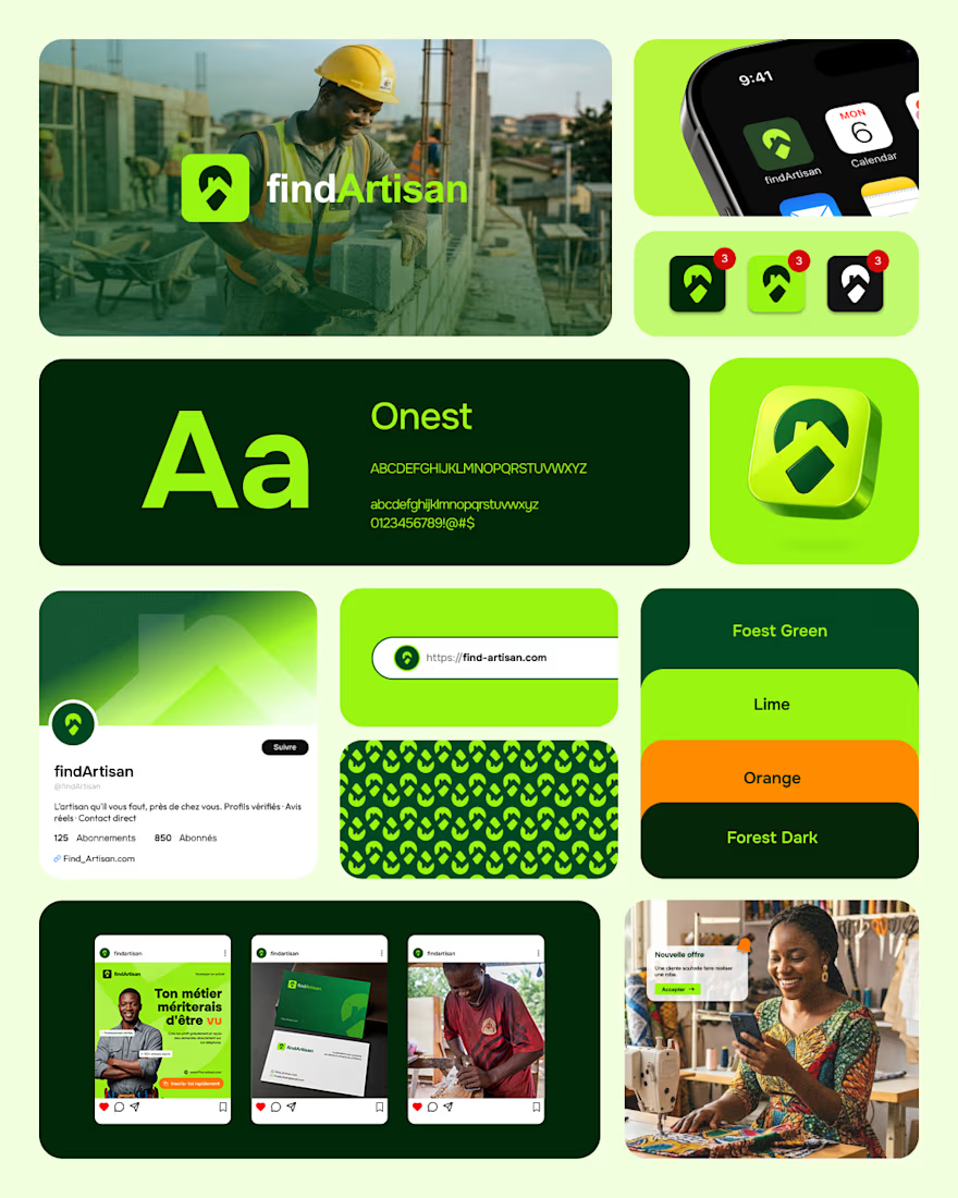
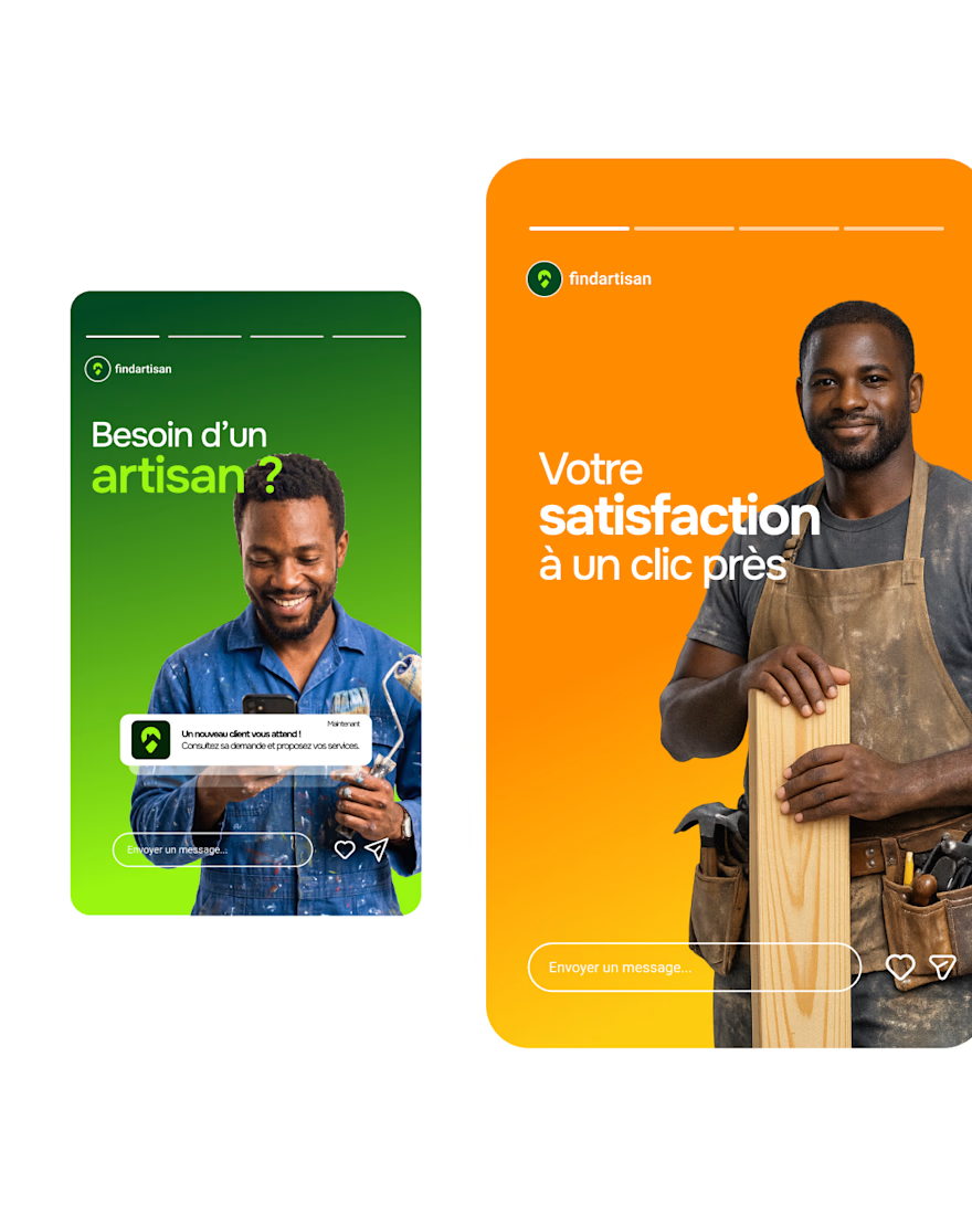
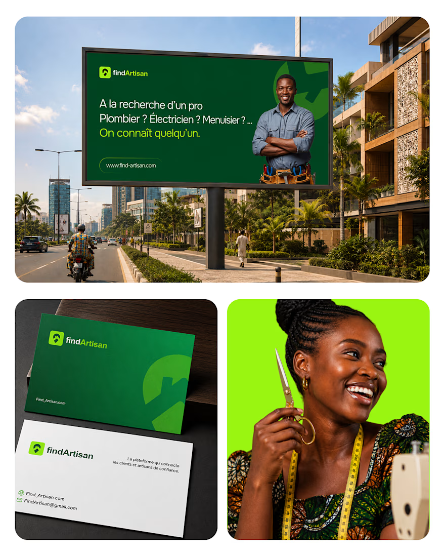
We've been working my team and I on the brand identity for FindArtisan, the platform that connects artisans and clients in west africa.
And I'm really happy with the outcome.
What your thoughts on it ?



Cool


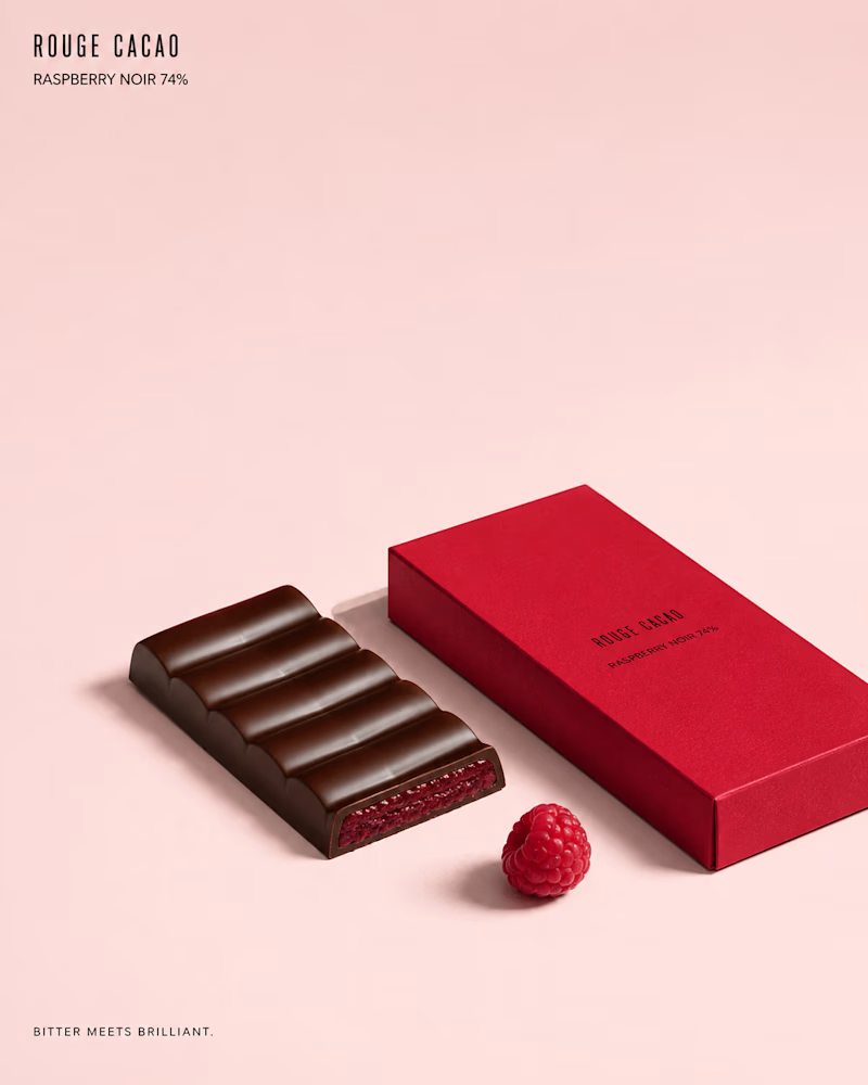
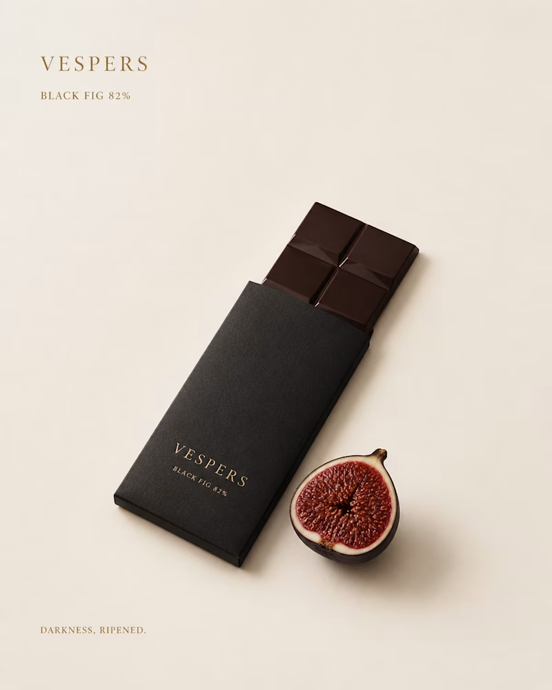
One bar, two ways to sell the dark.
One goes loud on colour: soft pink ground, a red sleeve, ridged chocolate broken open to show raspberry running bright through the centre.
The other whispers: bone paper, black card, gold type, a split fig lying beside a bar still half in its sleeve.
One wants to be picked up. The other waits to be found. Which shelf would you reach into? 👇
#brandconcept #packagingdesign #artdirection
6 voted
67%
3 voted
33%
9 votes
Closed

The second one almost looks like a lipstick ad, i love it