The network for creativity
Join 1.25M professional creatives like you
Connect with clients, get discovered, and run your business 100% commission-free
Creatives on Contra have earned over $150M and we are just getting started
Back to feedPost


Amazing!


Thanks

Excellent job! 💙


Amazing

Good Work
How do you get inspiration for these?


that yellow with the little sketchy faces is fun. nice one Sam

Such expressive work—the lines feel genuinely alive!

Amazing work!

good work brother


ramp got lucky with these

Running the halftone texture at an angle instead of straight-on is what keeps this from reading as a stock dot-pattern filter — it moves with the diagonal stripe field instead of sitting on top of it as a separate layer.

The texture in these is what gets me, that scratchy engraved look against the flat neon green is such a strong contrast. Was that hand illustrated first and then digitized, or built directly in software?

I love it man, so nice! 😍
The halftone gradient against the flat diagonal stripe block is the strongest choice here — one reads as texture/craft, the other as a hard graphic signal, and keeping them separate instead of blending stops the illustration from turning into noise.

Great job


Amazing work🔥👏👏

These look amazing, love how they collide with each other, to create this strong contrast, yet they feel very organic. Well done! 🙌

Great work

Love them, they're so unique! Do you explore them analog first or straightly experiment digitally? Such complex graphics have always been a challenge for me, any tips? 😄

Love how personalized and hand-crafted these feel! 🤩

nice job
The network for creativity
Join 1.25M professional creatives like you
Connect with clients, get discovered, and run your business 100% commission-free
Creatives on Contra have earned over $150M and we are just getting started











Related posts


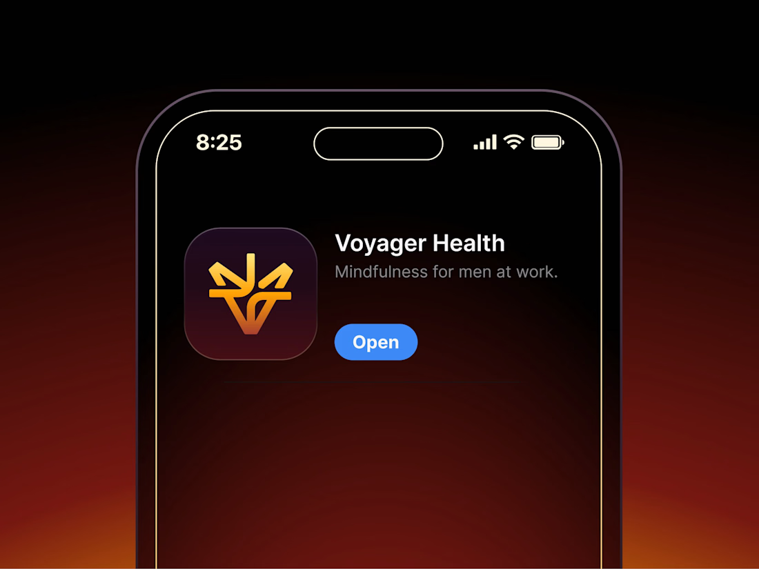

Aryna, that golden symbol pops so nicely against the plum background ✨

Finally a Contra Top Independent!
Been part of this community for a few years now, sharing my work, joining challenges, meeting some great people, and even picking up a few wins along the way.
I've genuinely enjoyed being part of Contra and seeing how much the platform has grown.
This one means a lot. Big thanks to the Contra team for the recognition!
More to come!


this is really nice 100%. nice job