The network for creativity
Join 1.25M professional creatives like you
Connect with clients, get discovered, and run your business 100% commission-free
Creatives on Contra have earned over $150M and we are just getting started
Back to feedPost

Turning 30 apparently took away my filter.
No, I don’t want “make it pop.”
Tell me what you actually want changed.

Congrats on your birthday and congrats on the new mentality 😂 it's very much needed!

Happy birthday Anita, may all your business goals come true!
Oh, I definitely don’t try to guess what is make it pop anymore, I just share my screen and say, “Okay, here we are. Let’s do this now.” And honestly, it’s worked even better for me now lol
The network for creativity
Join 1.25M professional creatives like you
Connect with clients, get discovered, and run your business 100% commission-free
Creatives on Contra have earned over $150M and we are just getting started











Related posts
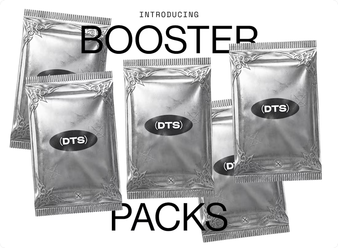
Stock photos, but make them ACTUALLY interesting. 👀
A couple of years ago I came across Death to Stock and today, they have launched their DTS Booster Packs: free creative drops delivered by email, packed with visual assets, resources, insider knowledge, and even exclusive rewards.
Think collectible cards, but for creatives. Each pack has its own rarity, so you never know exactly what you’ll get.
If you’re a designer who loves finding fresh visual references, I’d recommend subscribing. It’s free!
Check it out here: https://dtsclaim.com/?ref=EMTSYA
Who else loves collecting visual resources they might need for a project someday? 😂

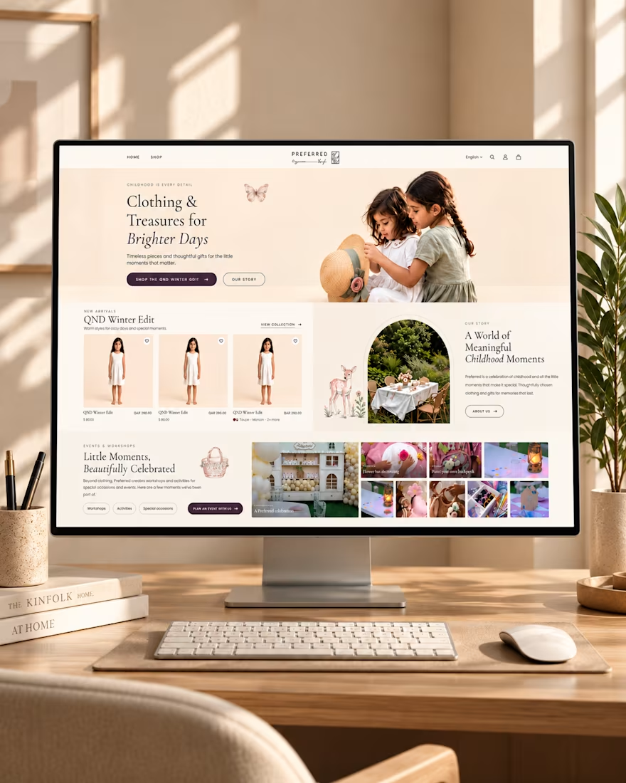
✨ Designing Digital Experiences That Feel Like Childhood.
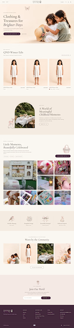
Introducing my homepage design concept for Preferred — a children's clothing and lifestyle brand built around meaningful moments, thoughtful gifts, and timeless style.
From the warm color palette and elegant typography to the seasonal product collections and childhood event showcases, every section is designed to create a welcoming shopping experience that connects with parents and celebrates childhood.
The goal? Combine beautiful design with intuitive navigation to make discovering products feel effortless.
💻 What do you think of this design?
#WebDesign #UIDesign #UXDesign #EcommerceDesign #ShopifyDesign #WebDesigner

Amazing work

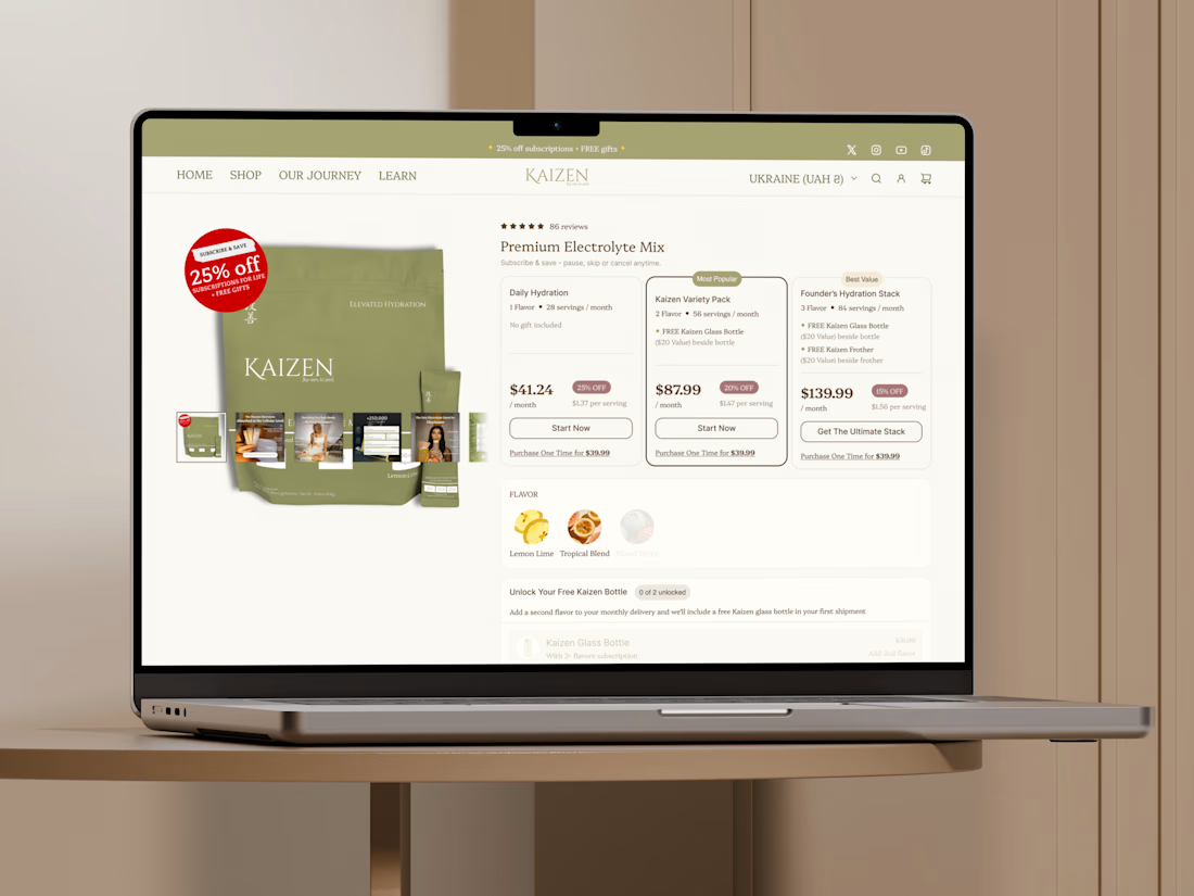
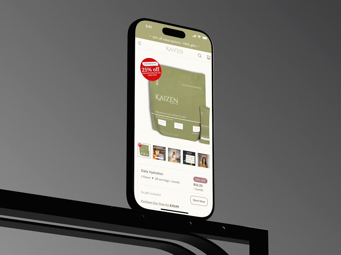
A little PDP redesign for Kaizen Hydration 🥤
My team and I took a standard product page and turned it into a clearer, more conversion-focused shopping experience.
We tightened the content hierarchy, brought ingredient transparency and key benefits front and center, added stronger trust signals, and made the path to purchase much easier to follow.
Clean, informative, and built around how people actually decide what to buy.
What do you think of the redesign?
Open to new collaborations, so DM me if you have a project in mind!


Ella, great job! 😍