The network for creativity
Join 1.25M professional creatives like you
Connect with clients, get discovered, and run your business 100% commission-free
Creatives on Contra have earned over $150M and we are just getting started
Back to feedPost

I designed and built this responsive personal portfolio website to showcase my web design and front-end development projects.
The website includes a modern hero section, selected work, services, process, and contact section. I built it with HTML, CSS, and JavaScript, and deployed it on Netlify.
The goal was to create a clean, professional portfolio that clearly presents my skills, services, and previous landing page projects to potential freelance clients.
Live website:
https://sara-benisi-portfolio.netlify.app/


The network for creativity
Join 1.25M professional creatives like you
Connect with clients, get discovered, and run your business 100% commission-free
Creatives on Contra have earned over $150M and we are just getting started
Related posts


dovvstudio.com is officially an Awwwards Nominee. First time I submit something there, no idea what to expect, and it got in.
Link below


Congrats! Getting nominated on your first submission is such a great achievement. Definitely something to be proud of!


We’re testing two filtering layouts for a template library.
Top Filters
The filters are placed above the content. This option feels lighter, leaves more space for the cards, and works well when there are only a few main categories.
Sidebar Filters
The categories remain visible in the sidebar. This makes the available options easier to scan and works better for more complex filtering, but takes up some of the content space.
Which layout would help you find the right template faster?

24 voted
39%
37 voted
61%
61 votes
Closed

Such a clean presentation. You can tell a lot of thought went into this.

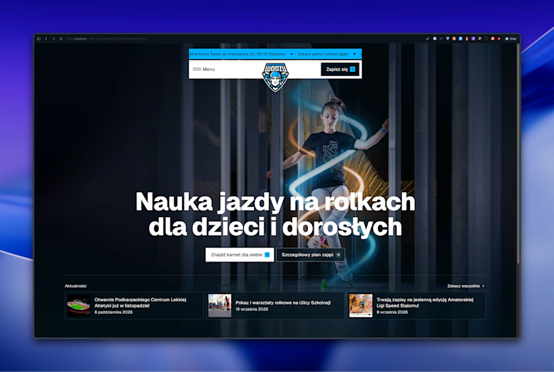
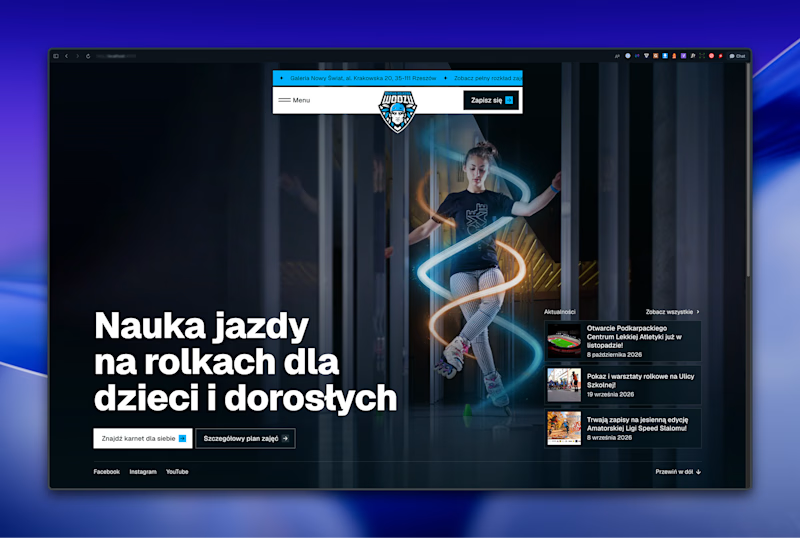

Left aligned for me. With that much body copy next to the headline it reads cleaner.