The network for creativity
Join 1.25M professional creatives like you
Connect with clients, get discovered, and run your business 100% commission-free
Creatives on Contra have earned over $150M and we are just getting started
Back to feedPost
Finished the UI design for Haven&Form — interior design studio concept.
- Clean,
- minimal,
- built to let the work speak.
Taking 2-3 clients at 50% off.
DM if you need a site.


Impressive!

Thank you🔥
Welcome
The network for creativity
Join 1.25M professional creatives like you
Connect with clients, get discovered, and run your business 100% commission-free
Creatives on Contra have earned over $150M and we are just getting started





Related posts

$10K earned on Contra. 🎉💸
Grateful for every client who took a chance on me. This is just the beginning. More great products, more real partnerships, more milestones to hit. 🙌
Thank you to everyone who's been part of it. Onward. 🚀
#10k #contraearnings #Freelance #Webflow #Framer #Webdesign


Congratulations nice job 🎉🎉

I wanted to make a photography website that felt more like an experience than a portfolio.
So I built CINÉRA — a cinematic photography studio website with a 3D gallery, interactive archive, real availability, and a complete booking flow.
You can explore the work, pick a date and time, add your shoot details, and get booked without the usual back-and-forth.
On the studio side, there’s a dashboard to manage bookings and inquiries, plus automatic booking confirmations to take a bit of the repetitive work off the photographer’s plate.
This was built for an appointment-based business challenge, and honestly, I had way too much fun making it.


Which Kajabi course outline makes you want to enroll?
Same course. Two directions: a clean accordion or visual module cards.
Vote below. What tipped the scale for you?

10 voted
33%
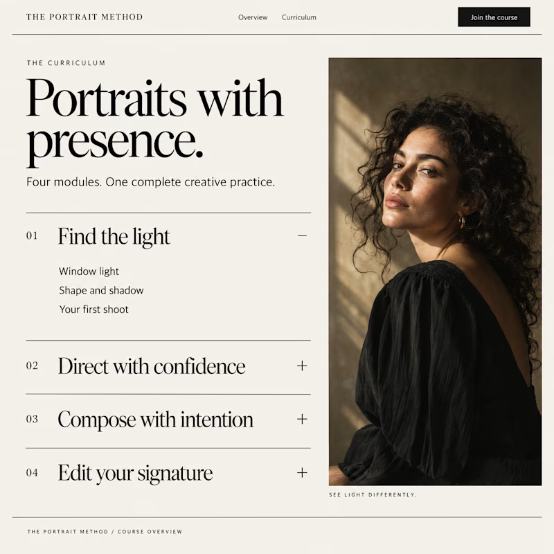
20 voted
67%
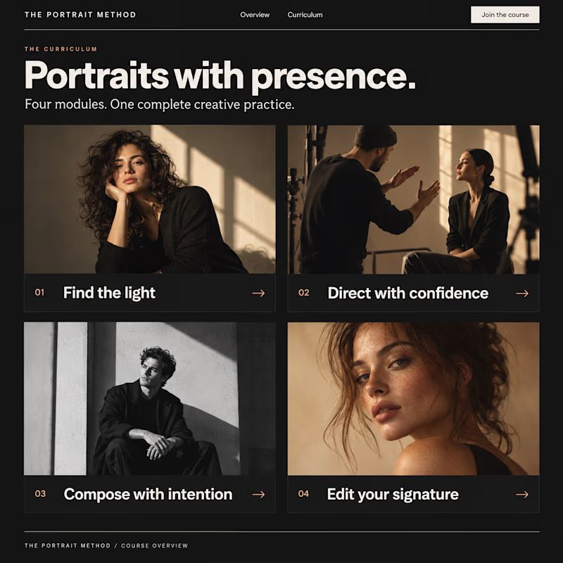
30 votes
Closed

Visual module cards win every time for user engagement—they give buyers an immediate sense of structural depth before they even enroll.