The network for creativity
Join 1.25M professional creatives like you
Connect with clients, get discovered, and run your business 100% commission-free
Creatives on Contra have earned over $150M and we are just getting started
Back to feedPost
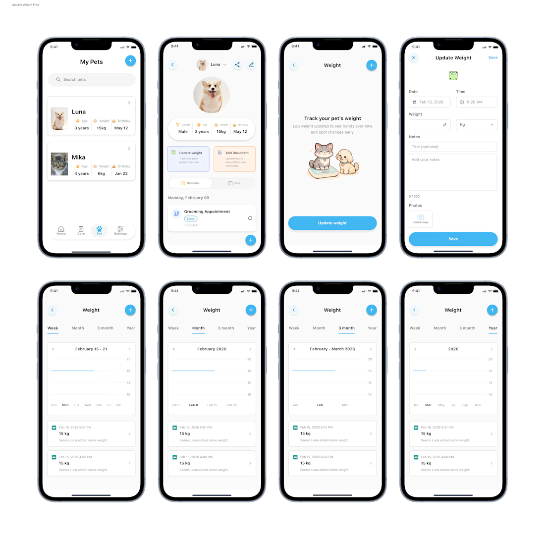
Your vet asks "has your pet's weight changed recently?" and you actually know the answer.
That's the feeling I designed for with PetCare's weight tracking flow.
Most pet owners notice weight changes too late. This feature fixes that:
→ Log weight in seconds, with notes and photos attached
→ Spot trends across week, month, 3 months, or a full year
→ Get context, not just numbers "Seems Luna added some weight"
The best health tools don't just store data. They tell you a story about it.
Designed this entire flow from the pet profile all the way to the trend charts. Every screen had one job, make tracking feel effortless so owners actually do it consistently.
Because a feature nobody uses is a feature that doesn't exist.
What health tracking feature would you add next? 👇
#UIDesign #UXDesign #HealthDesign #MobileUI #ProductDesign

nice work

Thanks Rasel
The network for creativity
Join 1.25M professional creatives like you
Connect with clients, get discovered, and run your business 100% commission-free
Creatives on Contra have earned over $150M and we are just getting started







Related posts

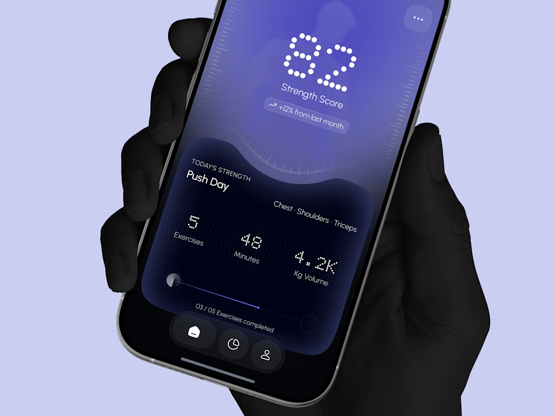
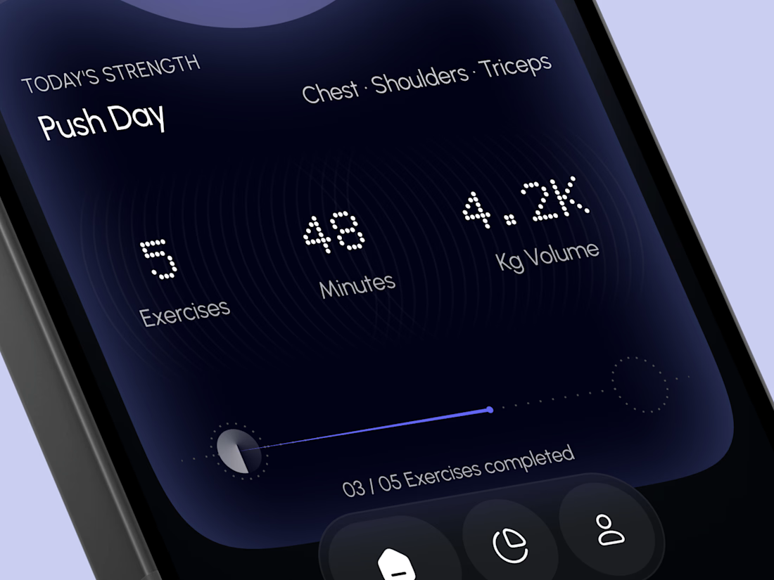
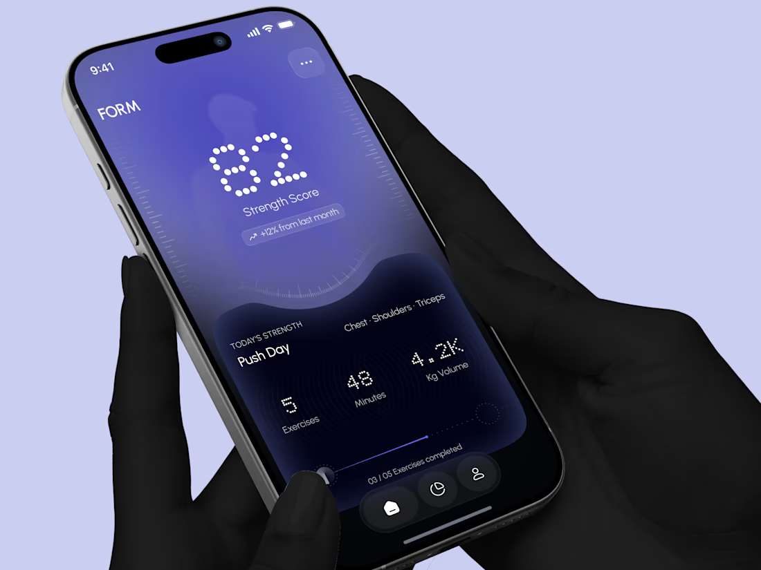
Designed a modern Strength Training Mobile App.
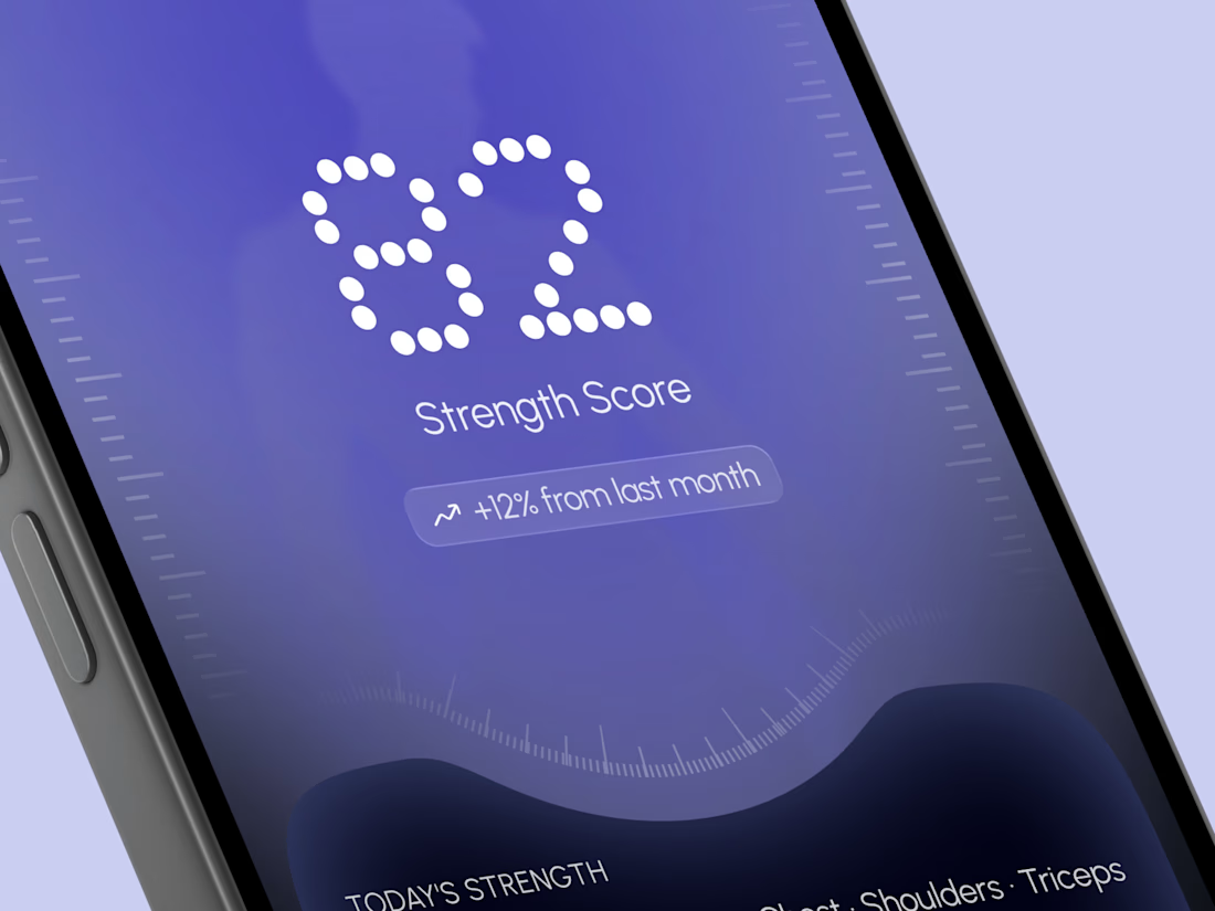
A deep indigo and violet gradient with a soft body silhouette and dotted display numbers for a bold and focused first impression.
A glowing strength score, a clear workout card with exercises, minutes, and volume, plus a simple progress bar make every training session easy to follow. A curved dark panel, fine tick marks, and a floating tab bar keep the whole app sleek, modern, and easy to use.


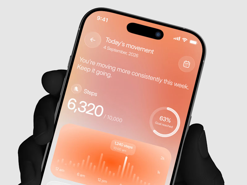
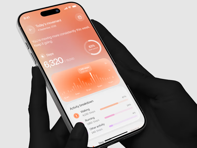
Designed a step tracking screen where you can see your daily progress and weekly trend in one glance.
Same screen, two shots. Which one would stop your scroll? 👀

14 votes
Ends in 2h