The network for creativity
Join 1.25M professional creatives like you
Connect with clients, get discovered, and run your business 100% commission-free
Creatives on Contra have earned over $150M and we are just getting started
Back to feedPost
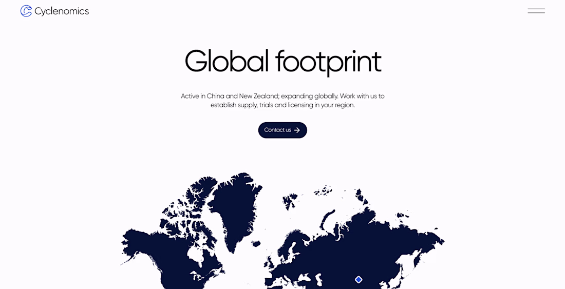
I honestly really like how this project looks.
Clean layout, sharp typography, nice spacing, and a visual direction that feels simple but strong.
It’s not overloaded with effects or random details. Just a clean Webflow build with a clear structure and good visual balance.
But here’s the funny part.
The project is still unfinished. At some point, the client just stopped replying, even though everything was moving well from our side.
So it probably won’t become a full portfolio case.
But I still think these screens deserve to be shared.
A few visuals from a project that never reached launch, but still turned out pretty nice.
Love the design and overall look of the website 🔥
Stunning!
The network for creativity
Join 1.25M professional creatives like you
Connect with clients, get discovered, and run your business 100% commission-free
Creatives on Contra have earned over $150M and we are just getting started
Related posts
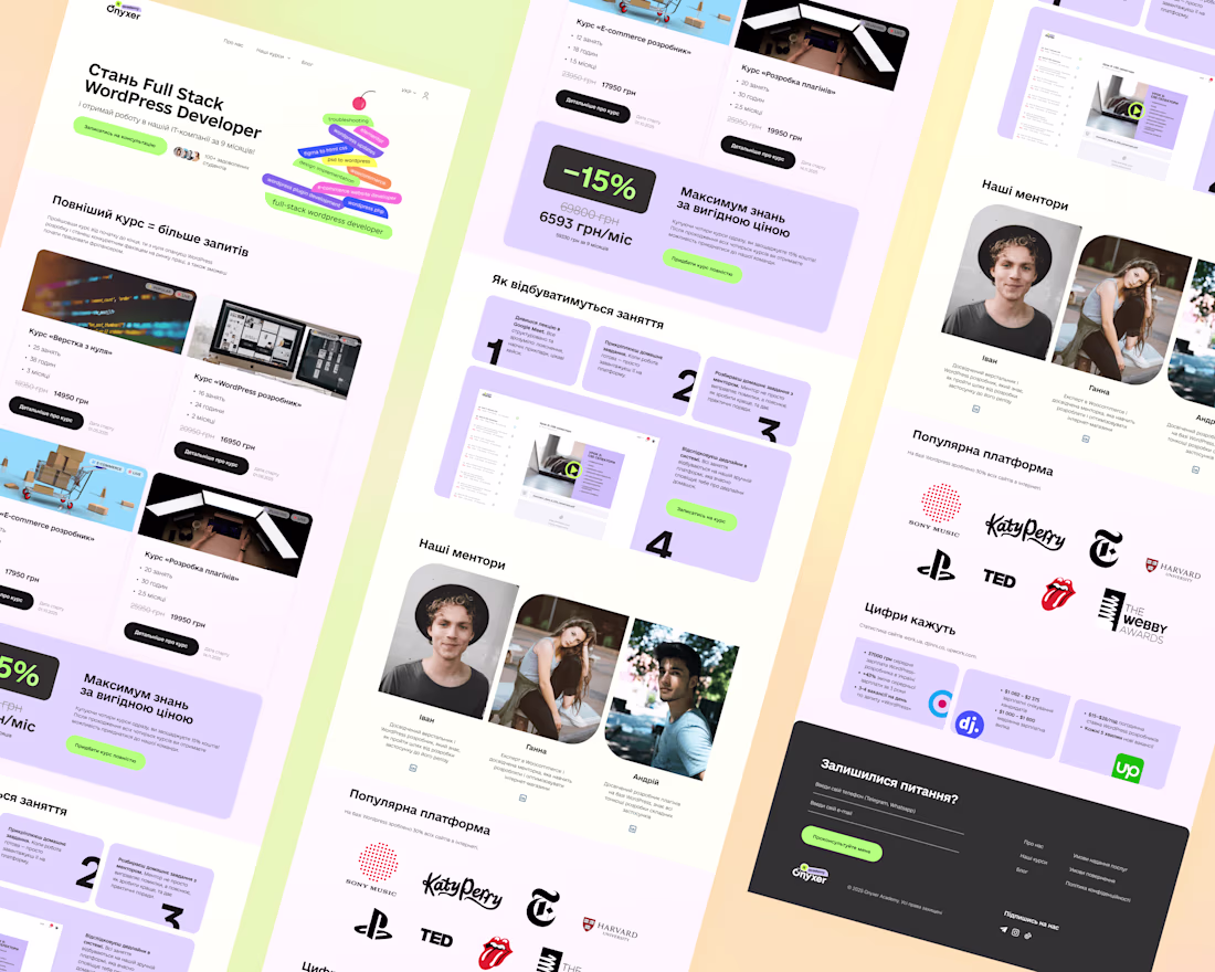
Hey Contra community!
I've decided to share my UX/UI design project, which was lead-generation-first to me.
Onyxer Academy is an edtech startup bootstrapped by a web development agency with a strong presence on Upwork.
The goals of the project were:
- Lead Generation through UX/UI design (my favourite!) = maximise conversion rates and make sure the marketing budget spent on customer acquisition, like ads and SMM, won't go to waste + the founder spent his own time on social media and his hourly rate is the highest in the agency (lead cost only increases from that)
- Motivate users to buy the full course (in the product design world, it's called a bundle, and even has best practices — my former boss's team even created a Shopify app dedicated to e-commerce bundles)
- Attract potential students to be the best during their study, since the best were promised to get hired (for real, the website was supposed to be a part of the hiring brand)
- "If there's time, provide also a concept of a Learning Management System..."
I've been a lead generation manager, team lead & mentor in agencies exactly like this, even though I already switched into UX/UI design, so the project excited me. The founder was thorough and detailed in his communication, and he also provided some visuals collected by an in-house graphic designer: logo variations, a mood board, and color schemes.
My then-process was almost as usual now:
- Deep briefing with a client through Zoom and Notion
- Even deeper analysis of all the info about the company to provide a truly narrow and personalized solution and maximise conversions
- Competitor analysis, especially pricing models analysis + UX/UI design standards of the industry, including not only Ukrainian but European & US edtech & coding bootcamp markets
- Website structure creation (the site is a landing page with AIDA framework)
- Wireframing
- UI Design
- Prototyping
- Figma File Cleanout :)
I was working with a wonderful UX/UI Design Mentor back then who had helped enormously by providing useful and pleasant feedback along the way.
The desire for future collaboration followed the project.
Hope you'll support it with your like and comment.
And as usual, if you want your website to bring you leads or conversions, I’m the woman.
See ya!
Starting from AIDA and working backwards into the site structure is the right call for a lead-gen project. Most designers approach it aesthetically first and then try to retrofit conversion logic. The competitor pricing analysis across Ukrainian, European, and US markets is a detail that most freelancers skip entirely.
dont we have to use bubble ?
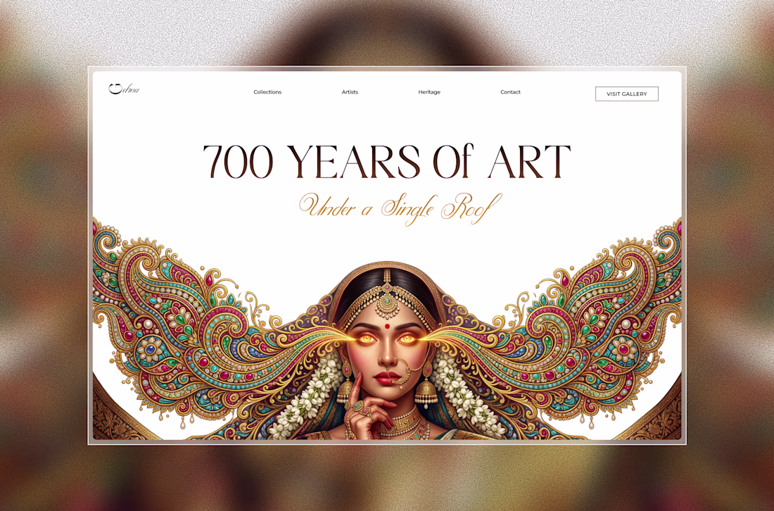
After a long time, I explored a new hero concept inspired by Indian craftsmanship and editorial luxury. ✨
Still early, but I loved blending ornate details with a modern web experience.
Should i turn this into a full landing page? ✨
framerdevelopercontralabsFramer Website DesignFramer Website DevelopmentEditorial DesignFigmaFLORAFramer
Love this!
Trending
Claude
Claude has entered the design space. How are you using Claude Design?
Contra University
Learn from expert creatives how to earn more using next-gen AI tools.
MagicPath
The canvas is infinite, and exploration is becoming the workflow. How are you using MagicPath?
creativeaiflow
Creative AI workflows are evolving. What tools do you use, and what are their strengths and weaknesses?
freelancerlife
Freelancer life is wins, pivots, and everything in between. What’s yours right now?