The network for creativity
Join 1.25M professional creatives like you
Connect with clients, get discovered, and run your business 100% commission-free
Creatives on Contra have earned over $150M and we are just getting started
Back to feedPost
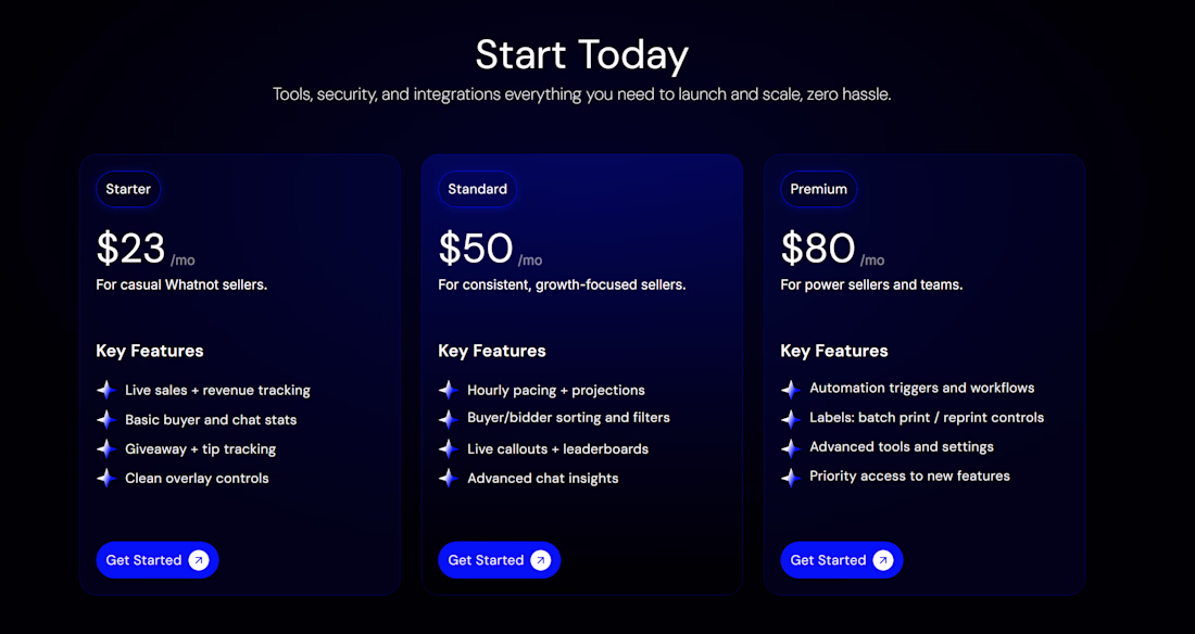
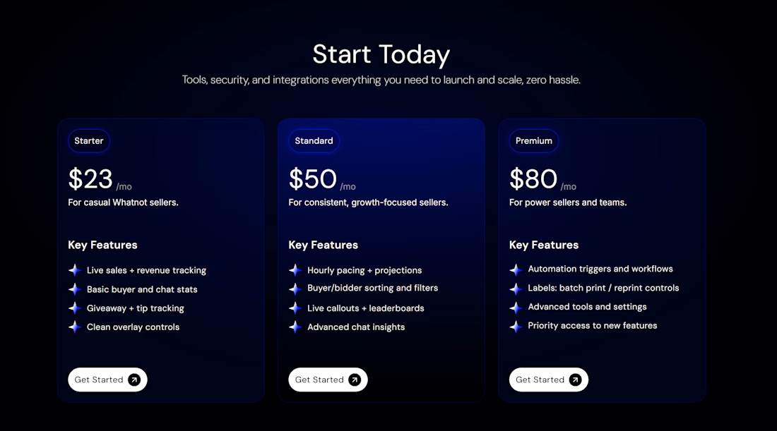
Choosing between design elements can be one of the toughest parts of the process, so I’m handing the mic to you! 🎤
I’m currently designing the pricing section for a new project and I’ve narrowed it down to two distinct looks for the primary call-to-action. I'd love to get your thoughts on which one hits the mark:
Option A: A bold Blue Button for a high-contrast, energetic feel.
Option B: A clean White Button for a sleek, minimalist aesthetic.
Which one would make you more likely to click? Drop an 'A' or 'B' in the comments! 👇
Option A ;)
Thank you ❤️
The network for creativity
Join 1.25M professional creatives like you
Connect with clients, get discovered, and run your business 100% commission-free
Creatives on Contra have earned over $150M and we are just getting started
Related posts
Hot off the press 🔥 super happy to work with Zapier again for ZapConnect 2026!
developed in Framer by me
design by Donna Fung
Go register: https://zapier.com/zapconnect
This is absolutely stunning. 🔥 The typography, spacing, and overall visual direction feel so premium. Amazing work! 👏
Design Duel ⚡
Two hero concepts. One fashion photographer.
🅰️ Structured split layout 🅱️ Full-screen editorial experience
Which one would you choose for your portfolio? Vote A or B and tell me why.
6 voted
20%
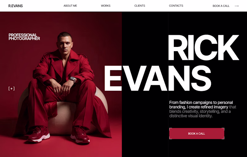
24 voted
80%
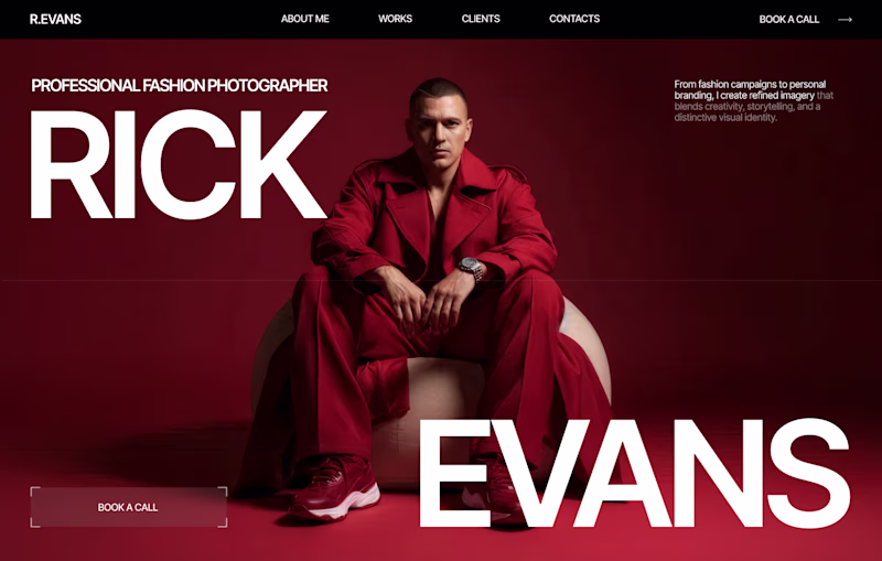
30 votes
Closed
I love your designs so much! 😍
Challenges
View allTrending
Claude
Claude has entered the design space. How are you using Claude Design?
Contra University
Learn from expert creatives how to earn more using next-gen AI tools.
fifaworldcup2026
The World Cup is here and the whole world's watching. How are you designing for the world stage?
creativeaiflow
Creative AI workflows are evolving. What tools do you use, and what are their strengths and weaknesses?
freelancerlife
Freelancer life is wins, pivots, and everything in between. What’s yours right now?