The network for creativity
Join 1.25M professional creatives like you
Connect with clients, get discovered, and run your business 100% commission-free
Creatives on Contra have earned over $150M and we are just getting started
Back to feedPost
Taste Test

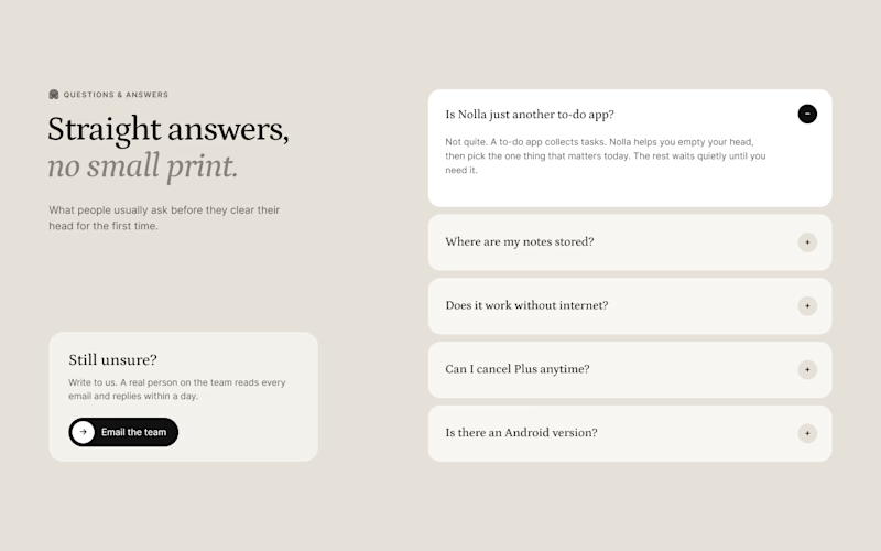
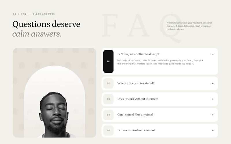
Nobody gets excited about designing an FAQ section. But it's often the last thing people read before they sign up.
Two takes for Nolla.
A is a calm split. Questions on the right, and on the left a small card saying a real person replies to every email. When someone's unsure, that's what they're looking for.
B numbers every question and brings back the arch portrait and logo pattern from the hero, so it still feels like the same site.
Designed in Figma for a Webflow build.
Which one would you trust more?


3 votes
Ends in 22h
The network for creativity
Join 1.25M professional creatives like you
Connect with clients, get discovered, and run your business 100% commission-free
Creatives on Contra have earned over $150M and we are just getting started


Related posts

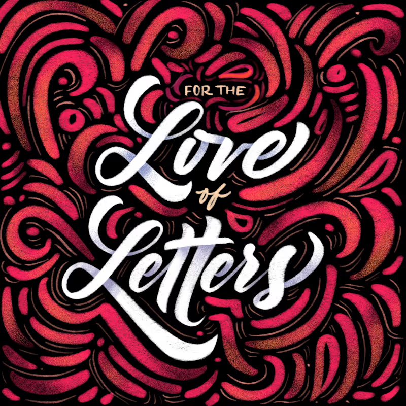
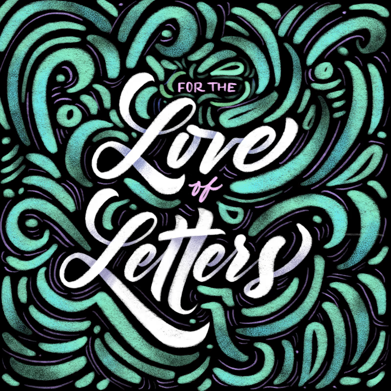
Same lettering, two color directions. Which one would you pick?
I got nostalgic this week looking at this lettering design. About 8 years ago I was deep into it and drew every day. Little by little I lost that rhythm, and now I only do it once in a while for gifts and small things.
Back then I could spend a lot of time choosing colors and comparing options. A taste test like this would have saved me so much time. 😅 I keep wondering how much I would have improved if I had never stopped practicing.
Is there something you used to practice a lot and would love to get back to? I had my lettering, illustration AND tufting phase.
37 voted
61%
24 voted
39%
61 votes
Closed


8 years later and the lettering still holds up

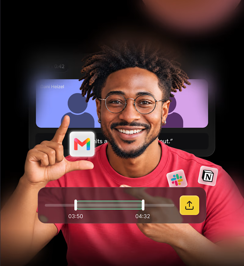
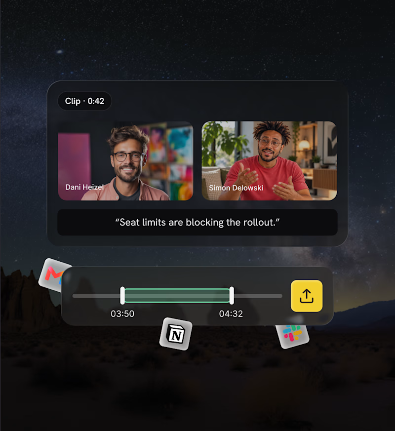
Explored two different approaches for the same section. One focused on human connection, the other on showcasing the product experience.
Both have their own personality, but I'm curious which one communicates the value better from a UI/UX perspective.
Which direction would you go with: 01 or 02? 👀
4 voted
67%
2 voted
33%
6 votes
Closed


human connection one for me, people buy from people first

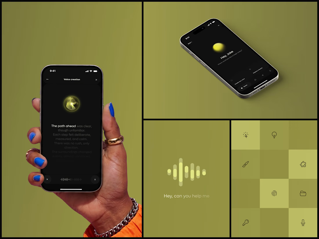
AI Voice Generator App
You can follow the voice with your eyes.
Designed by the Hue & Machine team.