The network for creativity
Join 1.25M professional creatives like you
Connect with clients, get discovered, and run your business 100% commission-free
Creatives on Contra have earned over $150M and we are just getting started
Back to feedPost

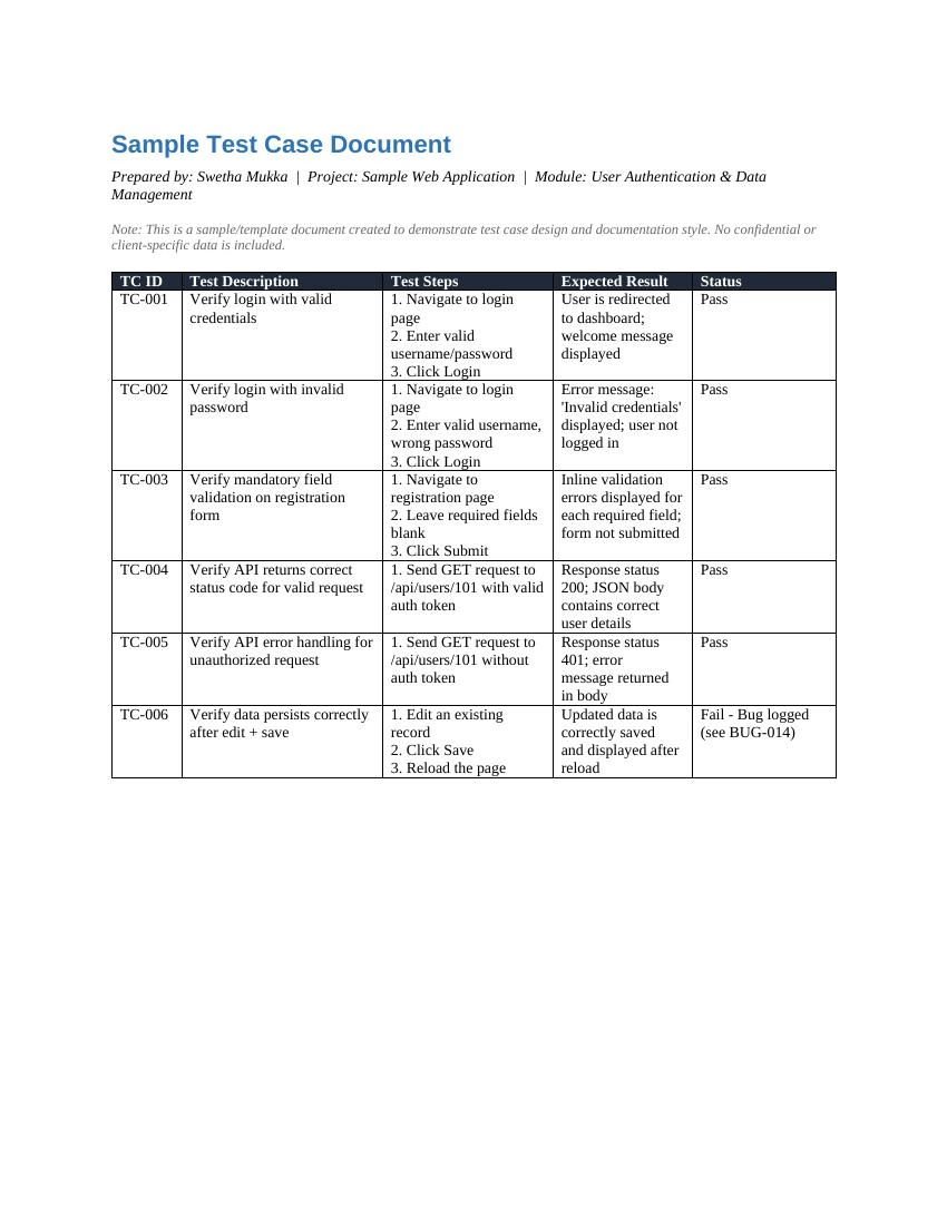
A sample test case document showing how I structure


The network for creativity
Join 1.25M professional creatives like you
Connect with clients, get discovered, and run your business 100% commission-free
Creatives on Contra have earned over $150M and we are just getting started



Related posts

Rebuilt my portfolio with AI and added new case studies.
Brand, web, and product UI. All custom coded, all in one page.

One page with brand, web and product UI together is a strong move. Clients see the range without clicking around. Rebuilding mine with AI coding tools taught me the same thing: the speed lets you spend the saved time on the case study writing, which is what actually wins work.

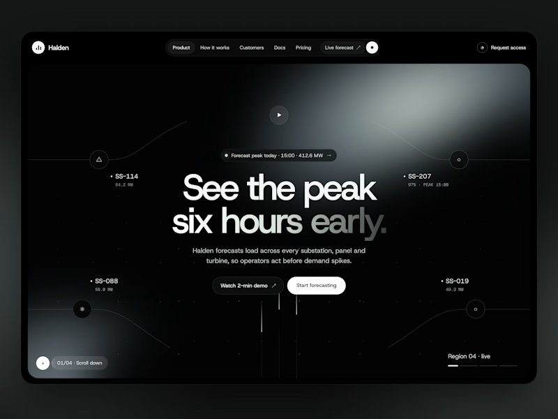
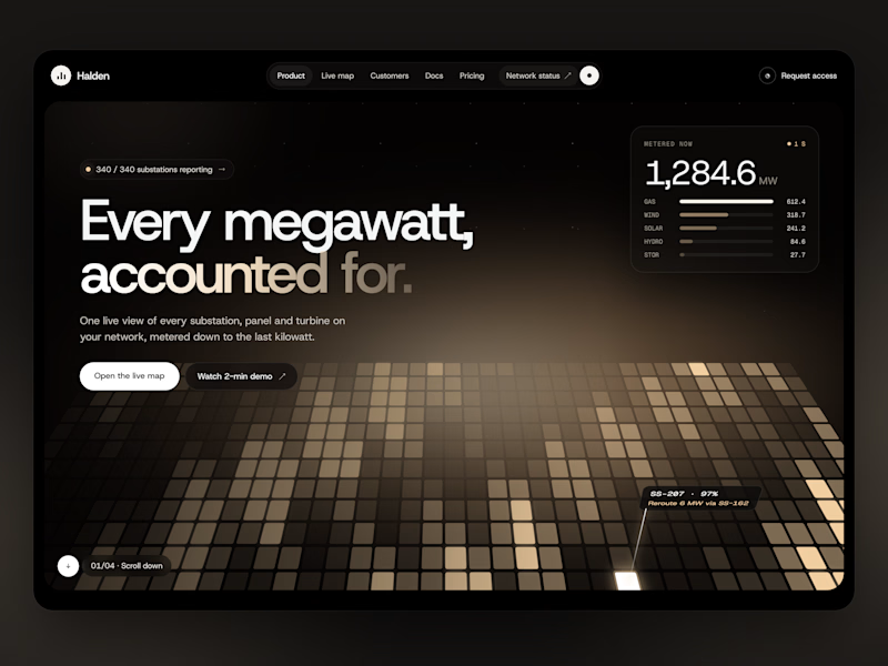
Halden sells to grid operators, and there were two good ways to pitch it: tell them what's coming, or show them everything happening now. Rather than pick one on instinct, I designed the landing page as an A/B test so real traffic decides.
The two pages share one 12-column grid, the same section order, type system and components. Each variant changes only its message, its hero visual and its light color, so any difference in demo requests comes from the pitch and not the layout.
The work was building a system flexible enough to carry two different stories without either one feeling like the backup version.
4 voted
80%
1 voted
20%
5 votes
Closed


When you read a studio's case study, ours included, try sorting each claim into four groups: what they delivered, what it's meant to do, what the client said, and what got measured.
Only the measured claims are results, so those are the ones to look for.