The network for creativity
Join 1.25M professional creatives like you
Connect with clients, get discovered, and run your business 100% commission-free
Creatives on Contra have earned over $150M and we are just getting started
Back to feedPost

A legacy pigment dispersion manufacturer sought to reposition itself for a rapidly evolving market—where sustainability is no longer optional, but expected.
The solution was the complete overhaul of the Brand Identity across all touch points, without loosing the credibility of the established firm.
Check the full case study here.
The network for creativity
Join 1.25M professional creatives like you
Connect with clients, get discovered, and run your business 100% commission-free
Creatives on Contra have earned over $150M and we are just getting started

Challenges
View all




Related posts

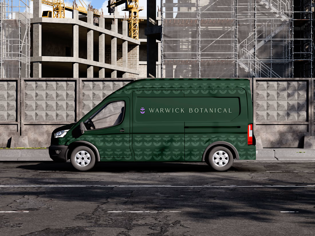
For brand identity, I like to show mockups to test of the identity system: the logo, pattern, and color palette all needed to work at a much larger scale without feeling overdesigned.
That’s where a flexible brand system really starts to prove itself.
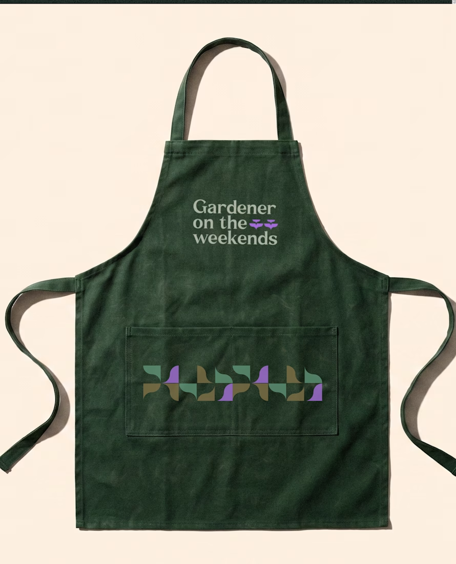
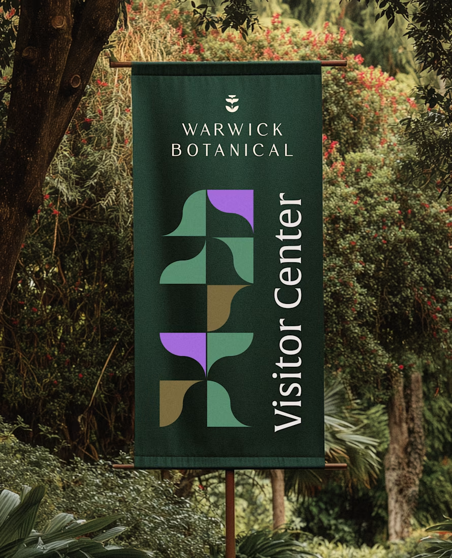

Powerful greenish look 👌
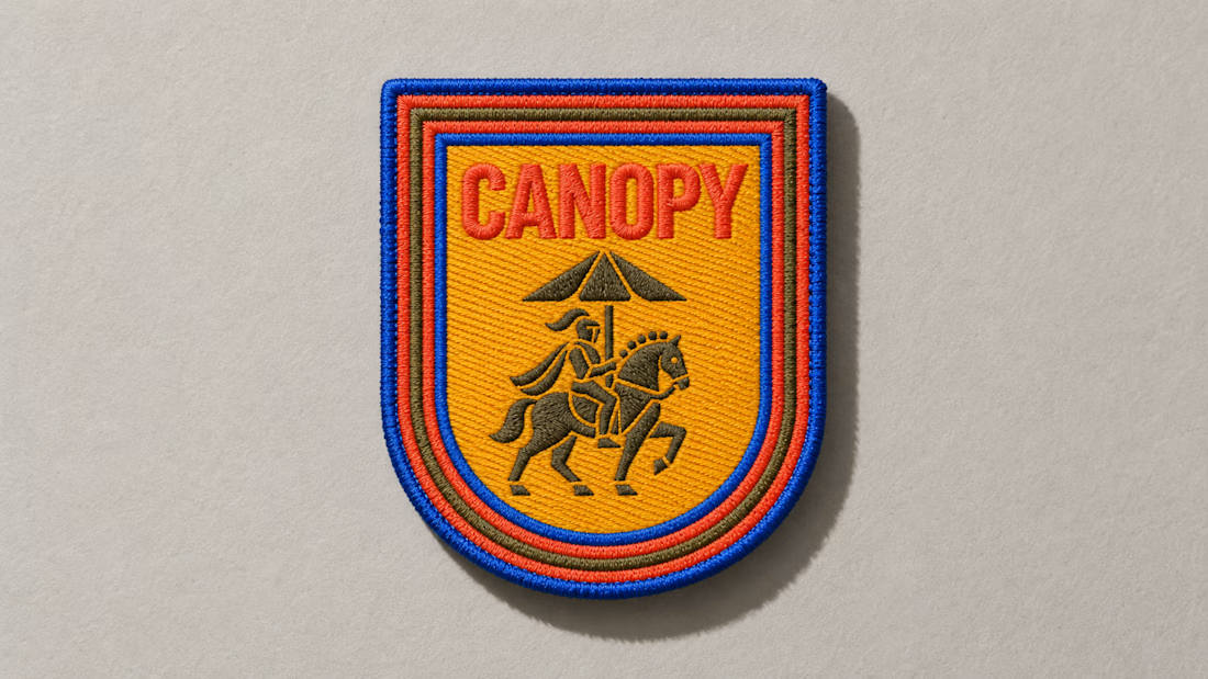
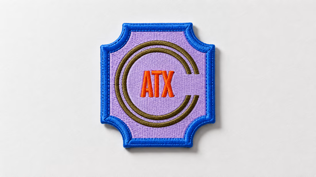
A little preview of something I’m working on.
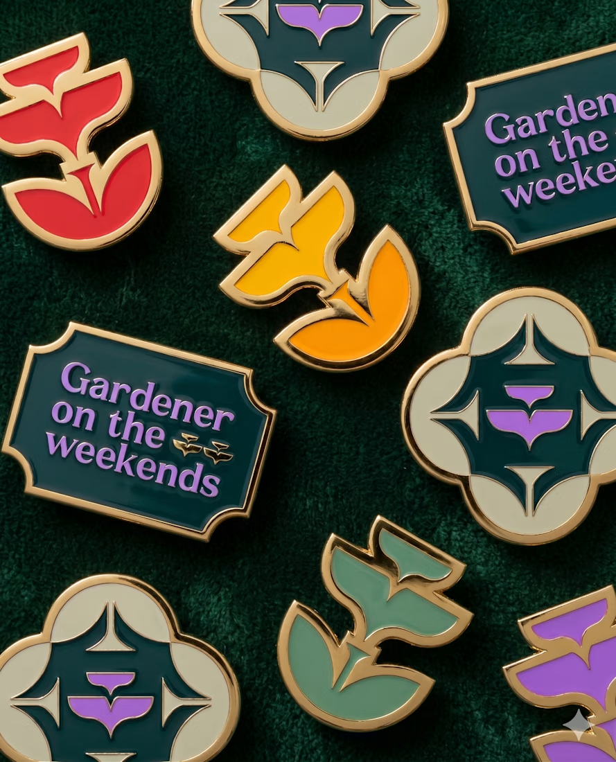
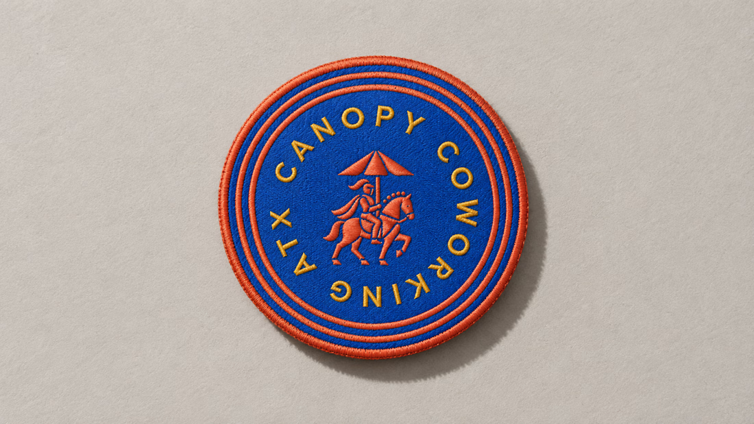
These embroidered patches are a small part of a much larger brand system, but details like this matter. The challenge is making sure the identity still feels distinct and intentional when it moves from screen to something physical you can hold in your hand.
That’s where a strong brand system starts begins to prove itself. More soon :)

Returning to foundational assets is always a valuable exercise in brand scalability. Currently, I am preparing and structuring the master delivery files for a new sub-brand—built upon a visual identity system I originally designed a couple of years ago. Designing adaptable brand frameworks from day one is what allows a business to expand seamlessly over time while maintaining complete visual coherence. Looking forward to sharing the final execution soon.