The network for creativity
Join 1.25M professional creatives like you
Connect with clients, get discovered, and run your business 100% commission-free
Creatives on Contra have earned over $150M and we are just getting started
Back to feedPost

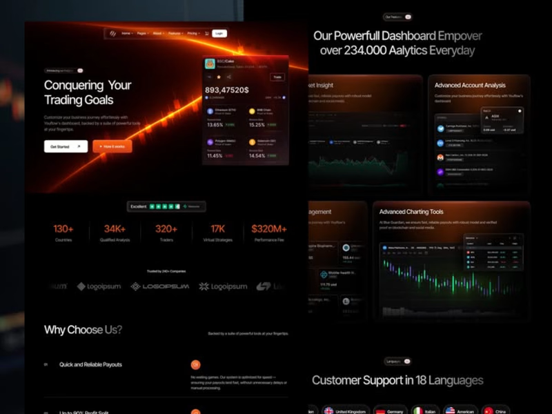
New drop — meet Trenox
It's a Trading, Crypto & SaaS template built for founders who want their product to look credible, not cartoonish.
If you've ever landed on a crypto site stuffed with neon gradients, glitchy 3D coins, and walls of charts no one actually reads — you know exactly what I tried to avoid here.
Clean layouts. Real product space. Pricing pages that don't make people bounce.
What's inside:
- 16 pre-built pages (3 homes, 3 abouts, 3 features layouts, pricing, blog, integration, FAQ, careers, contact, 404)
- Dynamic CMS collections
- SEO-optimized, fully responsive
- 100% no-code customization
Available on:
- Framer — $79
- Webflow — $129
- Figma — $99 (18+ files)
If you're launching a trading platform, a fintech MVP, or a crypto product — Trenox gives you a foundation that earns trust the second the page loads.
Take a look → https://waidastudio.com/templates/trenox
What's the most over-the-top crypto site you've ever seen?


The network for creativity
Join 1.25M professional creatives like you
Connect with clients, get discovered, and run your business 100% commission-free
Creatives on Contra have earned over $150M and we are just getting started




Related posts


Built a new Webflow site for Tangível, a UX studio in Portugal.
20+ years, 60+ specialists, 380+ projects. Research, design systems, accessibility, product strategy. Finance, energy, telco, government.
The site had to hold all of that without feeling like a brochure. I developed it in Webflow so they can keep publishing cases and services themselves.
Live: tangivel.com


nice work..


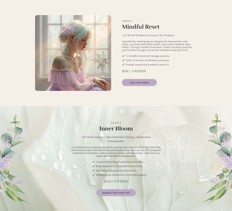
Cards or sections? How should you showcase courses on a Kajabi website?
It depends on what you want visitors to see first.
Course cards are great when you want to show the full picture at a glance – “Here are all the programs we offer.” They make the product range clear before visitors start scrolling.
Separate sections work better when each course needs more attention – its story, audience, benefits, and outcomes.
When we design Kajabi websites, we don’t use one layout for every course.
We choose the structure that makes the offer easier to understand – and easier to explore.

28 voted
65%

15 voted
35%
43 votes
Closed

Cards

Most consulting sites try to look impressive. This one tries to look trustworthy.
Hallam, a Framer template for boutique advisory firms. Work in progress. ✨

The arches in that hero shot do a lot of the trust-building on their own, they read stable and established without a single line of copy yet. Was there a version of this template that leaned harder into typical consulting-site cues, like team headshots or client logos up top, before you stripped it back to this?